The uniform world in the NBA has been turned upside down now that Nike is on board as the league’s outfitter. Gone are the days when the home team would wear white and the road team would wear their primary color uniforms. In fact, there are now no more home and road uniforms at all. Instead, teams can mix and match whatever they’d like to wear any given night. That means we see some nights where the home team wears white, or the road team, or both teams wear primary colors. It’s certainly made the uniform situation more vibrant, more unpredictable, and more colorful on a nightly basis across the association.
Now Nike adds on top of that their new City Edition alternate jerseys, which run the spectrum of everything you would expect in the words “alternate jerseys.” Some teams have gone with designs that are completely different than anything you’ve ever seen before, while others keep it pretty close to the vest with much more conservative looks.
To be honest, in our search of the top five and bottom five City Edition jerseys, it was much more difficult to narrow down the Top 5 than it was for the Bottom 5, which means that most of these Nike jerseys will be big winners with their respective teams. Nevertheless, there are some uniforms that stand out and some that would have been better left on the design room floor.
Bottom 5
5) Orlando Magic

When it comes to bold alternate designs, the new Magic jersey is definitely near the top of the list for these City Edition jerseys. It puts their traditional logo up against what appears to be a starry night sky. I really can’t tell if I love it or hate it, but the bizarre description is going to put it in our worst category.
Keep in mind that each team has one of these fanciful descriptions regarding their new jerseys. Some actually make sense, while others are just plain weird. Like this one. From Nike:
“The edges of light bordering our universe reveal a vastness greater than our imagination. Emblematic of the desire to achieve more, the Orlando Magic City Edition uniform is the will to break boundaries, push our outer confines and find something greater than our individual selves. Go higher. Go farther. Go deeper. Be limitless.”
Pushing the boundaries of the known universe and being “limitless” is not what I think of when I watch the Orlando Magic play basketball. Sorry, Nike.
4) Boston Celtics

Nike seems to be obsessed with gray color schemes for alternate uniforms and they’ve done it again with the Boston Celtics. Nike says it’s the color of unity (which is news to me and probably everyone reading this) and that’s why it was chosen for the Celtics to signify their large regional fanbase across New England. Oooooookaaaaay. The Celtics have such a rich history that to see them honored with something so bland and unimaginative (though if you squint, you can see a parquet design in there) is a disappointment.
3) San Antonio Spurs

San Antonio’s camouflage uniforms honor our armed services and the city’s label of Military City USA. It’s a nice gesture, as is anything that tries to pay homage to our men and women in service. (The “however” is coming.) However, camouflage uniforms just don’t work in sports. They don’t work in football, they don’t work in baseball, and they definitely don’t work in basketball.
2) Brooklyn Nets

It’s not that the Nets’ City Edition is a bad uniform necessarily. There just isn’t anything here that distinguishes it from its normal black uniform, aside from what Nike calls a “graphic wiring pattern” that is related to the Brooklyn Bridge. It’s hardly visible, especially on the court. Why not do something really cool and come up with a Brooklyn Dodgers-style scheme and be more creative like we’ll see in our top jerseys?
1) Cleveland Cavaliers

Ugly. Ugly. Ugly. This looks like something that is one of those bad CPU-generated options for your create-a-team in a video game. The Cavaliers have a rich history of vibrant color schemes — blue, orange, wine, gold — that provide a ton of good options for an alternate uniform. So of course, Nike has foregone all of that for this bland gray color scheme with “The Land” emblazoned on the front. Even the 1990s Shawn Kemp jerseys would be better than these! Worst of all for a Cleveland team, it looks more like something the Steelers would wear.
Top 5
5) Utah Jazz

I know what you’re thinking — putting the Jazz in the Top 5 of this list removes every shred of credibility whatsoever. But you’ll have to forgive me for this one because I’m a sucker for color gradients. And the new Jazz uni is so different and stands out so much that it deserves a spot on the Top 5 of the countdown.
Nike says it’s inspired by the various red rock formations around Utah, which actually connects with the state unlike some of their other explanations for these new jerseys. (Seriously, the Clippers jersey looks great, but it pays homage to the team’s days in San Diego and doesn’t have anything to do with Los Angeles.) And truth be told, any connection with the state of Utah is an improvement over the “Jazz” nickname that has somehow stuck since the days when the team was in New Orleans.
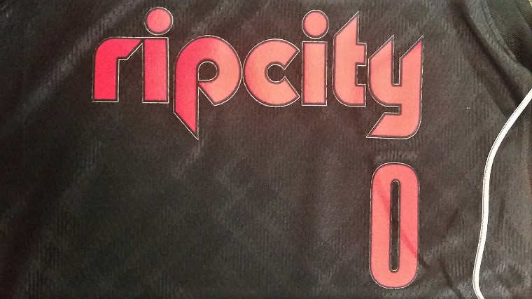
4) Portland Trail Blazers

The Blazers’ Rip City edition is an awesome looking jersey that will certainly connect with Blazers fans and hits all the right marks. It has a classic look to it with the Rip City font and the light touch of plaid that pays a fitting tribute to the great Dr. Jack Ramsay. It keeps the traditional black and red color scheme of the Blazers, but is different enough that it distinguishes itself from the team’s other black jersey.
3) New Orleans Pelicans

The Pelicans jersey is everything one of these City Edition jerseys should be. The details in this jersey, from the font to the numbers to the Mardi Gras color scheme perfectly captures New Orleans. It’s not all that different from alternate unis the Pelicans have worn in the past, but it’s a formula that works for the team and city so it was wise of Nike not to mess with it too much.
2) Miami Heat
This is the best alternate jersey ever. Do not @ or argue. pic.twitter.com/9GqV7PXOqY
— Phil Hecken (@PhilHecken) December 27, 2017
While not part of the official release from Nike, we do have a leaked version of the Miami Heat alternates, which are simply beautiful. The “Miami Vice” look with the pink and blue lettering somehow has a simultaneous modern look and throwback appeal. It should inspire the Marlins to try something similar with their uniforms as a shakeup, at least as a distraction from the Derek Jeter fire sale that is currently going on.
1) Chicago Bulls

This jersey is so nice that it should become the Bulls’ main jersey. This is pure class. In fact, it may be one of the best jerseys in professional sports, it’s that good. The red stars and blue and red font are inspired by the city flag of Chicago and the script Chicago font looks perfect. You can see players from any era of the NBA playing in this jersey and the timeless quality of it makes it worthy of the top spot.
