For a long time, the main Rice logo was an Old English “R”. This Old English “R”, in fact:

Perhaps relatedly, no one ever really cared that much about Rice athletics. That’s despite having a few solid programs, led by their baseball team, which won the College World Series in 2003.
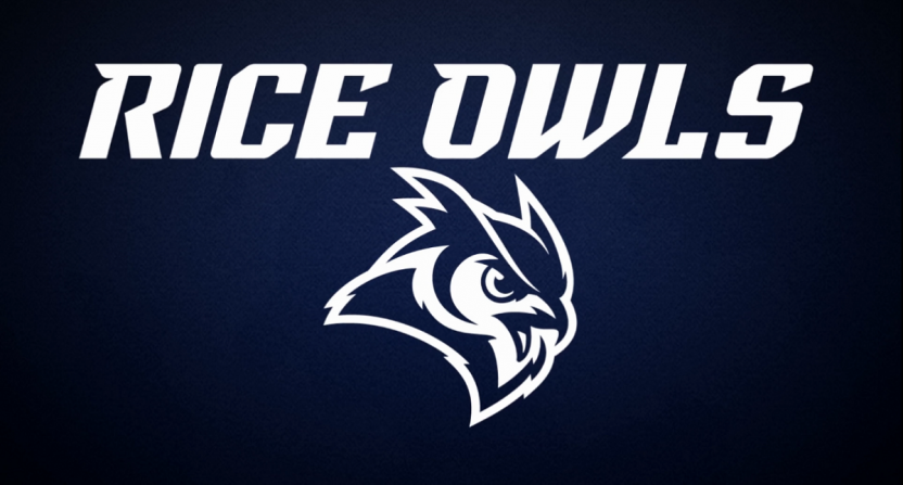
This is despite having an owl as the mascot, and it’s an irreproachable fact that owls are awesome. So, Rice decided to go to the drawing board (read: hire brand consultants) and come up with a refreshed look for their logos. That resulted in today’s “refreshed brand identity” unveiling (sigh) that gave us these sweet new logos:
Rice Athletics proudly unveils our refreshed brand identity. Visit https://t.co/sVcJpjZXHb to learn all about it! pic.twitter.com/T1z5XYniBm
— Rice Athletics 👐 (@RiceAthletics) April 11, 2017
Now, what that tweet doesn’t tell you is that the primary logo remains the “R”:
The result of this process is a refreshed family of design elements centered around our primary mark the Old English R, including a refreshed wordmark, owl head, owl body, fonts and a set of numerals.
Still, more owls are never a bad thing. Rice isn’t the only school with an owl logo, of course, and Temple’s logos aren’t that dissimilar:
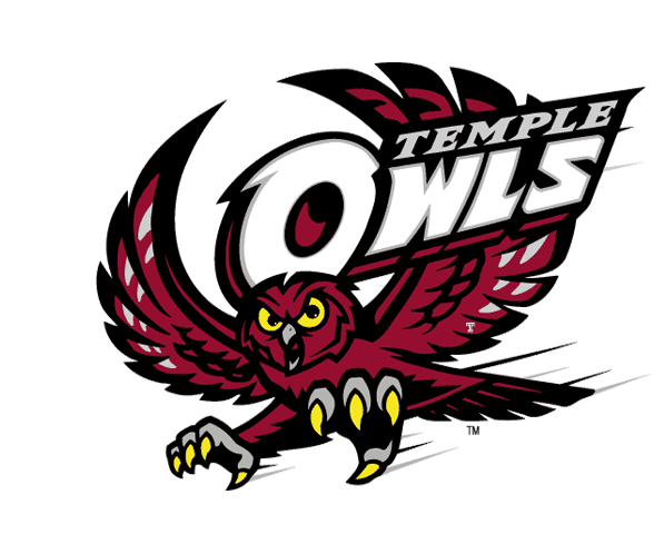
But then, there’s only so much you can do to differentiate owl logos. No one goes around worrying that ever wildcat or tiger looks different, and owls are superior mascots as it is. More schools should use owls. Indiana should just start using an owl mascot (they put the “hoo” in “Hoosier”) and see if anyone notices.
So, this is a good logo move. Considering how fun it is to make fun of the bad ones, it’s important to recognize when teams move in the right direction.
