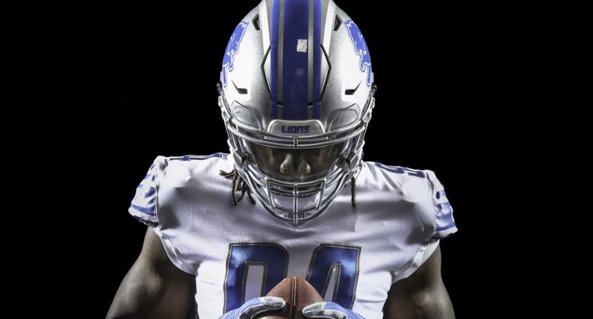
The Detroit Lions unveiled their new 2017-18 uniforms last night to mixed reviews.
They’re not bad, of course; the blue/gray combination is solid, and unique in the NFL. But the update isn’t really an update; the changes are such that had the Lions not trumpeted the changes, many people could have turned on their games this fall and not really noticed the differences.
But, hey, judge for yourself:
Nothing but 🔥🔥🔥!
Check out the new threads ➡️ https://t.co/ElZ8aiECWi pic.twitter.com/9nsMJEL4Jd
— Detroit Lions (@Lions) April 14, 2017
Lions' new home uniform. pic.twitter.com/oXn5Vl5ISN
— Paul Lukas (@UniWatch) April 14, 2017
Not a ton of obvious changes to the home uniforms, aside from the removal of the weird black trim the Lions had sported in prior seasons. That always felt out of place, and a bit cheap; looking at the update, it’s tough to look back at the black trim and figure out why anyone thought it was a good idea.
The number font has been improved, in my opinion:
Comparison of Matthew Stafford's number in Lions' old (left) and new number fonts. pic.twitter.com/UO6JwqpXYF
— Paul Lukas (@UniWatch) April 14, 2017
It’s kind of like in high school when the varsity team gets new uniforms, so the JV starts wearing the old varsity unis, and they look so dated right away. (I did not play sports in high school.)
The road uniform update is a clean look:
Lions' new road uniform. pic.twitter.com/tUTWx6vIQ1
— Paul Lukas (@UniWatch) April 14, 2017
The Lions also have maybe the best Color Rush uniforms in the league:
Lions' new Thursday-night uniform. pic.twitter.com/BcSimylnjq
— Paul Lukas (@UniWatch) April 14, 2017
I really, really like that all-gray look, especially with the Lions blue. That’s very nice, and I almost prefer it to the road uniforms, though I really like dark gray. (I like them much more than Paul Lukas did, for example; he gave the Color Rush an F in his review.)
There’s a throwback as well, which makes sense, as the team has been around since 1930:
Lions' new throwback. pic.twitter.com/jRwybCEreN
— Paul Lukas (@UniWatch) April 14, 2017
That’s a very simple, clean scheme for a throwback, which is a nice touch. The worst throwbacks are those that are too busy, like the Steelers bumblebee look.
All in all, these are upgrades for the Lions, which should be what every team strives for when attempting a uniform refresh. Not everyone thinks it’s a big deal, of course:
Uniforms don't mean shii.😎
— Ha Ha Clinton-Dix (@haha_cd6) April 14, 2017
But hey, Detroit has made the playoffs two out of the last three years, so maybe things really are looking up.
