5. N.Y. Islanders
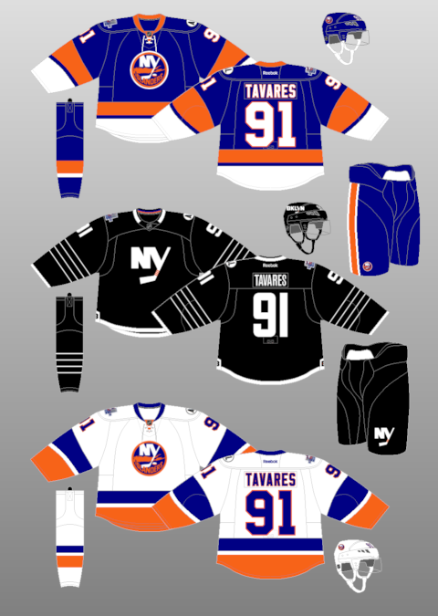
What works: Here’s one of the many teams that had a classic, vintage looked destroyed by goofiness in the 1990s. Remember the fisherman? Jesus. In a way, the franchise still hasn’t recovered. A lot of the designs going forward from here are simple, and that’s something all the teams behind this spot should notice.
What doesn’t work: That stuff inside the logo is Long Island, and the Islanders play in Brooklyn now, so maybe they should replace it with [enter hipster reference joke here]. (Ed Note: I got this Dave…a nine dollar cronut wearing skinny jeans and a toque in the summer! Okay, moving along…)
Rating: 8.5
4. St. Louis
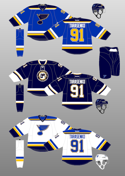
What works: A team called the Blues would screw this up if they came along today. They’d have an entirely blue jersey with a sad guy playing the trumpet. Yet these Blues played it smart with two shades of blue and a touch of yellow (because who doesn’t like yellow?). That blue note isn’t a person but I’d like to hang out with it.
What doesn’t work: Trim that layer of dark blue off the bottom of the jersey and sleeves and you’ve got perfection.
Rating: 8.8
3. Edmonton
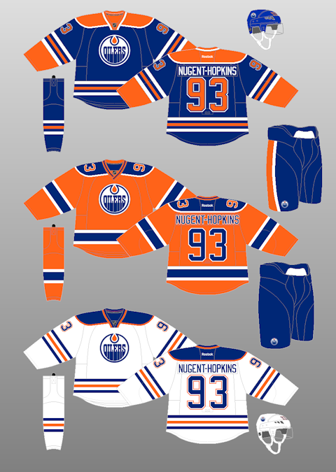
What works: Not only do the Oilers get to waste first overall picks, they get to waste one of the nicest jerseys in the league by never being on TV in the United States. This is the Islanders jersey, only nicer.
What doesn’t work: That oil drop is cool when you are winning, but when you have missed the playoffs for a decade straight, it looks like one of the planet’s natural resources is crying because it is associated with you.
Rating: 9.2
2. Montreal
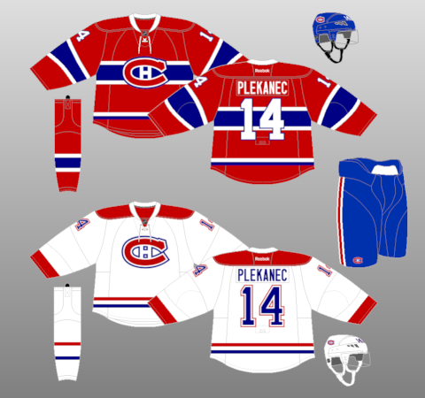
What works: It’s almost impossible to mess up a red, white and blue jersey but the Canadiens somehow make this a work of art. It has the ‘C’ for Canadiens and ‘H’ for Les Habitants to keep the French-speaking people of Quebec from rioting. And when you compare it to the super busy red jersey, you feel bad that fans in Montreal get that one over the white one.
What doesn’t work: Well, the jersey technically doesn’t speak French, so it should be run out of town any day now.
Rating: 9.5
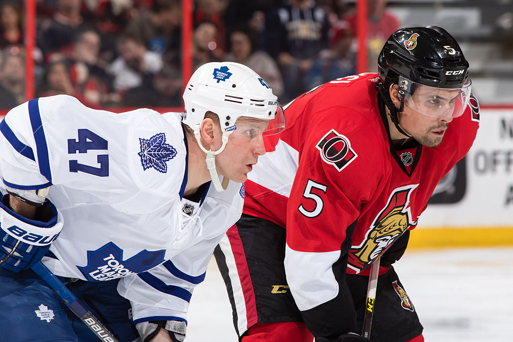
1. Toronto
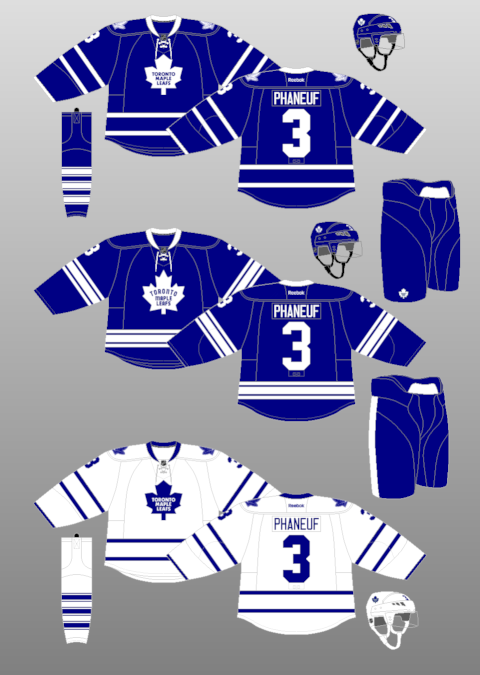
What works: This jersey is so beautiful that it has reportedly gotten both women and men pregnant simply by having them wear it. There’s something neat about a team having such an old jersey that it has its full name on it. It’s the type of jersey that will stand the test of time and never…what’s that?
What doesn’t work: The NHL being what it is, of course the Leafs are changing their logo for next season. So congratulations to Montreal on having the prettiest NHL jersey for the 2016-17 season.
Rating: 10.0
(Jerseys from nhluniforms.com)

The Bruins’ B is spoked because Boston is known as “The Hub”.