The Premier League is back and while everyone is talking about where teams will finish and speculating where certain players will play following the final few weeks of the transfer window, there is something else that soccer fans are intensely passionate about that is no doubt important.
A nice-looking kit is something that any team can do and every year we see our share of hits and misses. Fans hope their team comes out with something nice that will entice them to spend money on one. Whether a team goes traditional and errs on the side of caution or they go experimental and take a risk on something wild that we haven’t seen before, there are plenty of examples on either end that look great and some that aren’t so great.
We count down the five best and worst kits his Premier League season. It was tough to narrow both lists down to five, and I’m sure others will have a different order or even different kits, but depending where your team is, you should be proud or disappointed.
The Five Worst Kits
5) Swansea City home
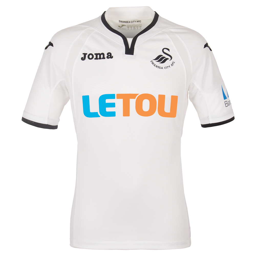
One common mistake in kit design is when the shirt sponsor doesn’t match with the rest of the kit. A lot of times this is because the sponsor isn’t willing to change their logo design and it just doesn’t make for a good look.
4) West Bromwich Albion away

West Brom’s away kit just seems too much like a stock design that youth teams buy in bulk for their team. Take away the crest and the kit sponsor, it’s like any other generic kit.
3) The Nike third kits

A problem that is seemingly more and more common in soccer kits has been stock designs by kit makers for all their teams. Nike has this same design for Manchester City, Chelsea and Tottenham and while neither kit has officially been released, it’s pretty safe to say these are the kits. If only one team had this design, I would love it more since it’s unique and original. Repeating it for two other teams loses that and just becomes a lazy attempt to cut corners.
2) Brighton & Hove Albion away
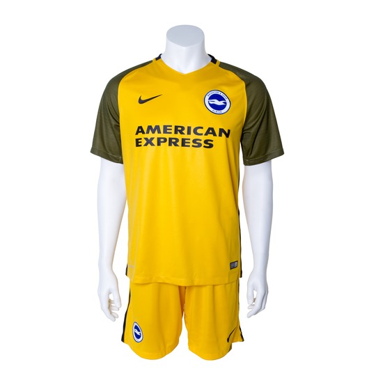
Brighton’s two-tone gold design probably sounded great on paper and maybe looked good in initial renderings but it doesn’t seem to work in real life. The sleeves and the dark gold stripes is definitely the worst part of the kit.
1) Everton away
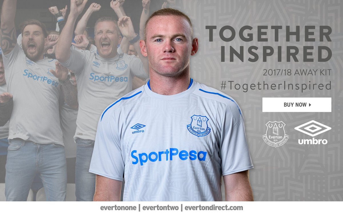
This looks like an undershirt that I would wear to bed or something I would use as a rag when I wash my car. This is one of the most plain-looking kits and this light gray/light blue design makes it look like the most boring kit ever. Even the faint design cannot save this weak attempt and hopefully Everton fans choose to spend $75 on the home kit rather than waste money on this.
The Five Best Kits
5) Stoke City away
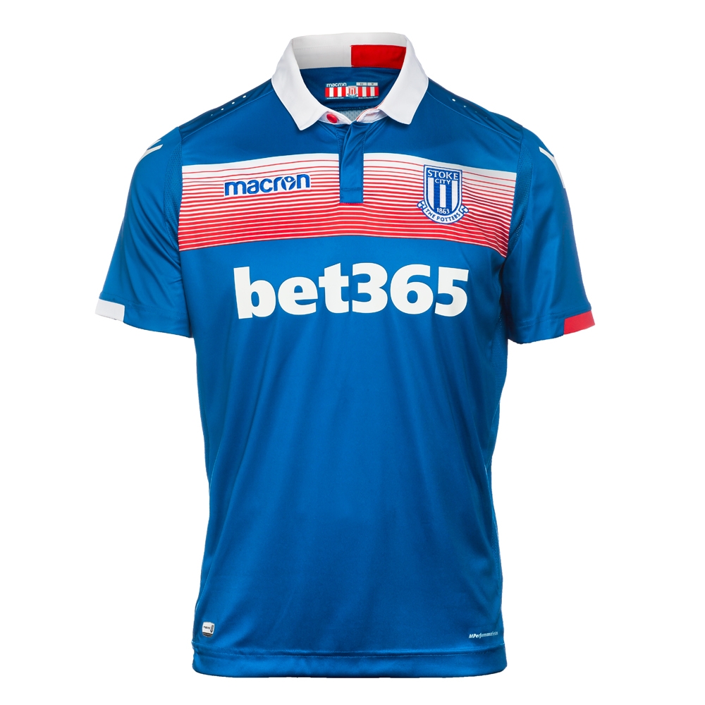
Stoke has a very 80s-looking design going. Last season, their away kit was a powder blue design that was a flashback of the 70s and that was one of my favorites. This is more of the same and I’m loving the retro look.
4) Manchester United away
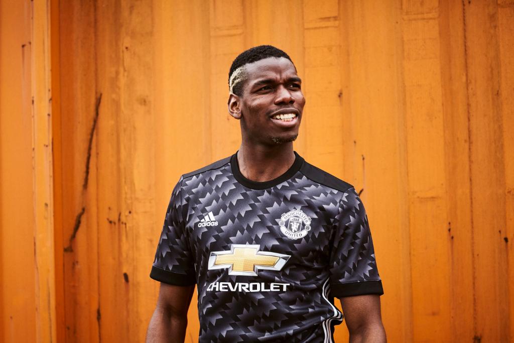
This is one of the best combos of retro and modern design I have seen. This kit was inspired by the United away kit from the early 90s and was blue and white. The only thing that changed was the color and that makes this an entirely new design despite the same pattern.
3) Huddersfield Town third
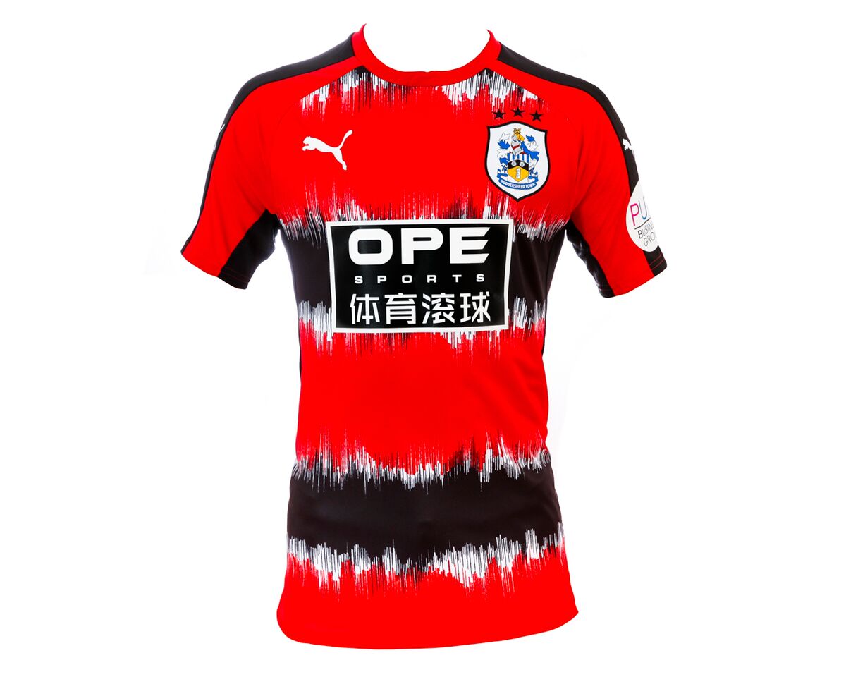
This kit isn’t for everyone, and probably isn’t for most people, but I am definitely feeling this. The crest may not match the rest of the kit, but this is a great-looking design. This kind of looks like something that a Pacific island rugby team would wear.
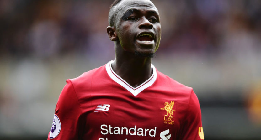
2) Liverpool home
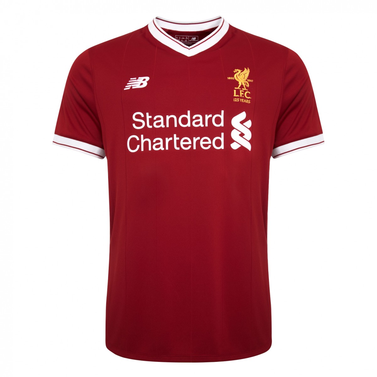
Liverpool is celebrating their 125th year as a club and they went with a classic design with a darker red that was more prevalent in their title-winning years during the 70s. The kit is clean and sharp, and the “125 Years” crest completes this special kit.
1) Tottenham away
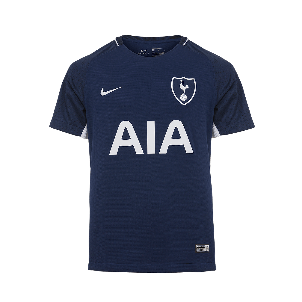
Talking about clean designs, this is simply immaculate. Some may call this plain, but the color scheme goes together perfectly and really is a great example of how “less is more” can be for the best for a well-designed kit.

not only is the spurs uni incredibly meh, it’s so meh that this ranking makes me want to bet you also think that Penn State has the best unis in CFB