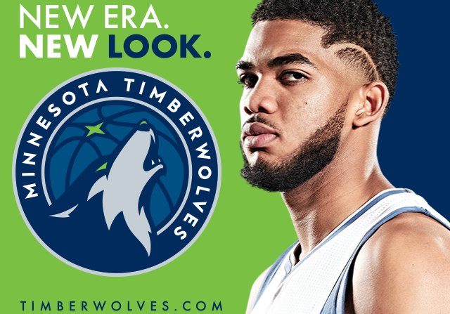
The Minnesota Timberwolves plan to roll out a new logo Tuesday night, but they seemed to accidentally give the world a sneak peak.
Tuesday afternoon, Conrad Burry of SportsLogos.net tweeted an image he came across on Reddit, which appeared to be an advertisement on the Star Tribune website featuring Karl-Anthony Towns aside a new T-Wolves logo.
Via Reddit (https://t.co/os34C3rbGR), here's the first "official" leak of the new Wolves primary logo. Can't confirm 100%, but seems likely. pic.twitter.com/KyscYcMc2y
— Conrad Burry 🔴🐐🎨 (@conradburry) April 11, 2017
Burry then followed the link and found the new design himself.
I can confirm this now as I visited the Star Tribune link (which has been since taken down). This is indeed the new Wolves primary logo. pic.twitter.com/h3gR6kOYSE
— Conrad Burry 🔴🐐🎨 (@conradburry) April 11, 2017
This wolf in the logo is not that different from the wolf currently in one of the team’s secondary logos, which is facing the opposite direction and howling over a slightly different background.
The Timberwolves’ primary logo is, for the time being, a snarling wolf looking head on over the team’s name. Minnesota has used some version of that design since 1996, according to SportsLogos.net.
The Star Tribune ad that gave away the new logo featured the words, “New Era, New Look,” which suggests the Timberwolves want to discard some of the brand identity built up over 12 straight losing seasons and market a fresh start. With Towns, Andrew Wiggins, Zach LaVine and other young players on the roster, Minnesota is hoping to start a streak of success and wanted a new design to match it.
The Timberwolves will debut their fresh look next fall for the 2017-18 season.

Typical TWolves fail, lol.
The logo…. eh, it’s ok I guess.