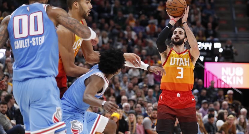
20. Houston Rockets
The Rockets, who are apparently incapable of trying new things on alternate jerseys, went the Chinese lettering route again. The darker red and off-white mesh, at least.
Upgrade? Yes, because last year was basically a duplicate of their regular red jersey.

19. Milwaukee Bucks
I respect the intent with this design. But the dual yellows don’t work, and combining red, green and yellow is difficult. That it’s the colors that fail this uniform speaks well of the design itself. They tried something and for that they get credit.
Upgrade? No. Milwaukee had one of the league’s best City editions last year.

18. Detroit Pistons
They couldn’t have at least tried to make this a little more interesting? It’s inoffensive, I guess, but uncreative.
Upgrade? I guess? Detroit and Nike need to add some creative people to their team.

17. Charlotte Hornets
Charlotte love the “Buzz City” thing almost as much as the Blazers love “Rip City.” Both trends probably need to stop — focus on designing better uniforms than trying too hard to represent your city. The Hornets have great colors but fail maximize them here.
Upgrade? Yes; last year they went black-on-black for no apparent reason. At least using light blue prominently makes this palatable.

16. Portland Trail Blazers
About the most basic City edition you can come up with. The only takeaway is that they should have used white more, and that the gray below the red stripe doesn’t fit especially well.
Upgrade? No, but only barely. Last year’s edition was basically the same.

15. Toronto Raptors
This is a white version of last year’s black City edition. I’m not huge on the front design or “North” insignia, but it’s a slight upgrade.
Upgrade? Indeed.

14. Cleveland Cavaliers
A polarizing design, the Cavs went outside the box with a throwback to their blue and orange days. The colors work, and featuring blue as the primary color was smart. But the jagged edge on the front of the jersey was unnecessary and likely drives criticism.
Upgrade? Yes. They went light gray and yellow last year for some reason.

13. Chicago Bulls
This is the second straight year that Chicago have taken elements from the city flag, which is smart. They did well last year, though they could have used light blue to a higher degree. This year, they had a chance to build on it, but instead went black for some reason and decided against words on the front of the jersey, a recent trend that I can’t get behind.
Upgrade? Nope, unfortunately. There is loads of potential here.

12. Washington Wizards
I have yet to figure out if this is black or dark blue. (I’m thinking black, but I’m not completely sure.) It looks like a better-executed version of last year’s white-on-white abomination. Using “District of Columbia” as a front woodmark is smart.
Upgrade? For sure. This year’s designers took the one good element (the D.C. reference) from last season’s trainwreck and made it look competent.

11. Brooklyn Nets
Brooklyn’s black and white color scheme is objectively boring, though it does not hinder their regular set — combined with a good-looking home court, they are a mid-tier aesthetic team at worst. But their dry colors hamstring them in the alternate department, and that’s how you end up with this. They do enough with the trim to get in over flawed designs.
Upgrade? Yep.


