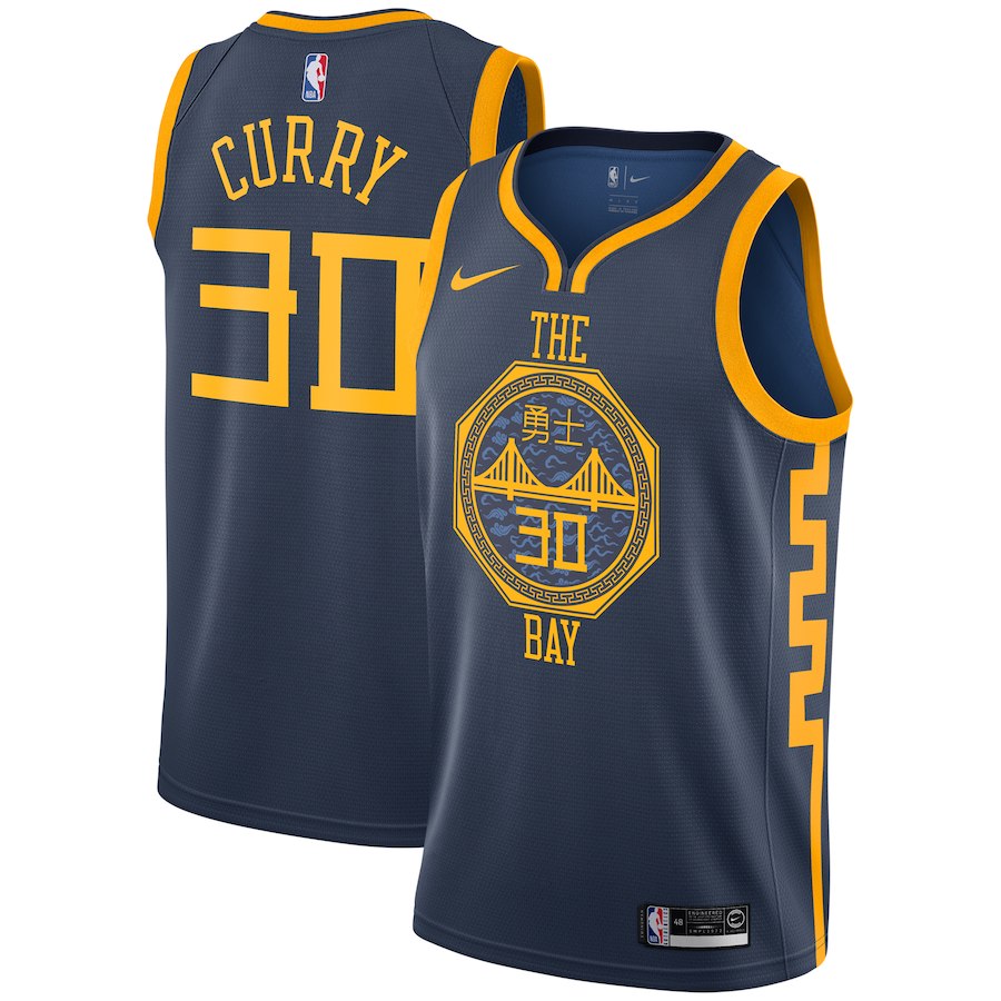
10. Golden State Warriors
It’s a bit messy, but Golden State’s template has produced some of the best uniforms in league history. Discarding the red of last year’s City edition was a good move.
Upgrade? Yes, though it’s close.
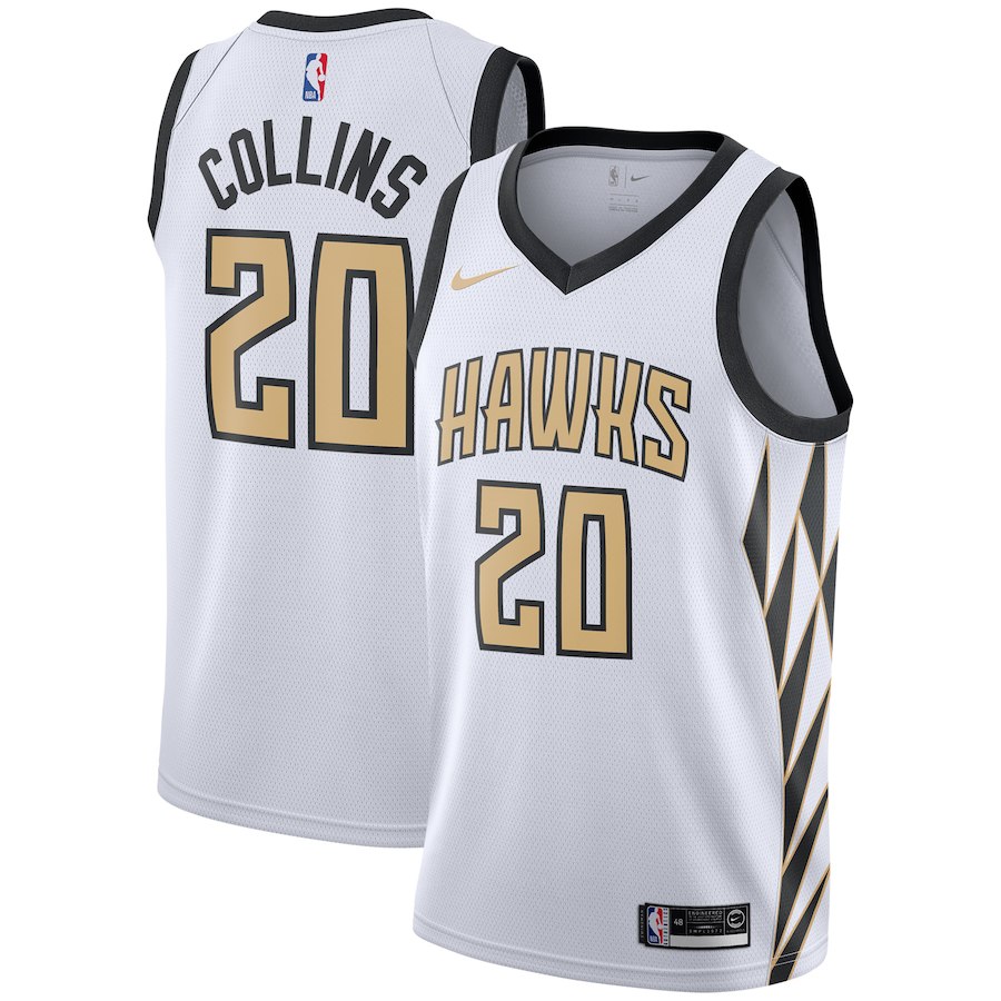
9. Atlanta Hawks
The Hawks honored their 50th-anniversary in Atlanta with gold trim, as MLB teams have done for opening day the year after winning a championship. Aesthetically, it’s effective, and the colors function well enough. The side panels are too wide.
Upgrade? Yes, because last year’s design was basically a reiteration of their black Icon jerseys.
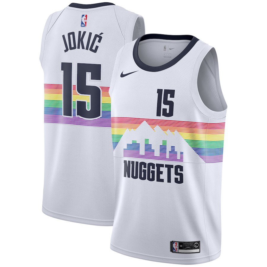
8. Denver Nuggets
Denver are proven experts at ruining their own great colors and jerseys — their new set this year has looked like crap, inexplicably replacing light blue with red once and for all. Regardless, they did well with this design. The downtown design across the front looks great and calls back to a time when they looked good on court.
Upgrade? No. Their navy alternate last year had better colors and used their excellent pick-axe logo.
7. Boston Celtics
You don’t need to do much with the Celtics’ set to make it look good. They shouldn’t be going crazy with alternates. This looks great, though, mixing the classic design with a classy green-gold combo. The yellow accents know their role and only enhance the pure green.
Upgrade? Comfortably. Their gray alts last season were fine, but don’t approach this look.

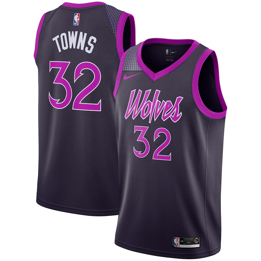
6. Minnesota Timberwolves
It feels weird ranking these so low, considering the noble initiative (a Prince tribute) and skillful execution — the “Wolves” script looks beautiful. Well done to Minnesota, who avoid dumb mistakes. (Looking at you, Kings.)
Upgrade? Easily. Last year’s gray design was unmemorable and looked mostly rough on court.
5. Sacramento Kings
Another beautiful light blue. Unfortunately, these Oilers-style colors are scarcely seen throughout sports. The Kings also use white as a secondary color with expertise, proving that white can be a design asset when combined with suitable solid colors.
Sacramento make a couple of inexcusable little mistakes that have big reverberations: On the front, the “Sactown” wordmark and number are unnecessarily small, and on the back, the name appears below the number, a simple and frustrating miscue.
Upgrade? Yep.

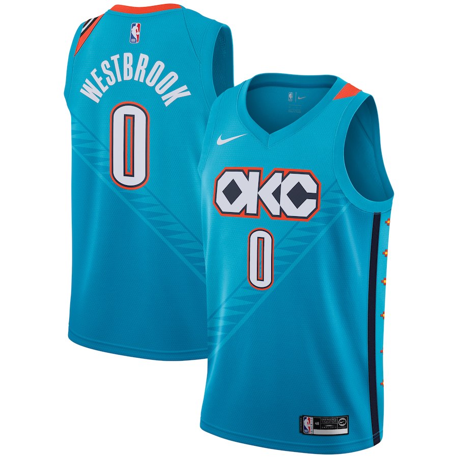
4. Oklahoma City Thunder
This shade of light blue is perfect. The orange does little to interfere with one of the best colors seen on any current NBA jersey. Evoking Native American imagery was a nice initiative and is executed well.
Upgrade? Extremely yes. Last year’s design was a catastrophe.
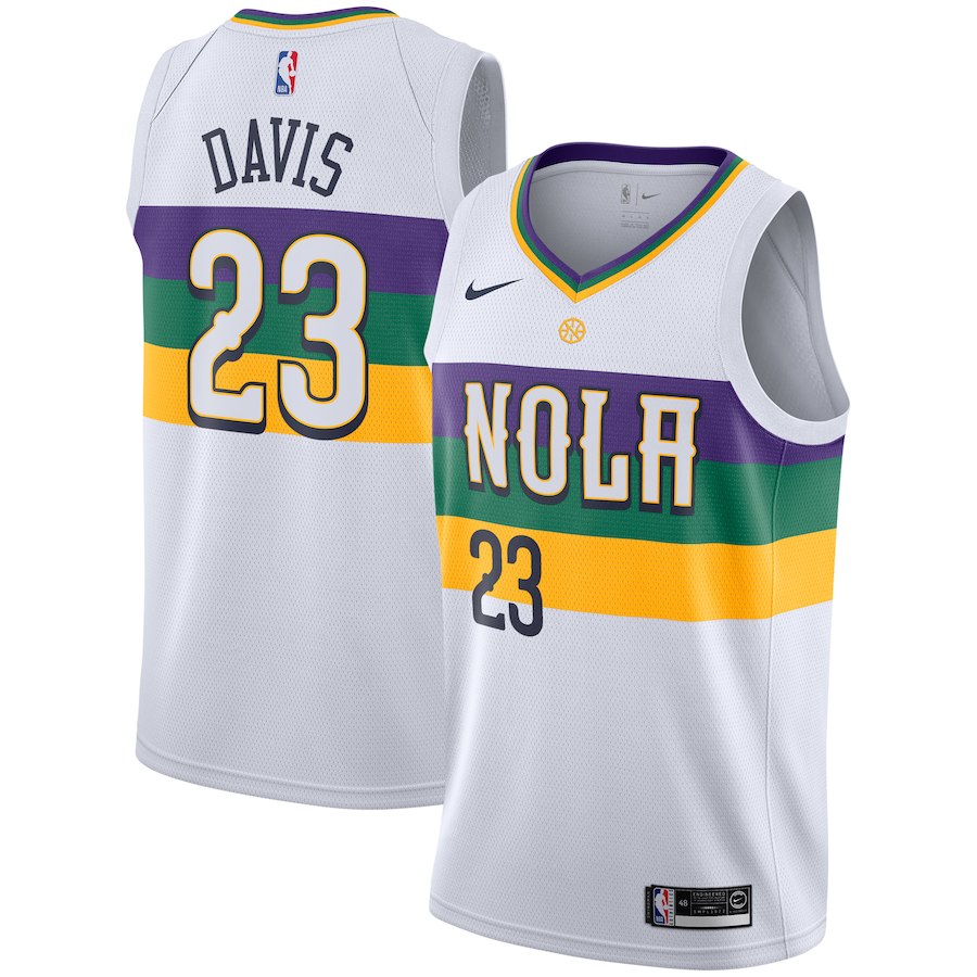
3. New Orleans Pelicans
New Orleans don’t have great colors (navy blue and Vegas gold with a twinge of red), to begin with, so they can afford to branch out with the City edition. In fact, they almost have to. With another Mardi Gras-themed alternate, they succeeded in besting the rest of their set. The solid purple-green-yellow stripes present a satisfying consistency.
Upgrade? Yes. Last year’s purple base was forced to mesh the three inharmonious colors.
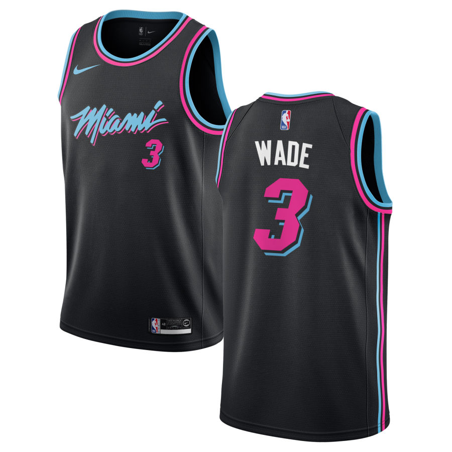
2. Miami Heat
The Heat maintained their eccentric light blue, pink and black color scheme from last season, switching this year’s primary color from white to black. They get points for maximizing an under-used color scheme and designing it with a bold, yet simplistic flair.
Upgrade? No, but only barely.
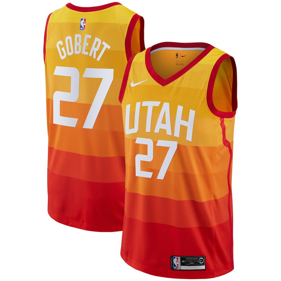
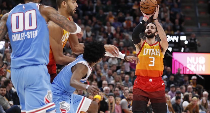
1. Utah Jazz
The only team to carry over their design from last year, the Jazz had the best design coming in and will not lose their title. This is a masterpiece.