It feels like we’re in a transitional period for NFL alternate uniforms. The Color Rush fad, unfortunately, remains prominent, and there are some teams that wear both ordinary off-color alternates (or throwbacks) and Color Rush sets. The Seahawks experimented last year with mixing-and-matching their green Color Rush jerseys with blue pants, to positive results.
There are clues that the NFL could end its one-shell rule, which stipulates that for safety reasons every player can only wear one helmet throughout the season, eliminating many potential throwbacks and alternates. If they get rid of the rule in the next couple of years, we could have the pleasure of seeing uniforms such as the Buccaneers’ creamsicles and the Patriots’ Pat Patriot throwbacks.
For now, the prevalence of Color Rush uniforms dilutes the quality of many alternates around the league. It doesn’t make much sense for some teams to have multiple versions of one color uniform — looking at you, Texans, Browns, Ravens, Cardinals, and others. Solid-color, mono uniforms are often bad ideas anyway. Fans have put out ideas for mix-and-match uniforms, similar to what the Seahawks did. Imagine the Broncos with their throwback “D” logo and white pants, or the Bills with white pants for their red uniform. The great Uni Watch imagined these scenarios back in 2017. If we’re lucky, more teams will make like the Seahawks and play around with their combinations.
Today, let’s rank the alternate uniform sets. We’ll take each as a whole, so if a team wore both a Color Rush set and a throwback uniform, they both count equally to the ranking. A team with different versions of pants, but the same jersey, does not count toward their alternates — so as much as you might like the Titans wearing light blue pants with their navy jerseys, that doesn’t count toward their alternates.
I’m only classifying an alternate as a uniform that is markedly different from the normal home and away. The Colts, Patriots, Rams, and Chiefs thus don’t qualify for this list. I’m also only incorporating the uniforms teams wore in 2019, in addition to the teams that have unveiled new uniforms this spring. Let’s get started:
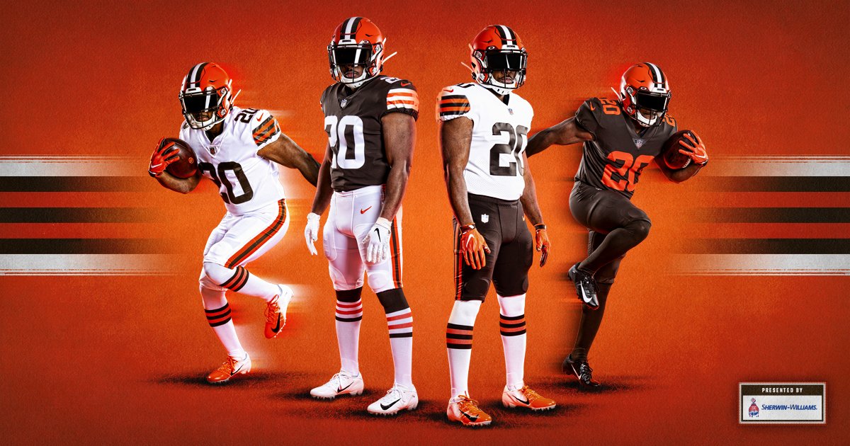
28. Cleveland Browns
The Browns’ new set is a massive upgrade on what they previously wore. While brown and orange will never be a particularly good color scheme, the Browns will wear what they should be wearing. That doesn’t make their all-brown Color Rush set any better, however. It’s slightly different from their all-brown uniform last year, with fewer stripes, but it remains mono-turd with no white to be found. They’d have been better served with an orange alternate in the style of their home and away uniforms.
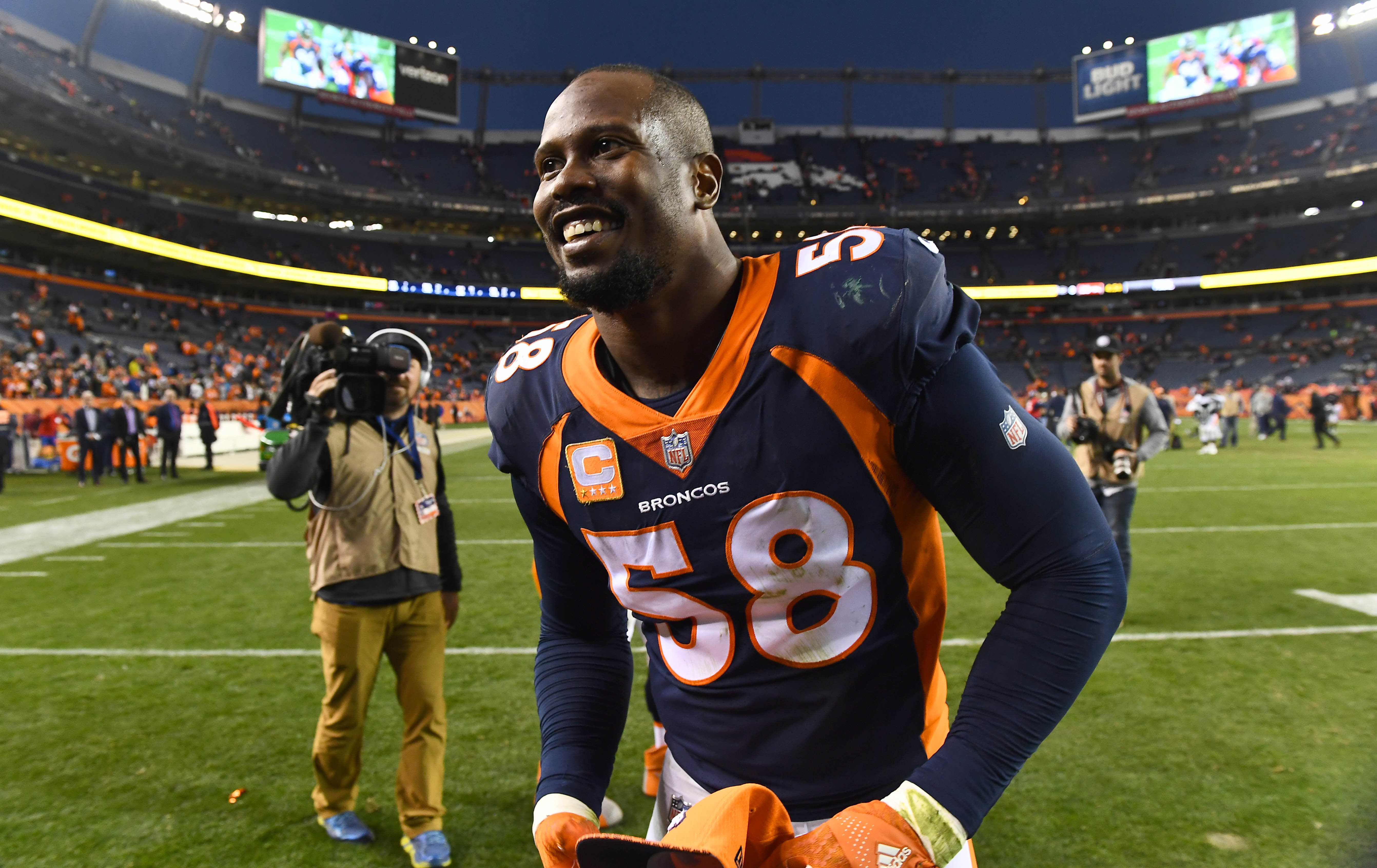
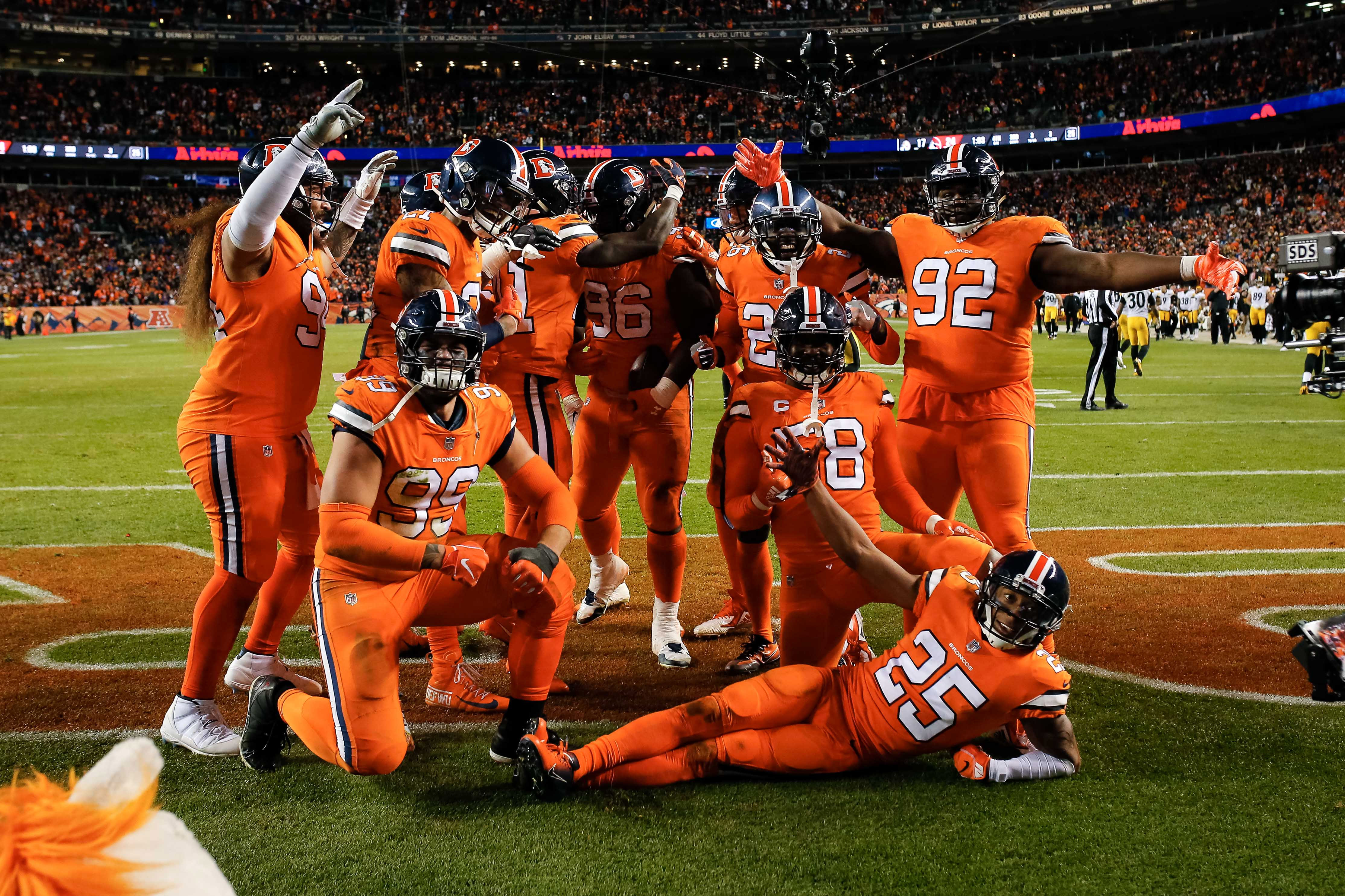
27. Denver Broncos
If the Broncos wore white pants with their all-orange Color Rush, they’d rise quickly in this list. As it stands, they look like traffic cones, despite the glorious classic logo on the helmet.
Their blue alternates are just as poorly-designed and outdated as their home and away uniforms have always been. It’s time for a major shift in Denver, perhaps to something closer to what they wore when John Elway was younger.
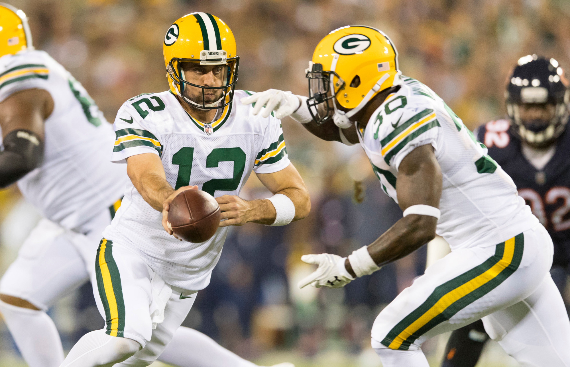
26. Green Bay Packers
The Packers’ all-white Color Rush unis are essentially their regular white jersey with white pants. Their throwbacks are fine for their purposes — honor the team’s history, and add another uniform to change it up — but they don’t look particularly good on the field. I’d rather see their regular home and away set, which is one of the best in the league.

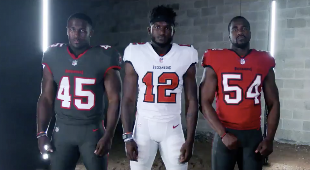
25. Tampa Bay Buccaneers
As with all the new sets, this comes with the caveat that we haven’t seen it on the field and thus can’t fully evaluate it. But the Bucs’ all-pewter alternate doesn’t make a ton of sense. It has heavy red and white accents instead of black and orange outlines like the home and away, hurting Tampa’s effort at a consistent visual identity. White pants, more than anything else, would solve some problems.
Still, Tampa’s new uniforms are a massive upgrade, as much as I wanted to see the creamsicles return.
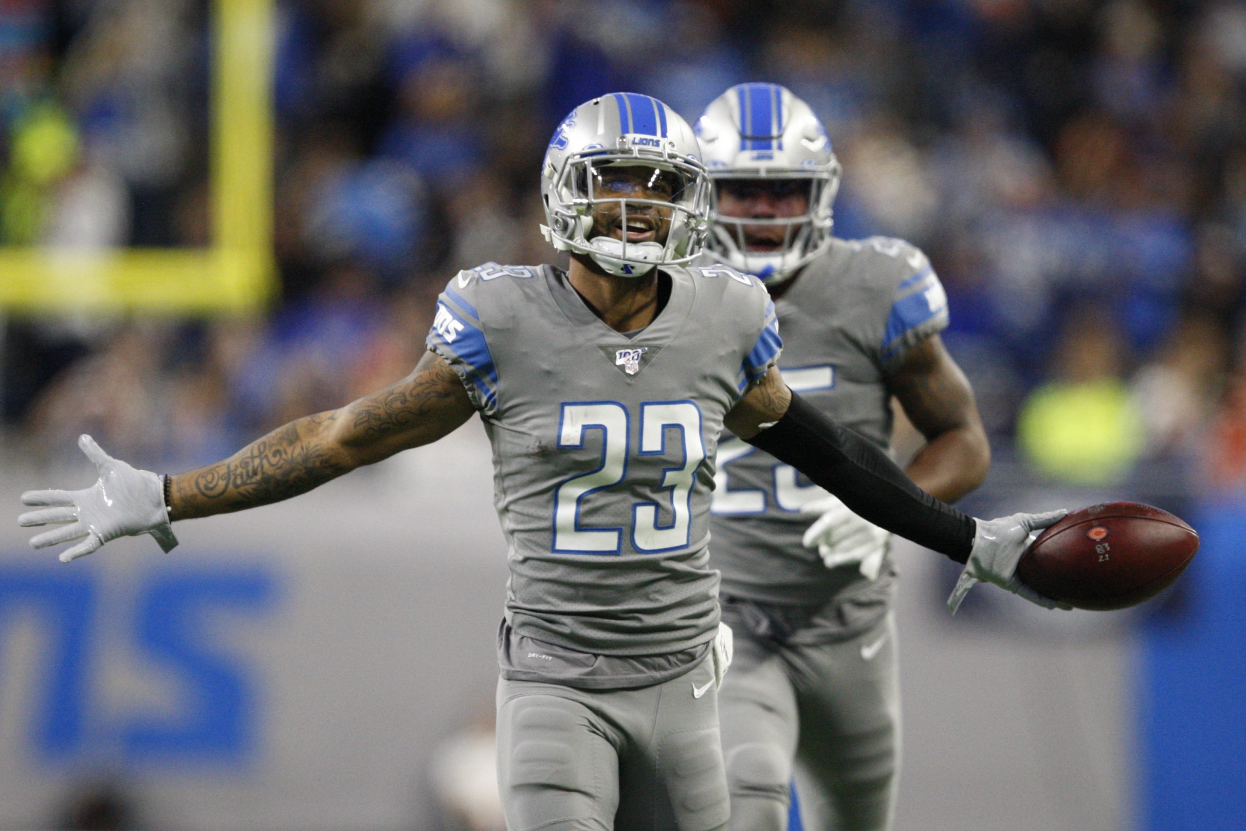
24. Detroit Lions
The throwbacks are what they’ve been for most of the decade, and that’s fine. The all-gray is a rough one — the helmets look out of sync with the gray jerseys and pants, and any uniform that is completely gray is doomed for failure. I respect the effort at an inverse-colored alternate, but the Lions should be fine sticking with their Honolulu blue.
They’re ranked higher than Tampa both because of the throwback and because the all-gray alts are designed in the same fashion as the home and aways.
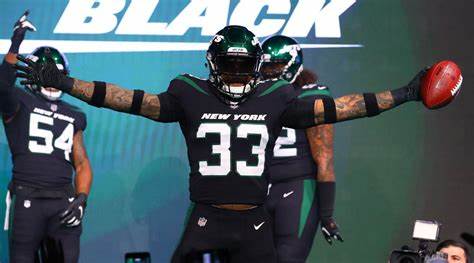
23. New York Jets
This, folks, is what you call “black for black’s sake” (BFBS). The Jets added black to their color scheme for no other reason than to produce an alternate. It isn’t particularly bad-looking, outside of the weirdo shoulder stripes and problematic pants striping, but mono-black wasn’t a good idea and the uniform feels out of place to begin with.
22. Cincinnati Bengals
Cincinnati continues to wear uniforms that look ripe for a redesign. They badly need something better designed than the outdated, cartoonish look they have going now. Their orange alternate is a nice change of pace, even if it falls victim to the same flaws as the home and away.
“Clean” is an overused term to describe sports uniforms, but the all-white Color Rush fits that adjective as well as any design. Perhaps that could be the blueprint for a future redesign.

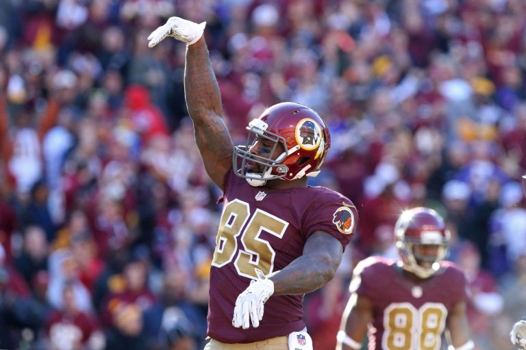
21. Washington
There are plenty of problems with Washington’s overall visual template, but the alternates are an acceptable way of throwing back to an older era. As Green Bay has shown us, it can be difficult to achieve a solid uniform based on something worn decades ago.
If the one-shell rule goes away, Washington should wear something like this, from the Jason Campbell era. Maybe that will get them to bring back the yellow pants.
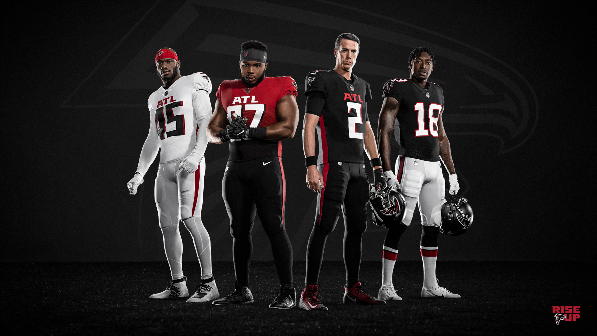
20. Atlanta Falcons
The Falcons’ new set seems to be a flaming disaster. It has been widely panned, and although we haven’t seen it on the field yet, I don’t imagine it looking much better than it appears now. There are two saving graces: the potential mix-and-match combinations (it’s been reported that we could see black-black-red, which could be cool) and the well-designed throwback.
If they’d designed the entire uniform set like the throwback (minus the throwback logo, which I don’t like as much), they’d be sitting pretty. Instead, they went with a bizarrely modern Nike set that they’ll probably regret in a few years.
The red gradient alternate will be interesting to see on the field. In all likelihood, it won’t look particularly good.
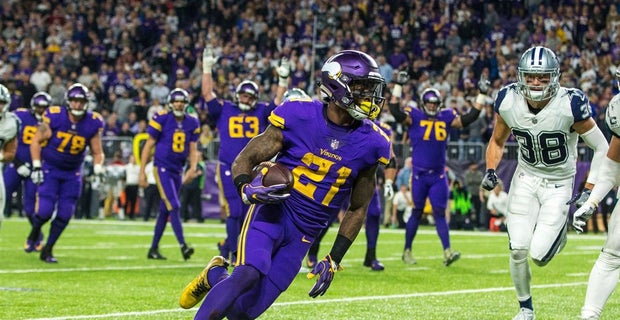
19. Minnesota Vikings
Not too much interesting going on with the Vikings — just a standard Color Rush set, with primarily yellow accents instead of white. Minnesota’s uniforms are perfectly acceptable overall, but I don’t see the need to go all-purple. These feel like a good example of how unnecessary Color Rush uniforms are.
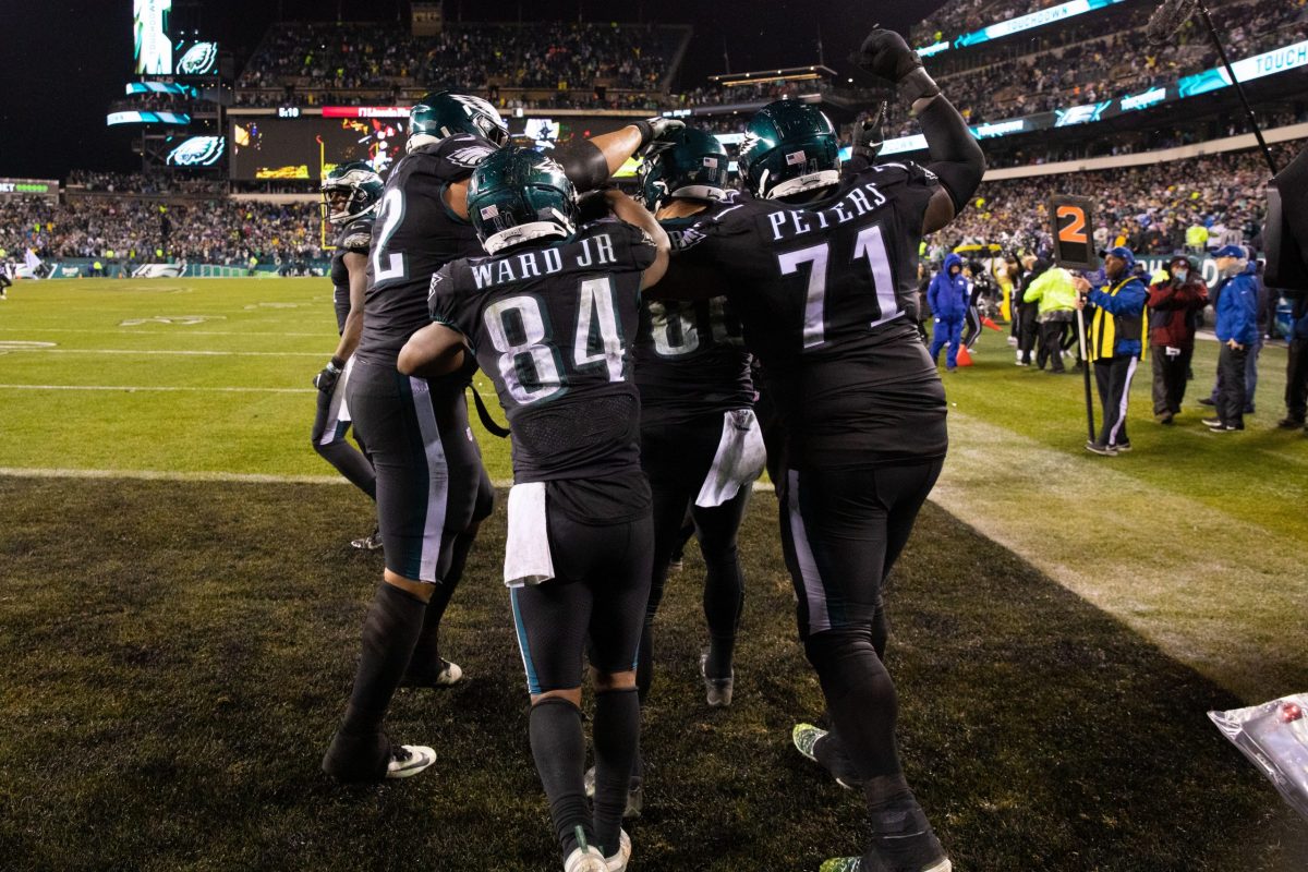
18. Philadelphia Eagles
For whatever reason, the Eagles haven’t worn their black alternate jerseys with white pants in the regular season since 2013. Every year since, they’ve worn all-black. That decision makes no sense and diminishes the set overall.
I’ve never liked the midnight green as a whole and hope they find an alternative at some point, most likely the kelly green. The black alternates would look better than their other options if worn with white pants. The mono-black might still be their best look — a pretty low standard.
17. Dallas Cowboys
Not too much particularly exciting is happening with the Cowboys, who wear an all-white Color Rush loosely reminiscent of the blue throwbacks they wore before the one-shell rule was put in place. I’d rather see their regular white uniforms — the double outline of the numbers on the alts is a bit irritating — but it’s acceptable by the standards of Color Rush.

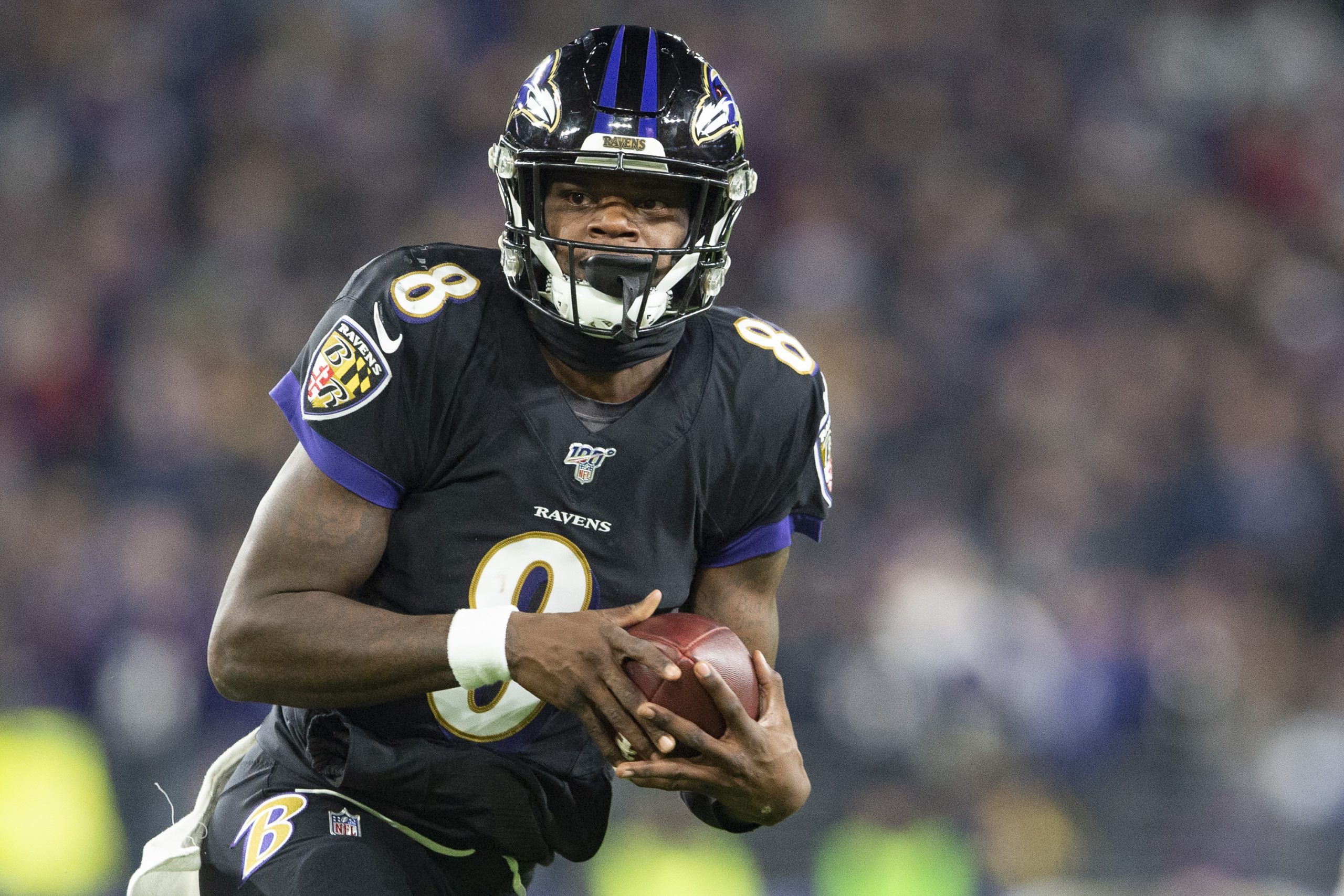
16. Baltimore Ravens
The Ravens have done some interesting things with their uniforms in the past couple of years. They’ve started wearing purple pants with their home and away jerseys, and once in 2018, they wore black over purple. It’s interesting turning on the TV and seeing which combination they’re wearing.
The all-purple combination does detract from the Color Rush, which is all purple with gold accents. There’s no reason to have any all-purple going on, much less two versions of it. The Ravens get credit for the black alternate — which, like the Eagles, is better with white pants. Hopefully they use the black-over-purple combo again.
I also enjoyed the gold pants they pulled out of absolutely nowhere in 2015. I might be in the minority here, but bring them back!
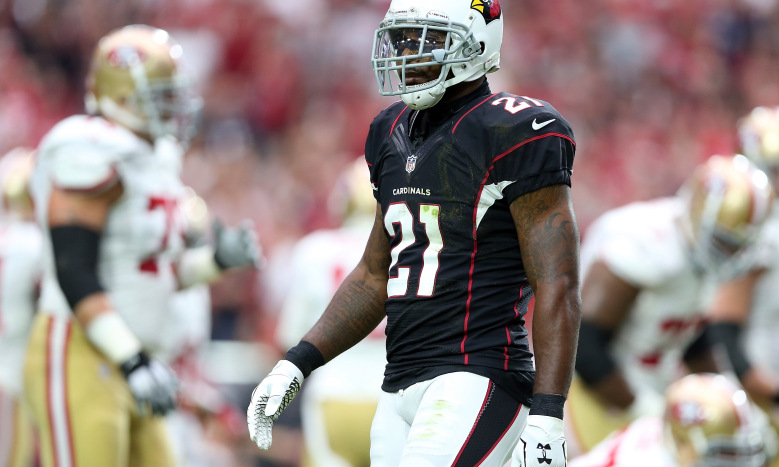
15. Arizona Cardinals
The Cardinals are among a handful of teams in bad need of a redesign — their road white uniforms, in particular, are an absolute monstrosity. They have two black alternate uniforms: the regular alt with white numbers and white pants, and a Color Rush version, with red numbers and black pants. Both fall victim to the problematic sleeve design, side panels, and pants striping of the home and away.
The regular black alt, with primarily white accents, is vastly superior to the Color Rush version, and I would actually posit that it is their best uniform, supplying a satisfying contrast to the red home. But at the very least, they should restrict their black alternate options to one.

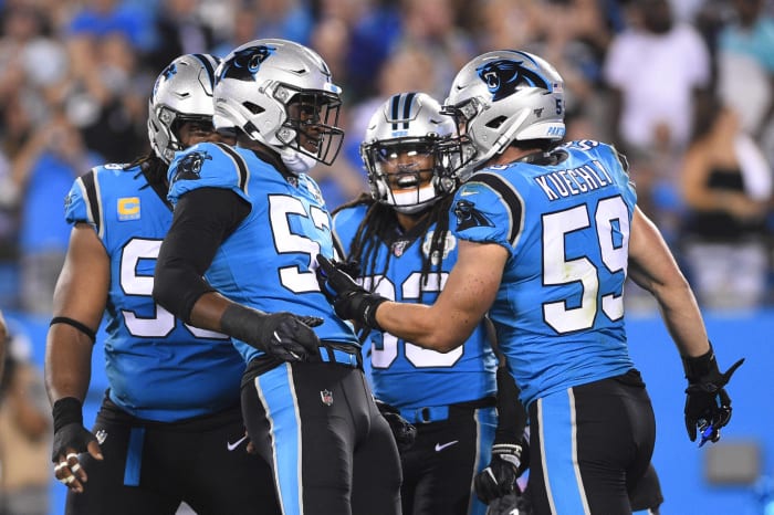
14. Carolina Panthers
It’s time for the Panthers to do something different with their uniforms. The silver has never made sense, and there ‘s too much potential with their beautiful light blue and black color combination to keep wearing what they wear. Their light blue alternate jersey is glorious in itself, even if the silver helmets take away from it.
They get additional points taken off for wearing black pants with the blue alt last year. With the silver helmets, that look comes off as dysfunctional.

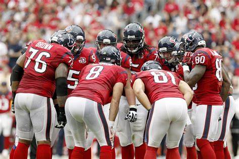
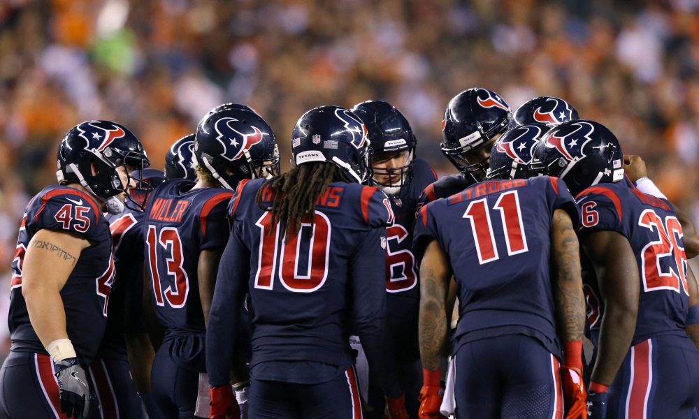
13. Houston Texans
Sometimes, the best thing you can do with an alternate uniform is simply wear the inverse of your regular home uniform. The Texans’ red alternate is one of my favorite jerseys in the league because it so satisfyingly contrasts with their regular blue look. It’s the quintessential alternate look.
Two things conspire to keep Houston in 13th: the all-blue Color Rush, which is wildly unnecessary; and the overall design of the uniforms, which is mid-tier at best. Still, they deserve credit for the red alts.
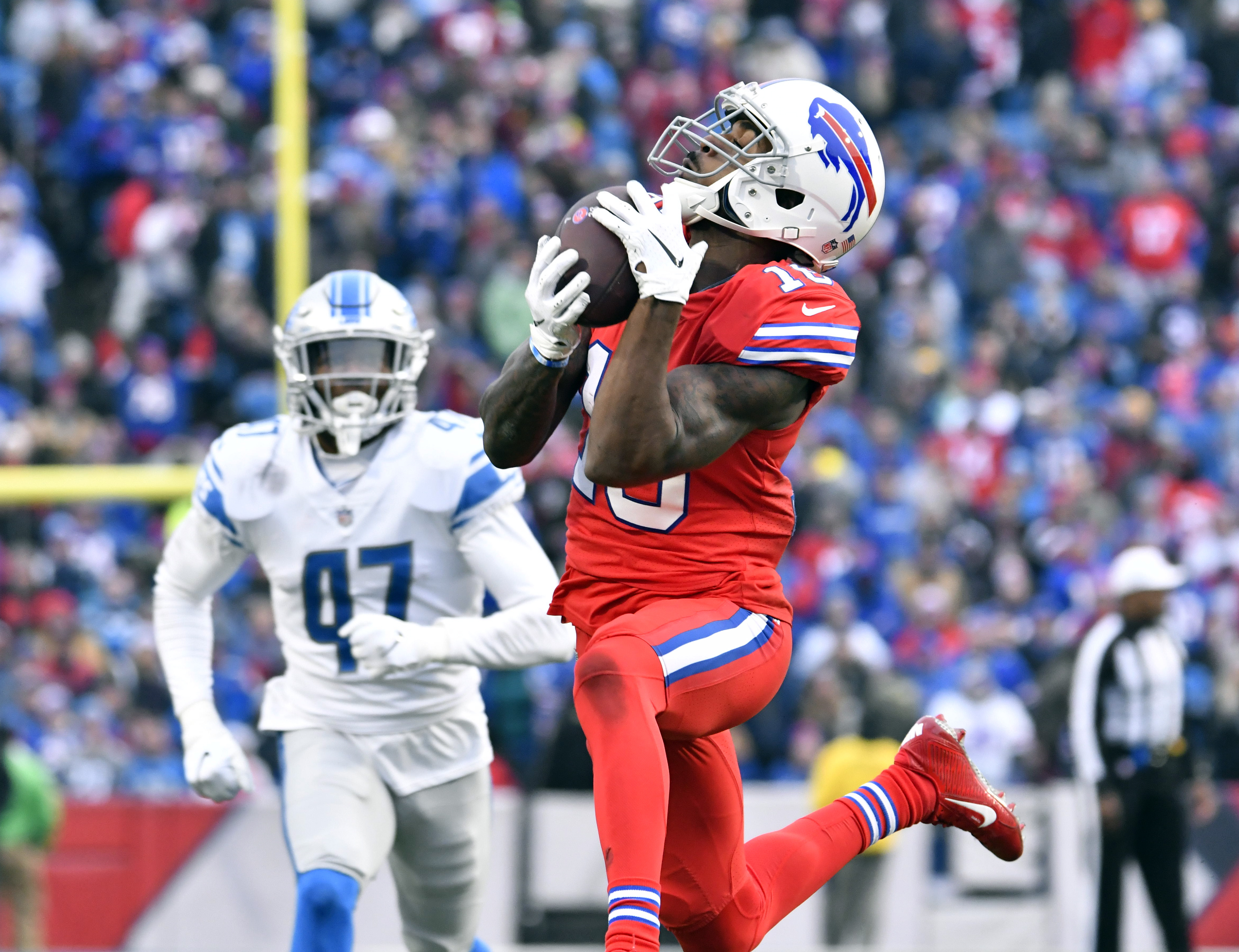
12. Buffalo Bills
Buffalo wear some of the best uniforms in the league. Their set is exquisitely designed, and for my money, their logo is up there as one of the best in all of sports. If they would wear white pants with the red jersey (meant as a Color Rush uniform, unfortunately), they would rise a few spots easily.
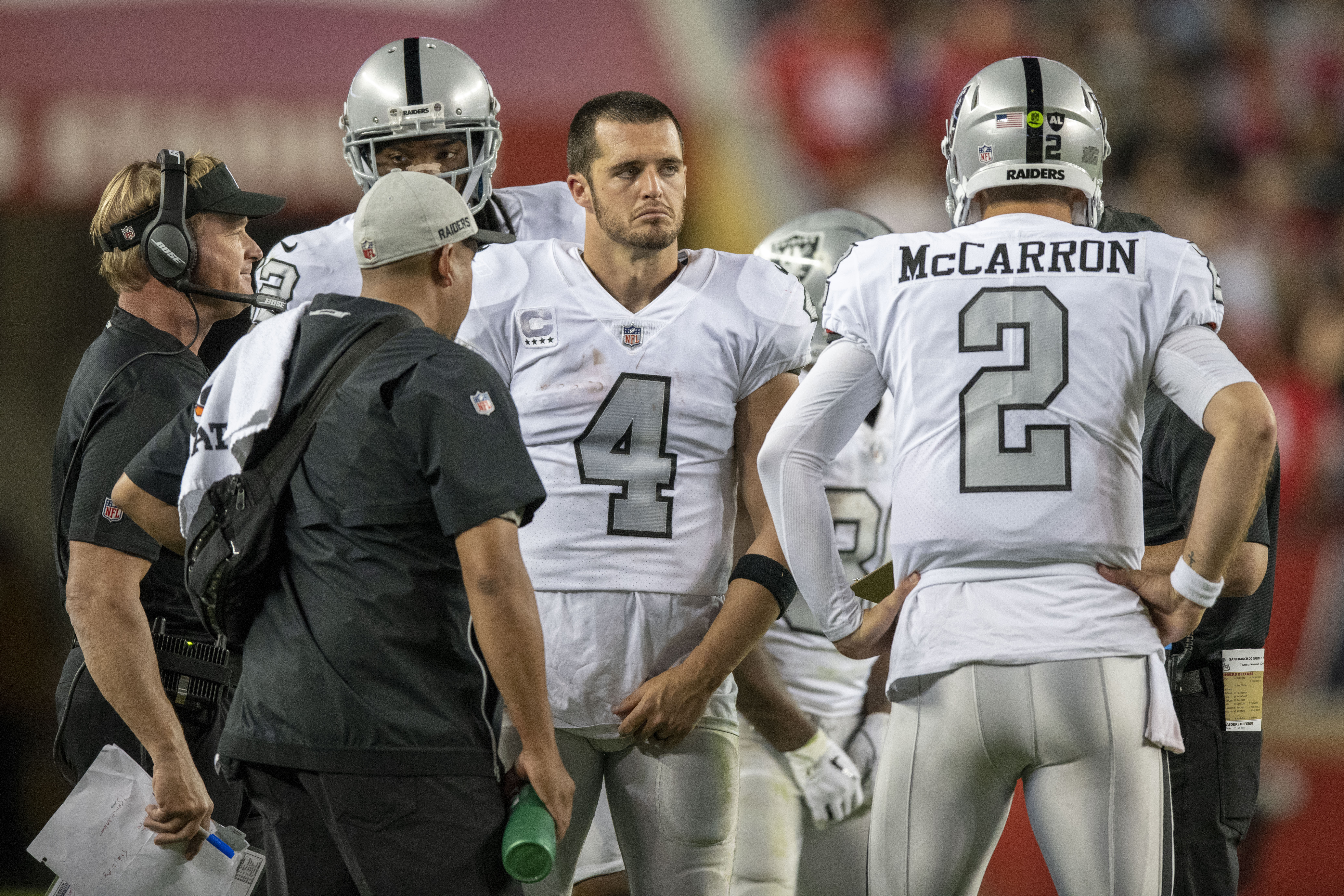
11. Oakland Raiders
Here’s another team that has top-tier regular uniforms. Their alternates with silver numbers look very nice, but I couldn’t justify putting them in the top 10 given their alts are so similar to their regular uniforms. Still, credit to the Raiders.
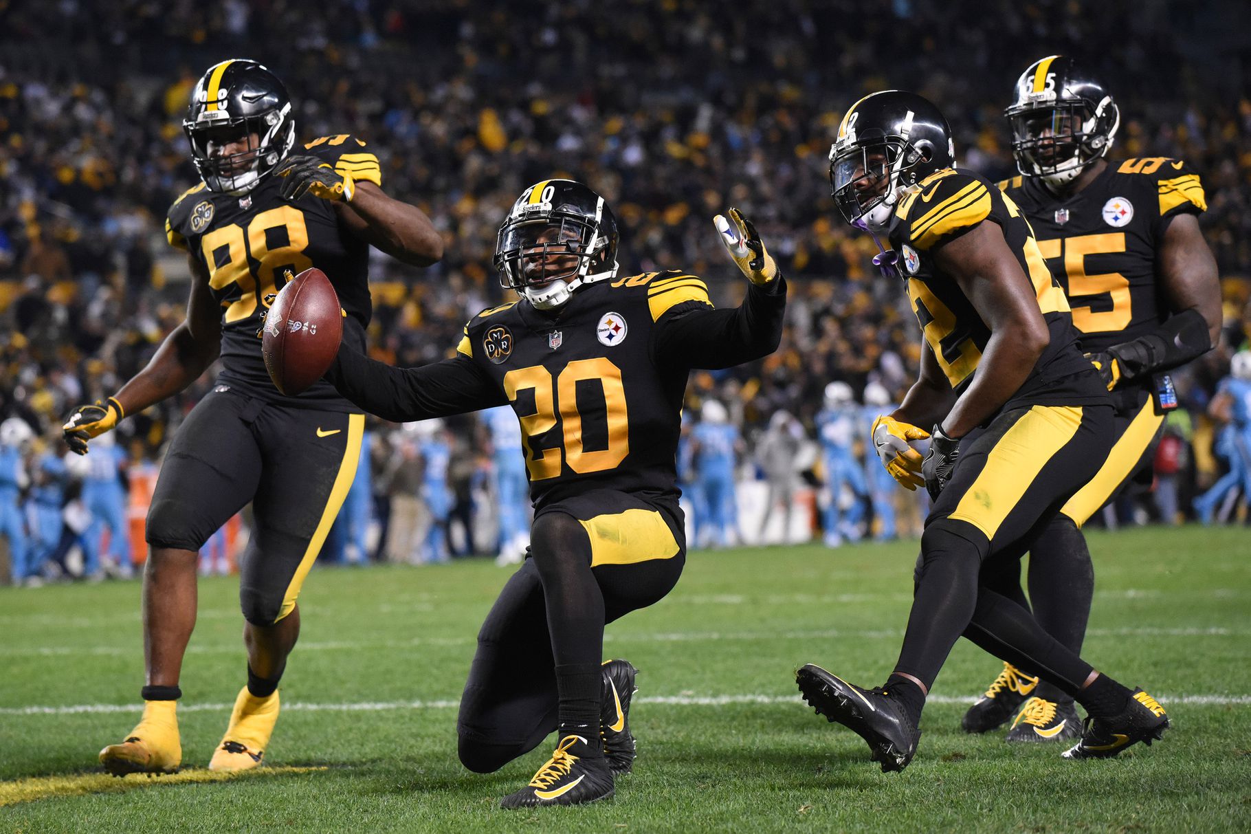
10. Pittsburgh Steelers
As Color Rush uniforms go, the Steelers’ all-black look is one of the best. The helmet being the same color as the jersey and pants helps, as does the color of black — mono-black simply makes more sense than any other mono version, save for white. The uniform is popular with fans and looks good under the lights. It also makes a bit of sense given its similarity to a pre-one-shell throwback.
They also have throwbacks with block lettering, the way they wore their uniforms in the Steel Curtain era. It’s subtle, but it’s a nice way to do a throwback.
9. LA Chargers
By far the highest-ranked of the newly-designed teams, the Chargers have had very good uniforms for essentially their entire history, and that success continued with their new set. Their alternates are now a mid-blue Color Rush (similar to what we’ve seen on the field the last couple of years) and an all-navy option.
While white-blue-blue isn’t a great combination, and there isn’t much of a reason to have two different all-blue alternates, I can’t help but like these designs. The bolts accents look good, and the colors are very nice. I look forward to seeing these on the field.

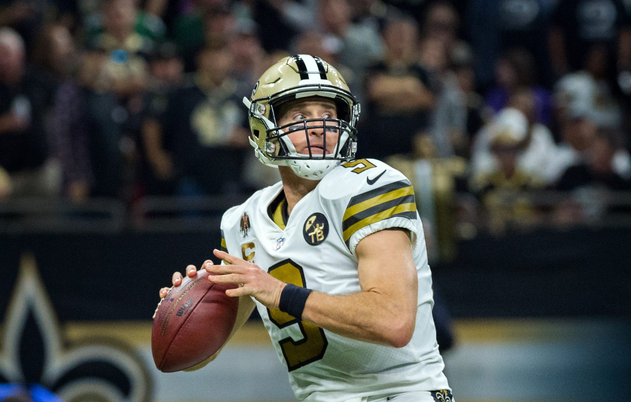
8. New Orleans Saints
The Saints’ insistence on wearing all-black at home, rather than gold pants, is a major disappointment. Their all-white Color Rush alternate, though, is a very nice piece of design, with a deeper gold and better striping patterns than their home and away options.
The problem is the helmet, which is very obviously a different shade of gold from the jersey and pants’ accents. That mismatch detracts from the whole. Still, it’s one of the best Color Rush designs in the league.
7. New York Giants
I’m not one of the people who thinks the Giants should go back to their Phil Simms-era uniforms — in fact, I think their current set is a bit underrated — but I very much enjoy their all-white Color Rush throwback design. The red accents on the deep Giants blue and the minimalistic blue-red-blue striping make for a pleasant uniform. The all-white combo makes a lot of sense in this case.

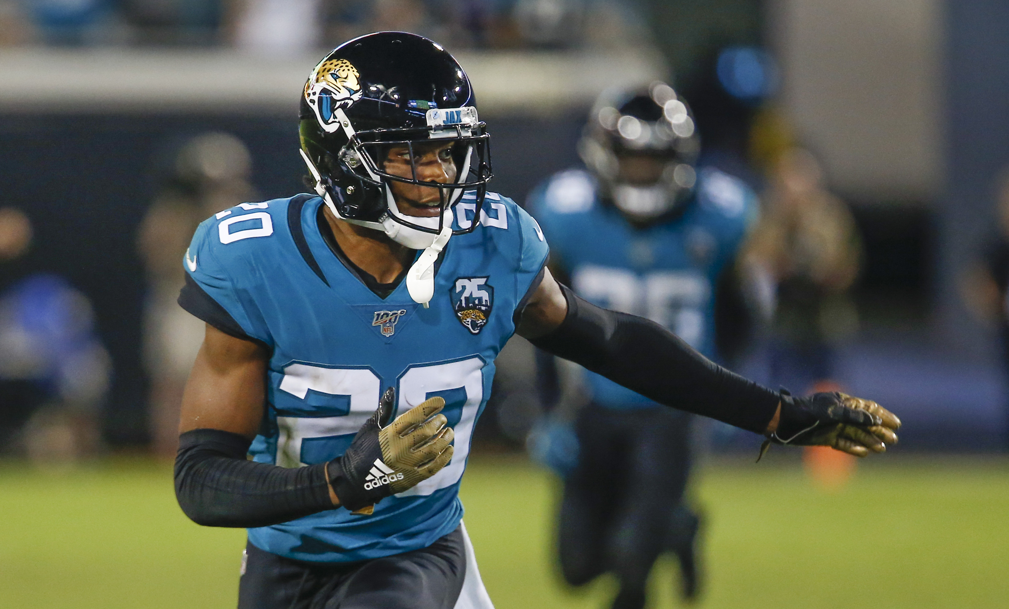
6. Jacksonville Jaguars
The Jaguars didn’t do much to maximize their unique color scheme with last year’s redesign. There isn’t much actual uniform design going on here, probably in response to the trainwreck their previous Nike redesign was. But they still have a nice teal and blue color combo, and they wore most of the possible jersey-pants combinations last year, which is fun.
The teal is the alternate. It looked good with both white and black pants. A respectable, if slightly unexciting, effort from Jacksonville.
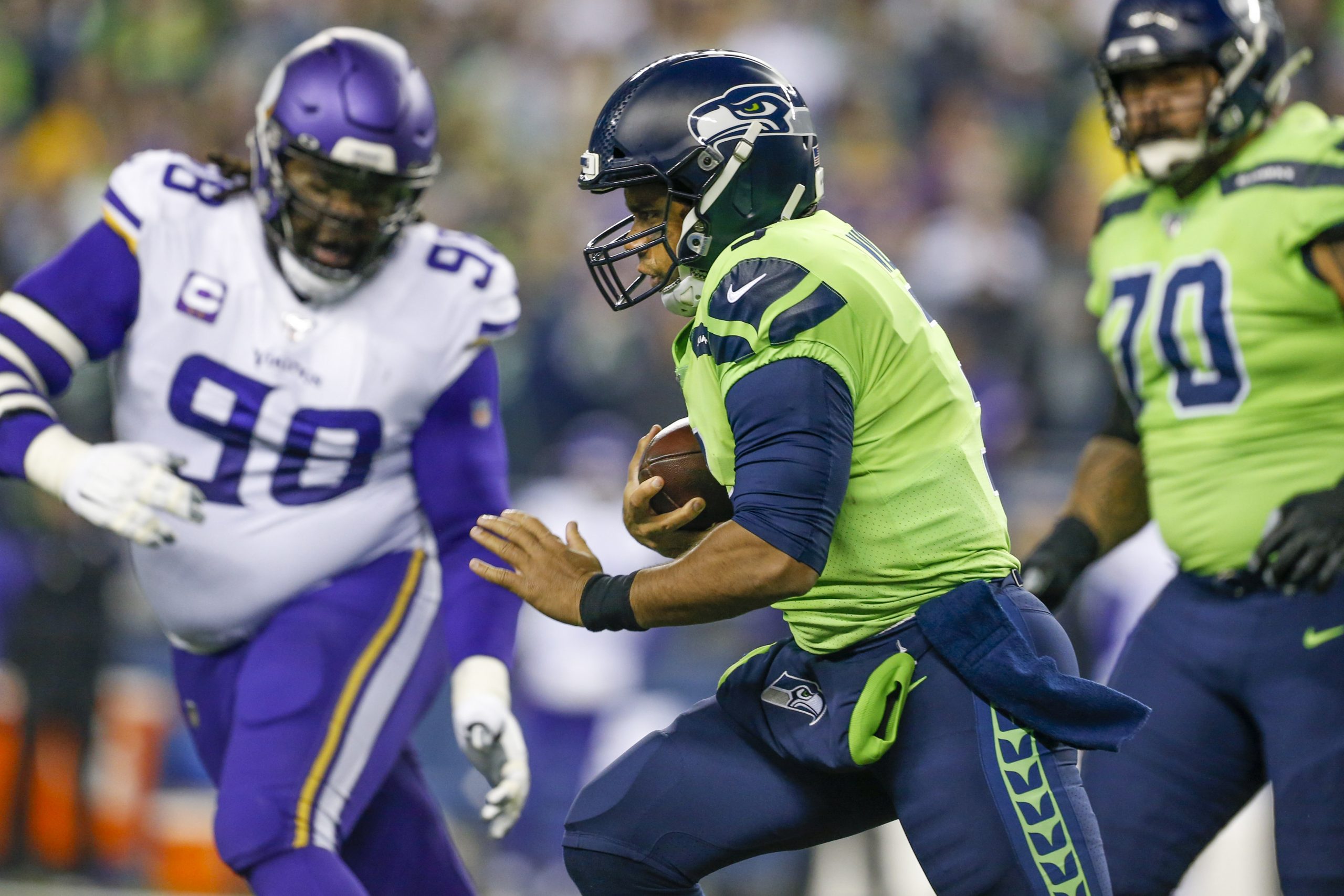
5. Seattle Seahawks
The Seahawks often have a lot going on. They are the only aggressive modern Nike design that has worked at all, and they have numerous combination options, if they’re inclined to take them. The all-green Color Rush is garish and bright, but when paired with blue pants, it’s significantly more acceptable. Their gray alternate jerseys look good as well, even the all-gray option, which is the only all-gray uniform I can remember that doesn’t look bad.
4. Tennessee Titans
This new Titans set isn’t perfect, but it has the perfect shade of light blue, and goes a long way toward making up for some of the faults. I’d enjoy the light blue alts more if they paired them with white pants (which they did in 2018) and avoided all-light-blue combos, which don’t make much sense. The jersey font is the primary flaw.
Keep it up with the light blue pants combos, though. It was a travesty that they didn’t wear navy-navy-light-blue even once last year.

3. San Francisco 49ers
There was a campaign for the 49ers to wear these all-white alternates in the Super Bowl, and while they were right to wear their regular road uniforms, these black-accented throwbacks are a great-looking uniform. A good use of the Color Rush concept.
2. Chicago Bears
Though they didn’t wear them last year, the Bears’ throwbacks with orange numbers seem to still be part of their uniform set. It’s Chicago’s inverse-colored alts that put them in second, however.
Given how good the Bears’ uniforms look, the orange is a shoo-in for top-tier alternate status. This particular shade of orange is perfect for an off alternate jersey.

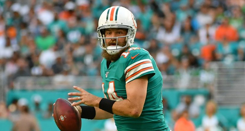
1. Miami Dolphins
Most people agree that the Dolphins should go full time to their alternates. They have both an aqua and a white version of their throwbacks, and they both look very good. The striping on the shoulders accentuates the colors well, and the throwback version of the classic dolphin logo looks the best.
Their Nike redesign is far from a disaster, and I don’t mind seeing those on the field, but they should go back to these throwbacks full time. Add a pair of aqua pants to wear on the road, and you’re set.
