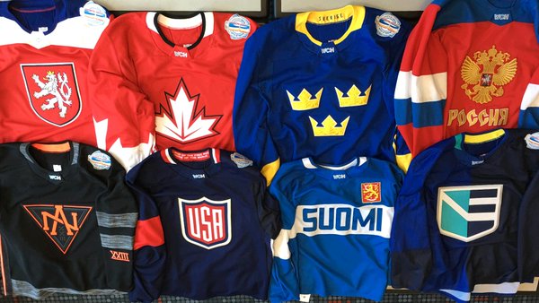
Wednesday was a big day for the hockey world as the rosters and the uniforms for the 2016 World Cup of Hockey were unveiled for the first time. Now, not only do we know who will be playing and representing their country in the international tournament later this year, but we also know how they will look. For the most part, they will look sharp in the uniforms specially designed by Adidas (and those of you who follow my uniform critiques know how difficult a sentence that is for me to write without laughing).
ESPN got the opportunity to unveil the uniforms using whoever was not on the Sportscenter desk at the moment to walk the runway to show off the new uniforms.
We’ll get to breaking down each of the uniforms in a moment, but it is important to make note of something we have previously discussed regarding the uniforms. If you noticed, or as you will see, none of the World Cup hockey uniforms have any advertising on them. The NHL has been trying to milk as much out of the advertising revenue as it can and started to run up against a deadline before having to release the uniforms to the public. Nobody was biting at the NHL’s high asking price, leaving the league a bit worried about whether or not it will be able to make as much a profit on this event as it had initially hoped. So none of the uniforms have any advertising on them at this point in time, but that is not necessarily a guarantee they will eventually be advertisement-free.
Bill Daly says not to draw conclusions from World Cup jerseys not having ads on them. Says to @reporterchris that there's still time..
— Stephen Whyno (@SWhyno) March 2, 2016
The World Cup of Hockey does not start until September 17, which leaves plenty of time to find an advertising partner and slap some corporate logos on the uniforms.
Now, let’s zip through the uniforms these nations will be wearing and offer some first impressions. First up, Team USA.
UNITED STATES
Red, white, and beautiful. These USA uniforms by @adidas for #WCH2016, that is. https://t.co/KrBIB1vymz
— NHL (@NHL) March 2, 2016
If I’m not mistaken, it looks like the United States shield logo is awfully close to resembling another shield logo I have seen before… has the NFL even found a way to influence the hockey world? Is it subliminal messaging to hockey fans to let them know the NFL is truly a year-round sport you simply cannot escape? Overall, it’s not a bad look, although compared to past uniforms worn by the United States, it is safe to say this is certainly different and maybe not quite up to par. But hey, go USA!
CANADA
Canada will be looking very sharp at #WCH2016 in these beauties by @adidas, eh? https://t.co/A1N2M06wFR
— NHL (@NHL) March 2, 2016
Canada has always seemed to have a rock-solid hockey uniform, and this World Cup jersey is no different. The maple leaf logo is bold and really looks good against the red field. You can even see the outline of the maple leaf on the sleeves, which is a nice touch Canada, you’ve done it again with your uniform. O Canada, you’ve got a nice look.
CZECH REPUBLIC
Czech them out! These are the #WCH2016 Czech Republic uniforms by @adidas. https://t.co/ddjDRFYSrp
— NHL (@NHL) March 2, 2016
I have always been fond of the Czech Republic uniforms over the years and love that it includes this shield on it. The Czech Republic gets absolutely no criticism from me with this uniform. Well done. This uniform may be the best in the tournament.
FINLAND
The finest Finnish hockey players will be rocking these uniforms by @adidas for the #WCH2016. https://t.co/UPjjC7JYeg
— NHL (@NHL) March 2, 2016
I don’t love them, but I don’t absolutely hate them either. If anything, it might actually be a little too busy on the front with its crest on one side and the enlarged “Suomi” (which translates to Finland) across the front. It would have been better to see Finland go the Czech Republic way and keep a large crest as the focus and put that all by itself on the front. I am not thrilled with the giant stripe across the jersey either.
SWEDEN
How “Swede” are these? @adidas has designed some stunning #WCH2016 uniforms for Sweden. https://t.co/N5ZnQPvFiF
— NHL (@NHL) March 2, 2016
Has Sweden ever looked bad in a hockey jersey? I think not. Sweden keeps it simple with their hockey jerseys and rarely does much different with it. Here we see the signature three crowns with some particularly nice detail. That extra attention paid to detail makes up for the lack of other features, but sometimes you can look fine by keeping it simple. Sweden does it again.
RUSSIA
Absolutely gorgeous, Россия. These uniforms by @adidas will be worn at #WCH2016 by Russia’s best and brightest. https://t.co/GzYElM9NRT
— NHL (@NHL) March 2, 2016
I wouldn’t get used to seeing too much of this jersey, because Russia will likely find a way to choke and take an early exit. It’s just what they do it seems. But the jersey is not that bad, and it took my advice to Finland to go the Czech Republic way. It’s a solid look and takes its inspiration from the nation’s flag. You get a thumbs up here, Russia.
TEAM NORTH AMERICA
Now that's a look fit for hockey’s rising stars. Here are the Team North America uniforms from @adidas. #WCH2016 https://t.co/OrKsW388PH
— NHL (@NHL) March 2, 2016
Team North America will be made up of players under the age of 23, and they will get to wear these specially designed uniforms. The NHL influence here is noticeable, as the uniforms are made up of black and orange, the longtime colors associated with the NHL logo. Or they’ll simply look like the bad guys. I am not sure what the best way to go putting together a North American jersey would be, but I would have preferred to see a little red mixed in as it is a color found on the flag of both the United States and Canada. Of course, we already have a few countries wearing red in this tournament. Perhaps somebody from Oklahoma State came up with this design.
TEAM EUROPE
Signifying a unity of nations, behold the #WCH2016 Team Europe uniform by @adidas. https://t.co/AdOshnmxZt
— NHL (@NHL) March 2, 2016
Well, this is interesting. The design is supposed to suggest the unification of eastern and western hockey players, which figures to make for quite an interesting bunch considering the nations it gets to pull from. This just feels like they came up with two designs and reached a stalemate on the final decision and decided to rip them in half and sew them together. It’s not a terrible look, mind you, but it just feels a little awkward.
World Cup of Hockey Uniform Power Ranking
Here’s how I would rank these uniforms. Feel free to chime in on this in the comment section.
- Czech Republic
- Canada
- Sweden
- Russia
- United States (but No. 1 in my heart)
- Team Europe
- Finland
- Team North America
