Logos and team names drawing inspiration from Native Americans are now increasingly becoming rarer and rarer, and for good reason as many of the representation of Indians were pretty blatantly racist. But, someone hasn’t been keeping up with the news, if this logo is any indication.
The Lake Erie Warriors are a new team in the NCPHL, or the National College Prospects Hockey League, which is a feeder to the Western States Hockey League. If that’s confusing, then don’t worry, because it is. The Warriors start play this upcoming fall and the logo they’ve picked is a bit… well, racist.
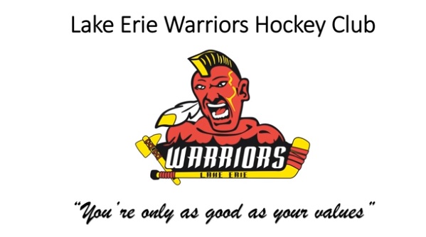
For a team based in Altoona, PA to call themselves the Lake Erie anything is pretty bad regardless, but this logo is also one of the most racist Indian logos I’ve ever seen. Howling, mohawk visibly present, Braves like tomahawk, and his skin is pretty red. All in all, Dan Snyder would say it’s honoring Native American heritage pretty well.
If you have any interest in the team trying to defend itself, watch this video:
https://www.youtube.com/watch?v=T9m1cMUtDRE
“You’re only as good as your values”, they say. If that’s any indication, then based on this logo, the team won’t win a single game ever.
