To much fanfare, the NHL released all 31 “Reverse Retro” jerseys that its teams will be wearing as alternates this year Monday. Some are duds, but many are not, and this looks like a fun and fulfilling project to spice up the regular season.
Unfortunately, we only saw them release the jersey, not the uniform, so it’s hard to render full judgment on many of these. But for now, I’ll rank the ten best:
10. Edmonton Oilers
— NHL (@NHL) November 16, 2020
It’s simple, and it feels weird for them to have essentially two standard away uniforms, but it is a beautiful uniform in itself. The Gretzky-era colors should absolutely be their full-time look. I enjoy the introduction of orange as a more prominent alternate color here.
9. Pittsburgh Penguins
— NHL (@NHL) November 16, 2020
They probably could have been bolder, but it’s a nice and clean white look with the diagonal script working well. They already have a gold alternate, so this is a nice addition to the palette.
8. New Jersey Devils
— NHL (@NHL) November 16, 2020
I wanted to see an inverse-colored black jersey, but this green look fits the spirit of the “Reverse Retro” concept. It’s well-designed and highlights the colors well. They went full into a color scheme that the Minnesota Wild never really seemed to buy into.
7. Chicago Blackhawks
— NHL (@NHL) November 16, 2020
It feels notable that the Blackhawks, with their prominent Native American imagery, were the only team that the NHL showed from the back. Nevertheless, this looks really good as an inverse alternate for Chicago’s elite uniforms.
6. Boston Bruins
— NHL (@NHL) November 16, 2020
A yellow Bruins alternate is perfect, and exactly the direction that they should have gone. They didn’t overcomplicate it with some weird throwback or alternate logo. Good stuff from the Bruins.
5. Colorado Avalanche
— NHL (@NHL) November 16, 2020
There are various problems with co-opting a relocated team’s old look, but in a vacuum, this is a really good-looking jersey. (Which is a nice change from the team’s regular look, which has, uh, a lot of flaws.) They used the Quebec Nordiques’ old design with their current colors, a creative approach. I will admit, though: I was hoping for a light blue alternate.
4. Los Angeles Kings
— NHL (@NHL) November 16, 2020
I would not mind if the Kings fully went to this color scheme. It’s unique in the NHL and they pull it off really well here. It’s uncomfortably Lakers-y, for me, but it’s a really nice jersey.
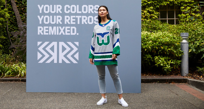
3. Carolina Hurricanes
— NHL (@NHL) November 16, 2020
I feel for all the Whalers fans out there. But Hartford wore some of the best uniforms in NHL history, and it’s nice to see them back on the ice. Going gray was an interesting decision, and I think it will work well. I’ll be curious to see whether they wear a gray or a blue helmet on the ice.
2. Minnesota Wild
— NHL (@NHL) November 16, 2020
Now this is the way to bring back an old franchise. I’d have preferred to see the old North Stars logo here, because that was a work of art, but I love the way they incorporate these colors. Keeping it to green and gold rather than trying to work black into it was a commendable decision. They should embrace these colors full-time.
1. Montreal Canadiens
— NHL (@NHL) November 16, 2020
Montreal has the best uniforms in all of sports, so naturally I’m a big fan of their work here. I adore the inverse concept — they kept all of the best elements of their regular home design, only flipped to blue. It seems like the blue is slightly darker than the regular accent blue, but I have no complaints. It works brilliantly.
