I enter this 2018 MLS season feeling very much underwhelmed with the new kits this year. It’s not like any of these kits were necessarily bad, but they weren’t necessarily good as a whole either. Overall, I found everything to be very “meh” and it seemed clear that someone at Adidas told these teams to either have a primarily black or primarily white kit this season.
While that might be great for contrast reasons on TV, it kind of stifles the creativity that goes into making some of these kits. Unlike the Premier League, which has newly designed kits every season, MLS operates on a two-year cycle for all kits. This is designed so every team gets to release one kit before every season and alternate between a new primary and secondary kit, with expansion team Los Angeles FC releasing both home and away.
With that, we rank the top five best and five worst new kits of the upcoming 2018 MLS season.
Top five best new MLS kits
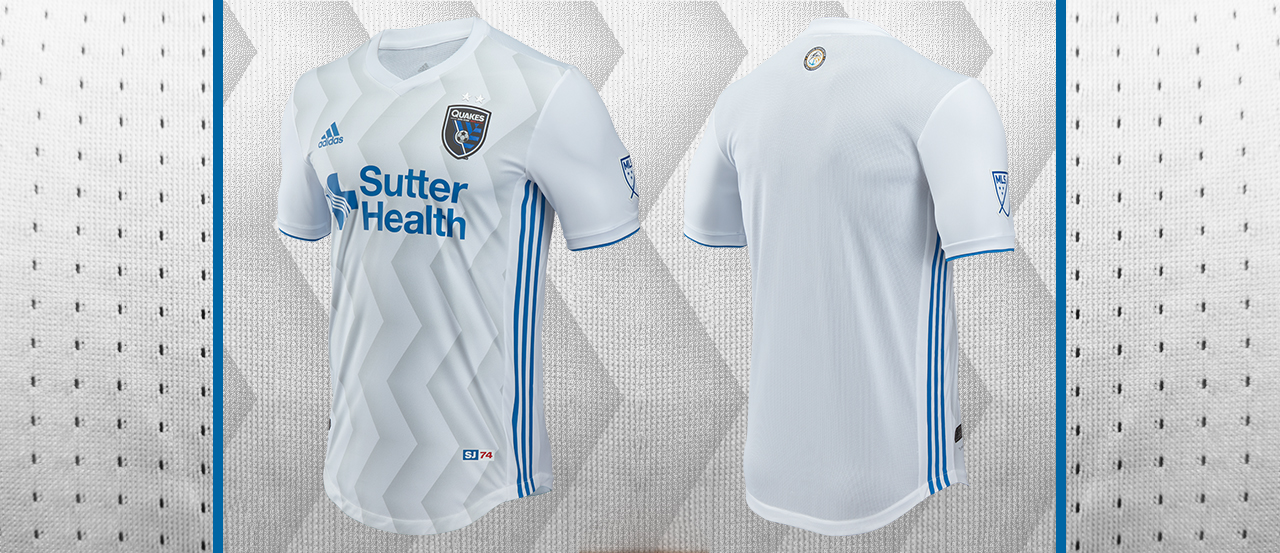
5) San Jose Earthquakes Secondary
One thing that typically makes or breaks a kit is how the kit sponsor is incorporated into the shirt. For San Jose, Sutter Health is in their traditional blue and while they went with the primarily white kit, the Earthquakes were still able to incorporate a wavy gray pattern that works.
In addition, 5 percent of each kit sold will go to the Navy Seal Foundation. Doesn’t really have much to do with the kit design but if you do that, you’re going to get some brownie points in my book.
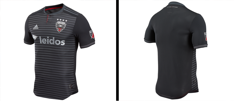
4) D.C. United Primary
It’s very tough to design a kit that looks great and keep with your traditional team colors. Just look at what European teams have to go through for their home kits where they have been trying to come up with different designs regarding the same color for decades.
For D.C. United, they took traditional black and turned it into a subtle, but striking kit with just a touch of red on the collar. Nice reinvention of one of the few traditional kits in MLS.
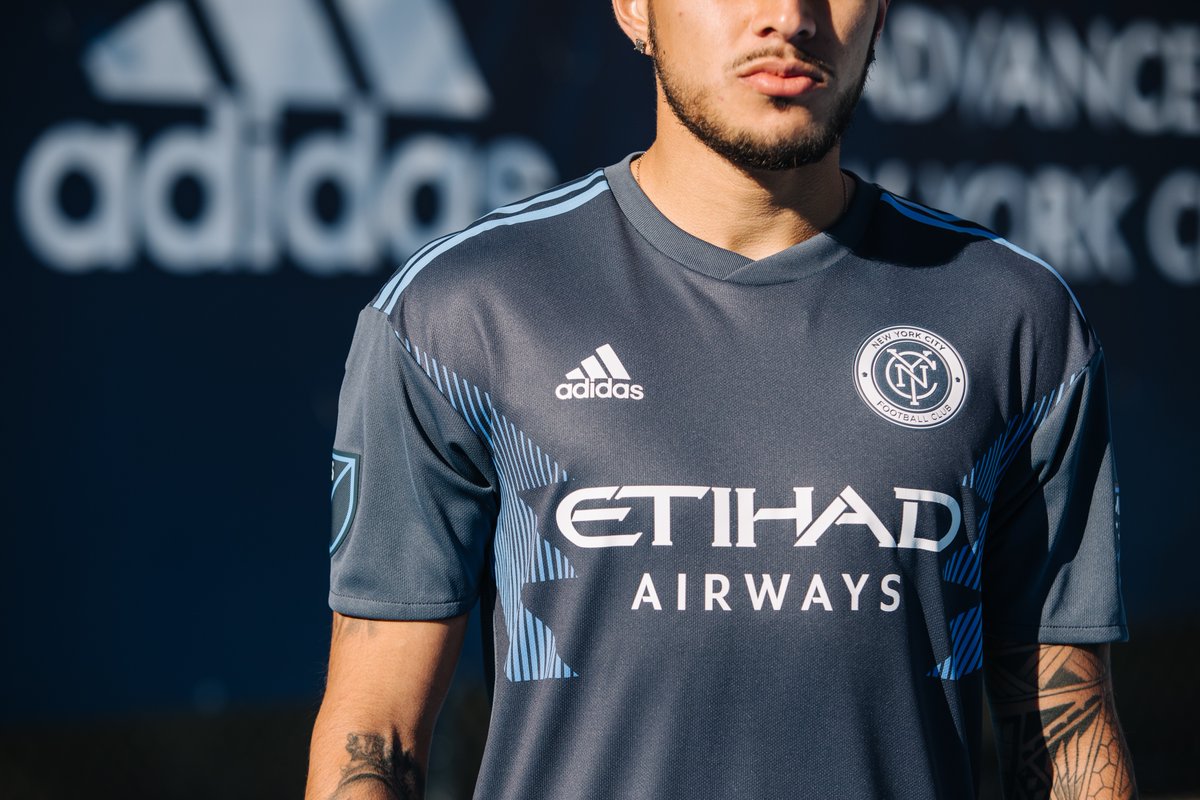
3) New York City FC Secondary
This might look too much like a training kit, but in a year when so many designs went too conservative, I appreciate NYCFC for taking a chance. This is a rare design that kind of accentuates their kit sponsor, fitting Etihad Airways in between the striped design.
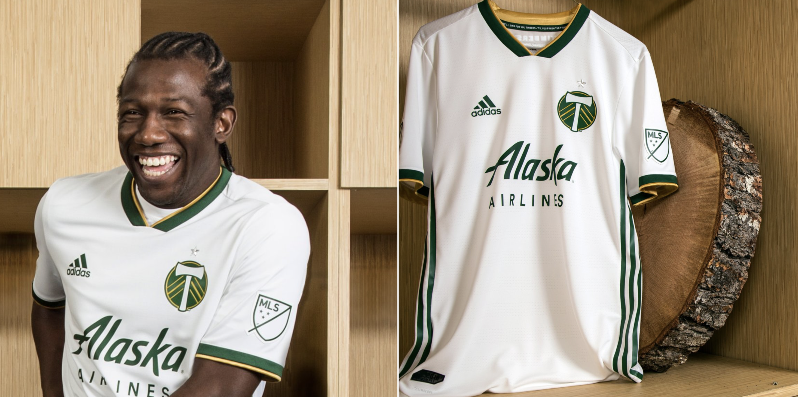
2) Portland Timbers Secondary
I have never seen the Portland Timbers make a bad kit. There was a time where I didn’t like their red kits that much, but I grew to love them. The green lettering on white is exquisite and the gold trim on the sleeves and collar put it over the top. It only took a very special kit that kept this from being top of the list.
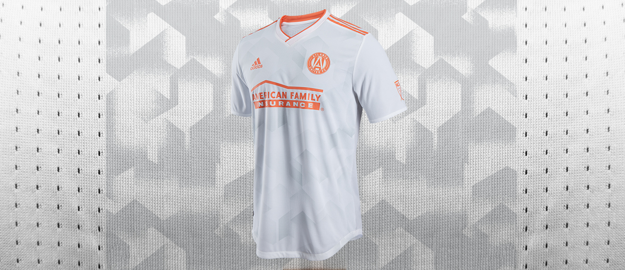
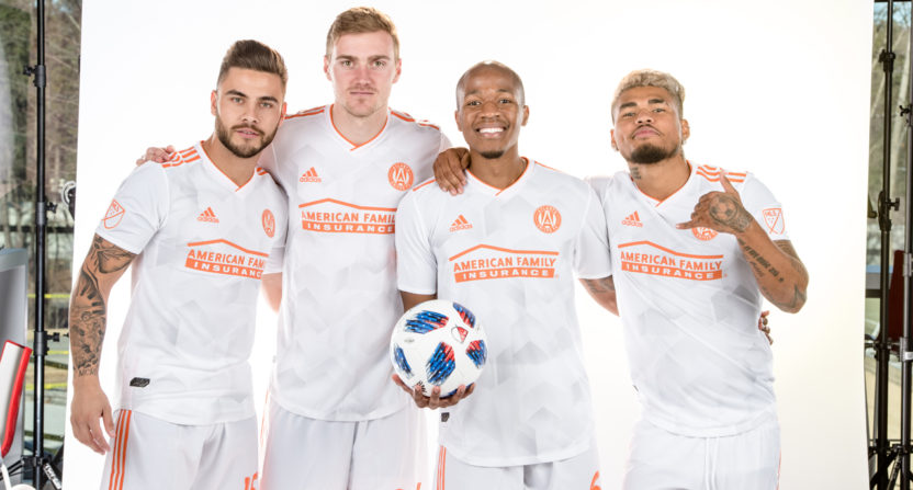
1) Atlanta United Secondary
If you were to ask me what new kits I would buy with my own money, I would say Portland’s secondary and this. With all due respect to Houston, who have orange as a primary color, Atlanta United has taken this shade of orange (peach, specifically) and transformed it in a way that is completely stunning.
This cream sickle design is a brilliant combination of taking a color that isn’t a team color, but has importance within their city, and making it their own. Not to mention, it’s a shade of color that no other MLS team has done, so the originality factor is through the roof here. I don’t know if Atlanta United plan to keep using peach as a secondary kit design and/or plan to sell apparel in these colors, but they must because this will fly off the shelves.
Note to anyone at Atlanta United who may be reading this: If you can get Tata Martino to wear an all-peach colored suit during a game while the players wear peach kits, you will break MLS Twitter.
Top five worst new MLS kits
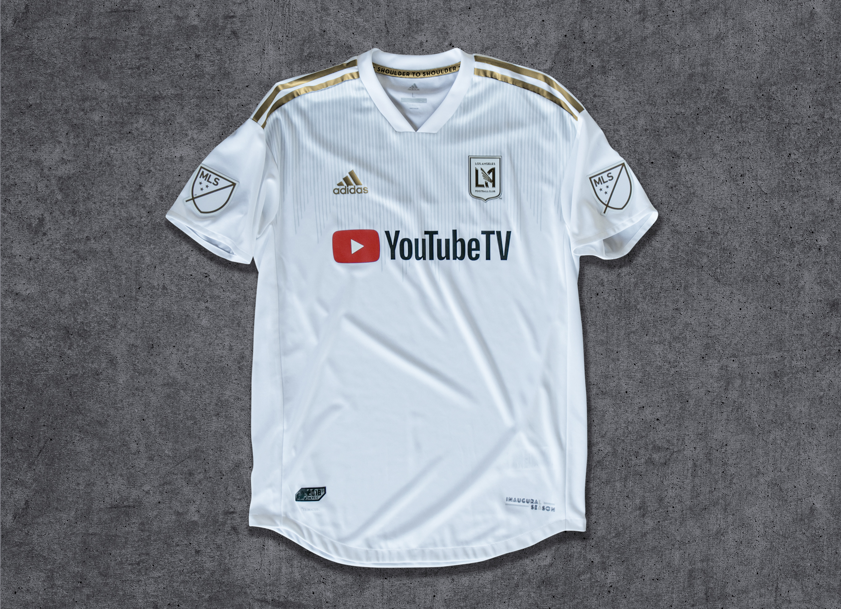
5) Los Angeles FC Secondary
When I first saw LAFC’s team colors, I was loving the color design and was definitely looking forward to what they would bring. Then LAFC signed YouTube TV to be their local broadcaster and their kit sponsor. That’s when I knew I was expecting a sponsor logo that wouldn’t adapt to the color scheme and keep the regular red logo.
I wanted to love this kit, I still love the colors of this kit, but the kit sponsor just ruined it for me.
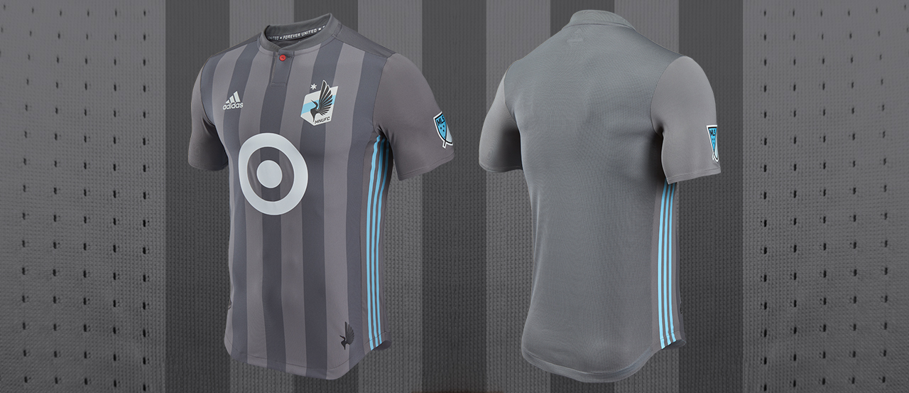
4) Minnesota United Primary
When I did my kit rankings last year, I had Minnesota United’s primary as one of the best-looking new kits. This season, it’s one of the worst. It just seems like the blue diagonal sash made everything look better and it looks like something that got taken away from last year’s kit, rather than it being a completely new design.

3) Colorado Rapids Primary
I like the blue on the kit, but there’s really nothing here. It’s a solid Burgundy kit with blue stripes. It honestly could have been something that was designed in five minutes. This very much seems like a starting template for the Rapids to build off of in their kit designs. Let’s hope that happens in the future.
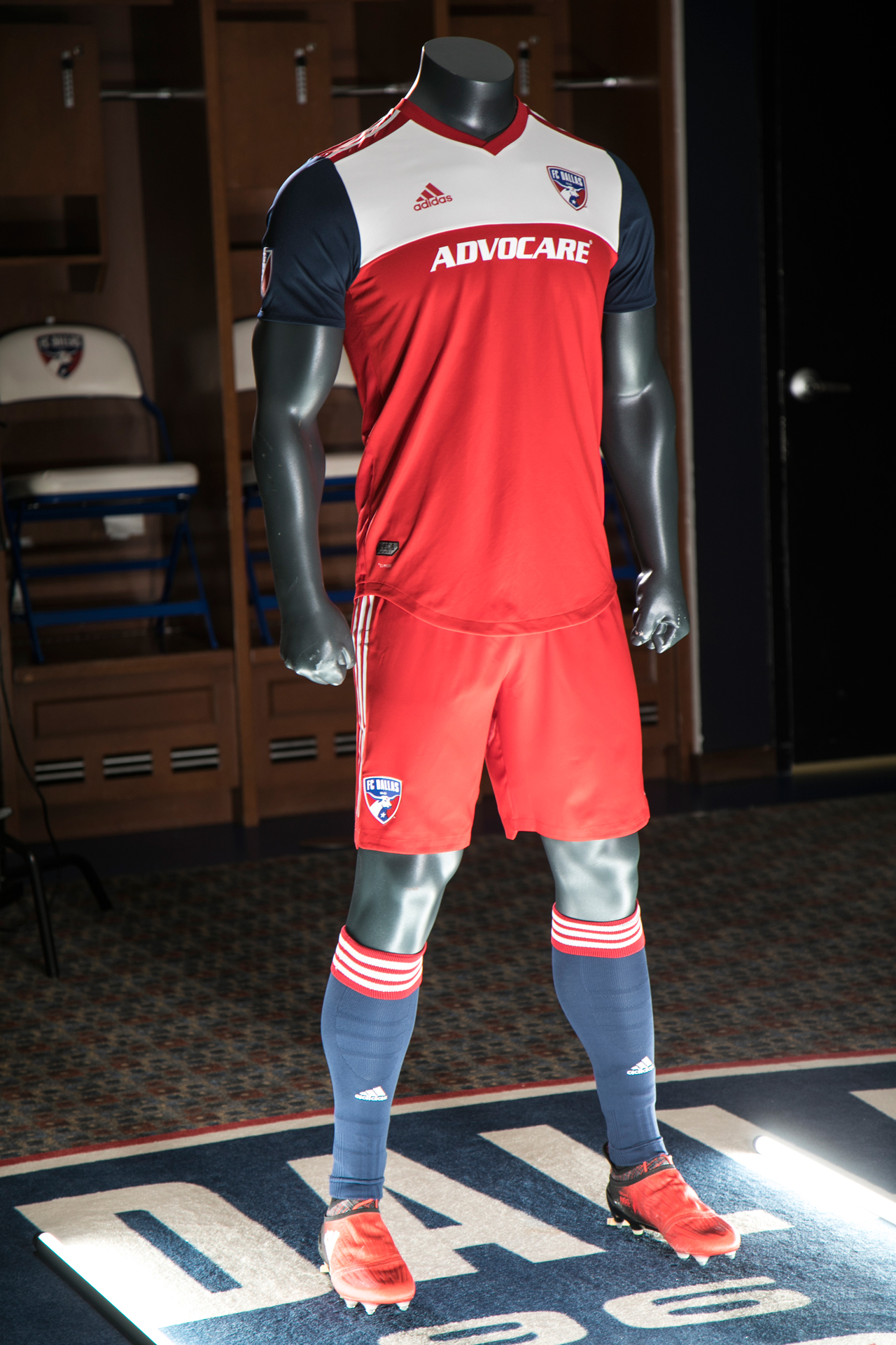
2) FC Dallas Primary
There are ways to incorporate the red, white and blue of the Texas flag, but this isn’t how to do it. Instead of incorporating all three colors together, it seems like the red, white and blue are about to do their own thing. It’s not ugly by any means. But like the top three on this list, it’s just uninspiring and forgettable.

1) Chicago Fire Primary
I’m normally down for a kit with nostalgia and Chicago tried to do that with their 20th anniversary kit. It’s just that, except for the 20th anniversary tag and one or two subtle changes, I would have thought I was looking at last year’s kit. It’s a safe choice, it’s going to be loved by their fans for its history, but it’s just not for me.

