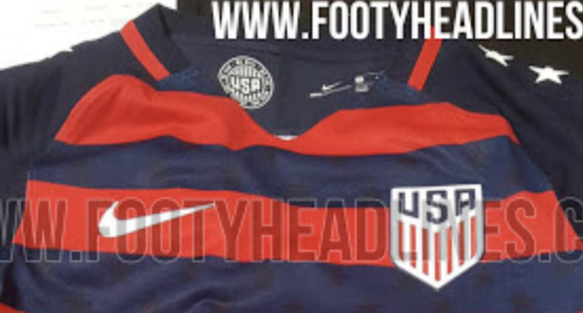
I, along with many others, have been critical of Nike’s unimaginative kit designs. Every Nike country they represented carried the same pattern last year consisting of different color sleeves and a solid color below. The result consisted of bland USMNT shirts and shirts that looked very similar to others, particularly France.
Nike seems to have done a complete 180 this year for the Gold Cup as they supposedly designed a kit that is anything but boring and unimaginative.
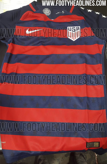
I do appreciate Nike for at least trying to do something different. That alone makes this kit better than whatever it is they tried to sell last year.
Having said that, this still isn’t a good looking kit. Apart from the stars on the sleeves, it kind of looks like a rejected Barcelona kit design. And the stars make it look gaudy. The first thing I thought was that this would be something a patriotic pimp would wear if they were to go to a U.S. soccer game. Actually, that might not be a bad thing to see in the stands so maybe I can come around on this design. But for now, it’s a pass for me.
While this hasn’t been officially released, there have been pics of this kit circulating online so there’s an extremely good chance we’ll be seeing this next month at the Gold Cup.
