
Looking through the 64 kits for this year’s World Cup, one thing stood out to me and that was the lack of kits that stood out to me. This was by far the most boring collection of soccer kits I have ever seen.
The vast majority of the kits are one solid color that looks like a generic shirt bought in bulk by a youth soccer team and these kit makers have the audacity to charge over $100 for these? It’s too bad the United States isn’t in the World Cup this year because for once, they actually have some good looking shirts that would probably be at the top of this list. But that didn’t happen so here we are.
Throughout all the blandness, I did find five kits I liked more than others and five I found were worse than others.
Top five best World Cup kits
5) Belgium Home
Belgium’s kit is an understated argyle pattern that is primarily red with gold pattern and black lines. Keeping with their traditional colors and of their flag, Belgium did a pretty good job here.

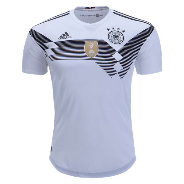
4) Germany Home
This is a modern take on Germany’s 1990 kit which won the World Cup. Germany isn’t the only team who came out with a retro kit but they did it the best.
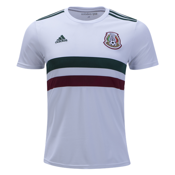
3) Mexico Away
Mexico’s kit is subtle but striking. This isn’t a traditional looking kit by any means but the horizontal stripes with a white, green and red color scheme works.
2) Sweden Away
Sweden’s blue and gold ensemble has a great color scheme and has a lot of subtle patterns working for them. From the small horizontal stripes to the blue on blue checkerboard pattern, this is a great looking kit.

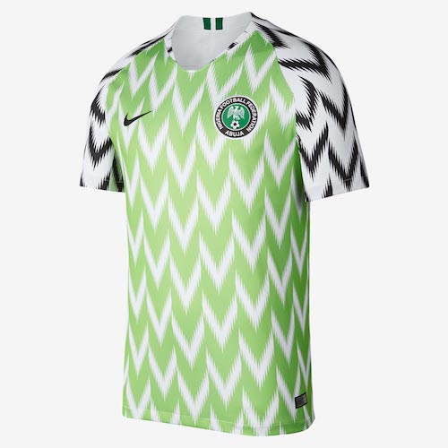
1) Nigeria Home
This may divide opinion but in a year with so many conservative designs consisting of a solid color, Nigeria took a chance. Is this the best looking kit ever? No. Does this look good? That depends on your personal taste. For me, this looks wonderful and I appreciate someone taking a chance with a wild design and Nigeria deserves recognition.
Top five worst World Cup kits
5) Panama Home
The theme for many of these kits on the worst end will be “boring.” The small grid pattern is I guess okay for Panama but this is essentially a red shirt.

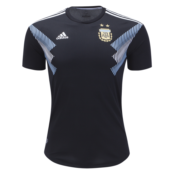
4) Argentina Away
This has a little bit of flair with the armpit stripes but this looks too much like a training kit rather than something that should be worn on the pitch. This isn’t the only Adidas kit doing a similar design. Mexico’s home kit has the design closer to the middle while NYCFC launched a similar design in MLS earlier this year.
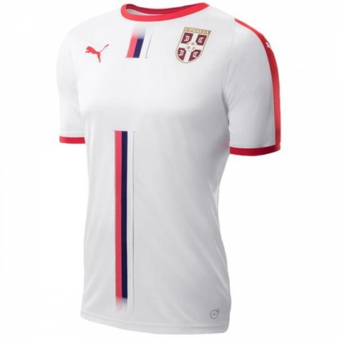
3) Serbia Away
Don’t worry about the white space on the chest, the player’s number will be there. Even so, there’s just something missing from this kit. If you’re going to buy this kit, you better spend the extra money and don’t leave it blank.
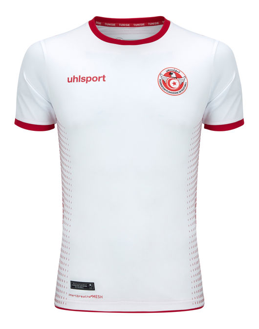
2) Tunisia Home
I could put a number of kits in this spot. The generic white kit that doesn’t really have a discernible memorable look. Tunisia has a great looking crest but the rest is rather forgettable.
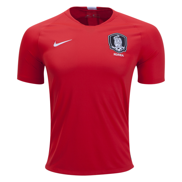
1) South Korea Home
Same description as Panama but at least Panama had the grid pattern. This is how I imagine the conversation went for designing this kit.
South Korea FA: “Hello, Nike. We want our World Cup kit to be a plain red shirt with our crest.”
Nike: “Sounds good.”
I hope that was it because this looked like it was designed after a five second phone conversation.

Comments are closed.