Euro 2016 begins Friday in France and 24 European nations will vie for what is the second biggest men’s international tournament in the world. It is also a time for these European teams to showcase their new kit designs for the year.
You can check out all 49 kits (because Albania for some reason has a third kit) on our soccer site 32 Flags. We are here to choose the five best and five worst out of the 49 kits you will see at Euro 2016.
Top five best kits

5) Belgium Away
This Belgian kit is very much what you would see worn from a Belgian cycling champion. It’s definitely a different look, one that may not be many people’s favorite. But it’s a personal favorite of mine, so it’s on the list.
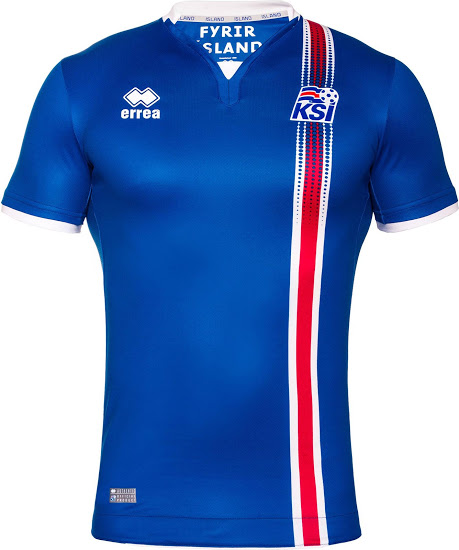
4) Iceland Home
Kit maker Errea scored an upset victory with their Iceland kits. The away kit looks great too, but the home kit looks even better. From the crest to the overall design, this kit is so remarkably retro and something that could be from the 80s, though also modern all at the same time.
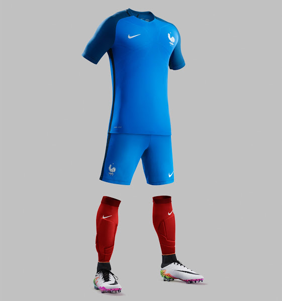
3) France Home
The hosts are wearing this great looking blue two-tone kit in front of their fans. Modeled in the same Nike pattern as England, the U.S. and others, this is easily the best-looking kit of all of them.

2) Croatia Home
It’s very tough to reinvent a kit that historically has the same design. Not to mention, it’s tough to make a kit look good when it has the design quality of a tablecloth. I’m sorry, I know it’s traditional for Croatia to have that, but it literally looks like a tablecloth. Somehow, Nike was able to do this and make one of the best-looking kits in the entire tournament. This was maybe Nike’s toughest task and it was knocked out of the park.
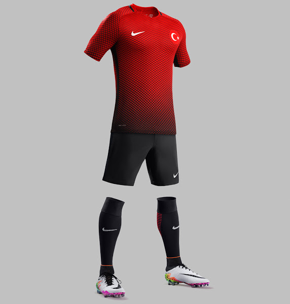
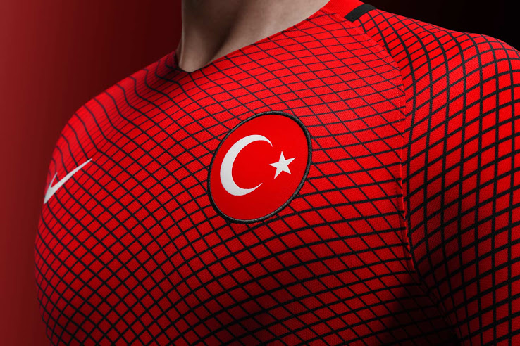
1) Turkey Home
The winner is simply no contest. Turkey is far and away top of the list and did so with a great blend of red and black. The shirt itself looks great, but the entire kit is where this really shines as the black gets blended into the all black shorts.
Top five worst kits
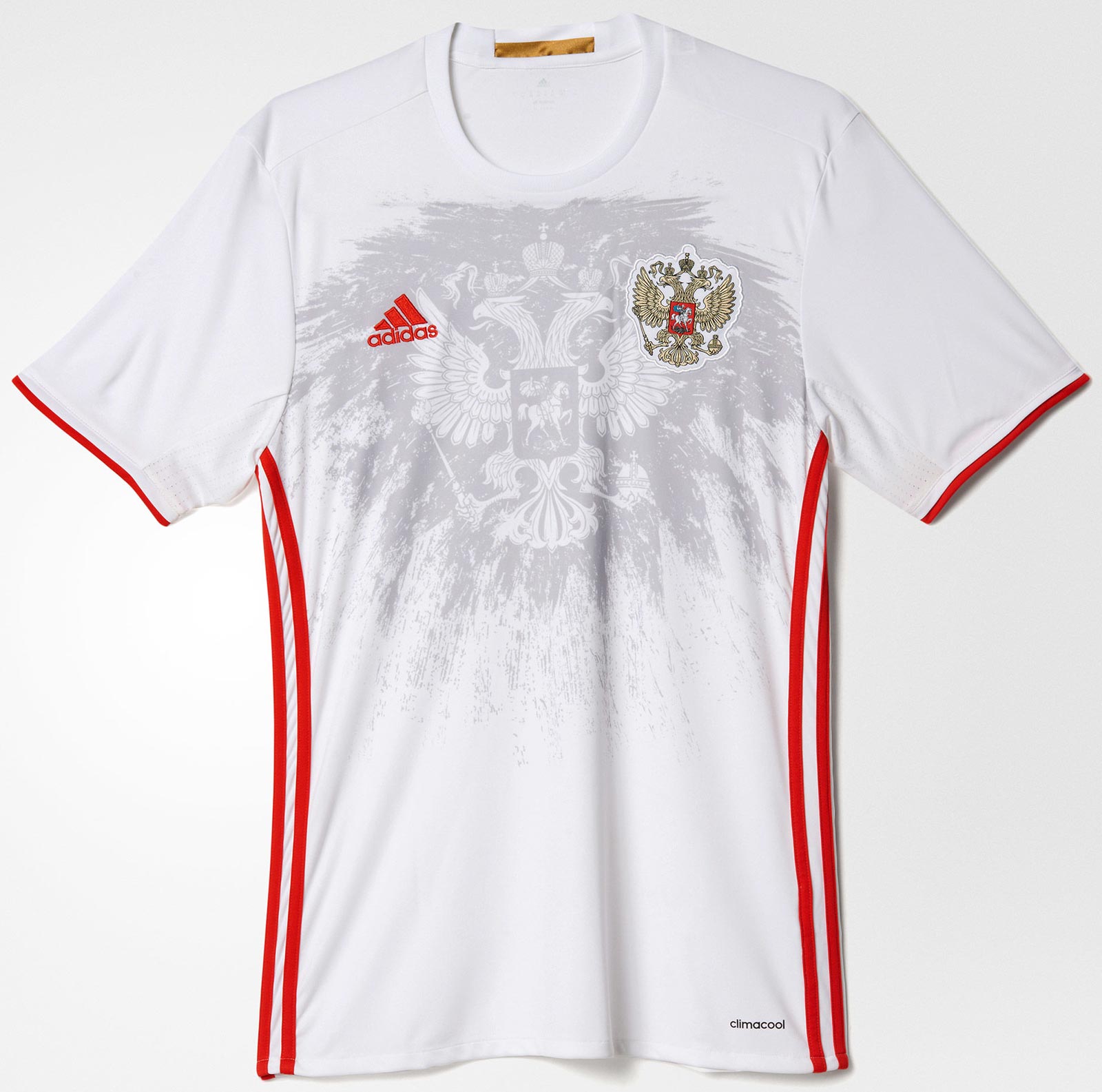
5) Russia Away
I can see Russia’s kit being a hit for some people, but it just doesn’t work for me. I feel like having a crest on the heart as well as superimposed on the front of the kit is a great idea in theory, but not so much in reality.

4) Germany Away
Germany’s away kit turns inside out and has the World Cup champion patch. Other than that, there’s isn’t much good to say about this kit. The color scheme just looks drab and not a kit that looks great on the field.
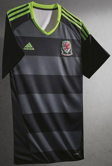
3) Wales Away
Similar to Germany’s away, but it doesn’t turn inside out and doesn’t have the World Cup champion patch. So that really makes this kit worse.
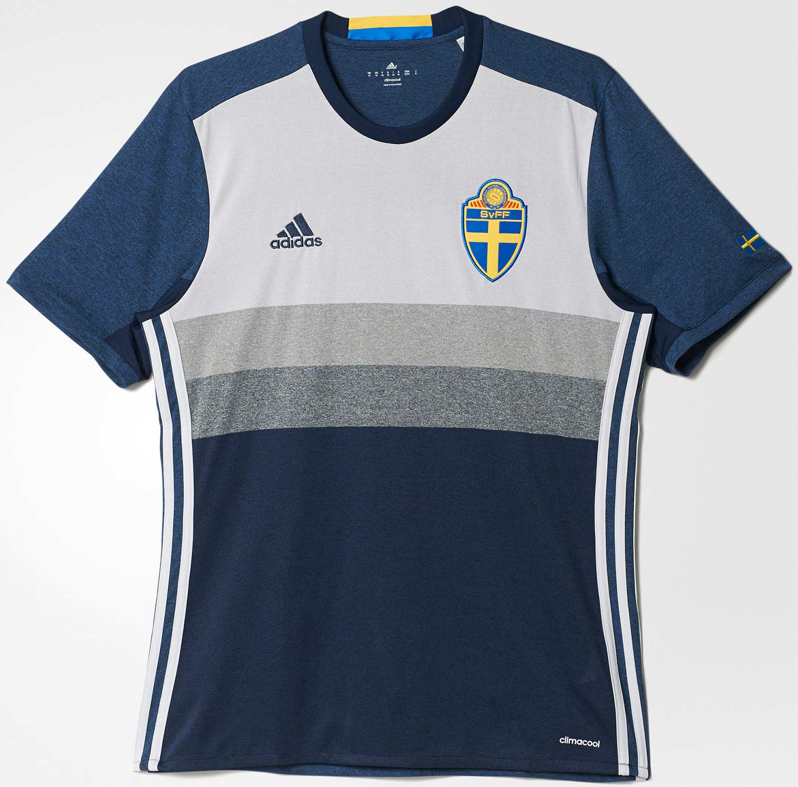
2) Sweden Away
I kind of get what Adidas is going with when it comes to Sweden’s away kit, but it kind of comes off as a cheap looking shirt. Sweden went with the retro look and kind of missed the mark here.
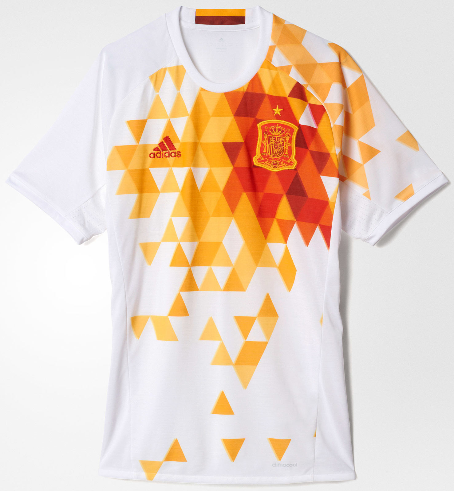
1) Spain Away
No, just no. Whatever Adidas was thinking when they designed this was just flat-out wrong. I don’t exactly know what the triangles are meant for and why they’re in such a random place, but this needed to go back to the drawing board. Sadly, it’s being worn in Euro 2016.
