The 2016-17 Premier League season begins Saturday as we are set to see 20 teams battle it out for the title. Will an established team take back what has traditionally been theirs or will a smaller team like Leicester pull off another shock? Will Leicester repeat what they did last season? We don’t know that yet but we do know what these teams will be wearing for the upcoming season
You can check out all 50 kits on our soccer site 32 Flags. We are here to choose the five best and five worst out of the 50 kits in the 2016-17 Premier League season.
Top five best kits
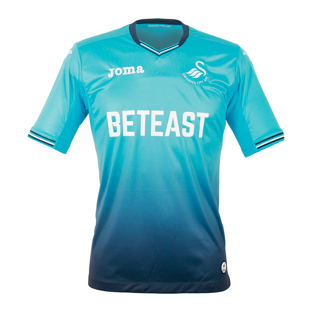
5) Swansea City Away
This kit may be a bit polarizing and I can see why people wouldn’t like this kit but I thought it was interesting to incorporate turquoise and mix it with dark blue to have a kind of oceanic and tropical look. That may not make sense for a team from Wales but whatever, the kit looks good regardless.

4) Stoke City Away
Talk about retro, this sky blue kit from Stoke looks like it’s straight out of the 1970s. With the watermarked “S” behind the crest, Stoke did a really great job going old school with this kit.
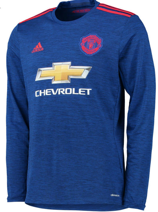
3) Manchester United Away
I have normally been harsh on Manchester United’s kits because the Chevrolet kit logo is too big and the gold inside the “bowtie” design makes it incredibly tough to design a kit which can incorporate that and make it appear half-decent. But this dark blue with red stripe kit looks great regardless and is an homage to them winning the 1968 European Cup. Why not wait until next season so they can use this kit and celebrate the 50th anniversary of that European Cup, I honestly don’t know. But the kit looks nice.
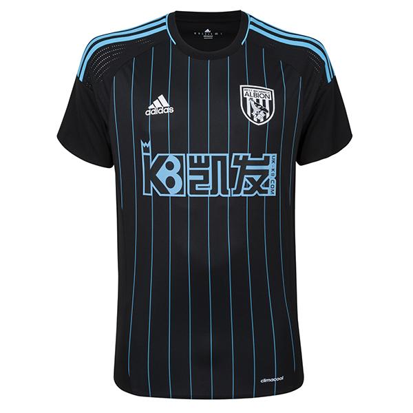
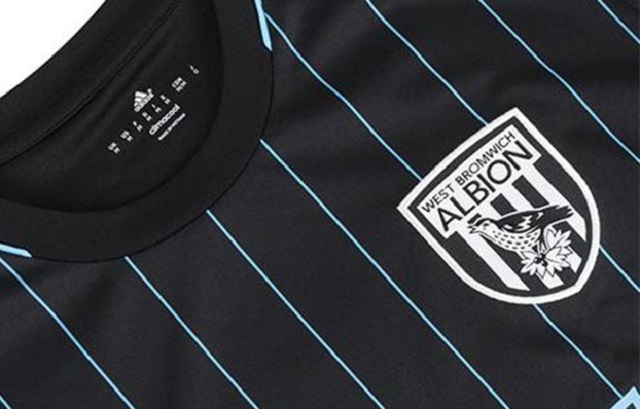
2) West Bromwich Albion Away
I was very close to include West Brom’s home kit, but I went with the away kit because I liked the light blue pinstripes paired with the black design. One thing I appreciate, and usually gets you a few points in my book, is that West Brom’s kit sponsor, UK-K8, is willing to alter their logo into different colors so it works better with the kit design. It’s a subtle concession, but that can make a kit go from being one of the worst to one of the best. And that, in turn, could result in more people being happy to wear a shirt that bears your company on the chest.
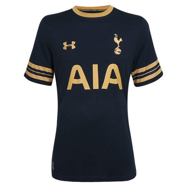
1) Tottenham Hotspur Away
Simply magnifico. This looks like something that would be worn 50 years ago, yet the color design is very modern. It’s very minimal, but striking all at the same time. And the gold lettering along with the dark blue base works. Definitely the best of the best.
Top five worst kits
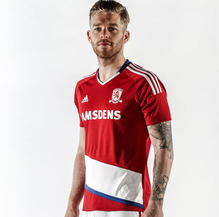
5) Middlesbrough Home
Maybe I’m being too harsh with Middlesbrough. I have a feeling this is a kit I will grow to like, but having the diagonal slash down toward the waist instead of across the chest will take some getting used to.
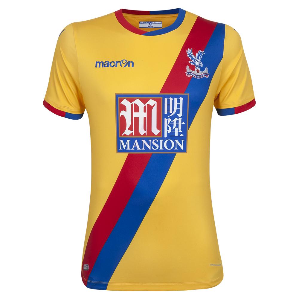
4) Crystal Palace Away
What I like about Crystal Palace’s kits is that their blue and red stripes fit so well with the Mansion kit sponsor. Unfortunately, the gold base of the kit clashes with the red and blue and completely ruins the good thing that was happening.
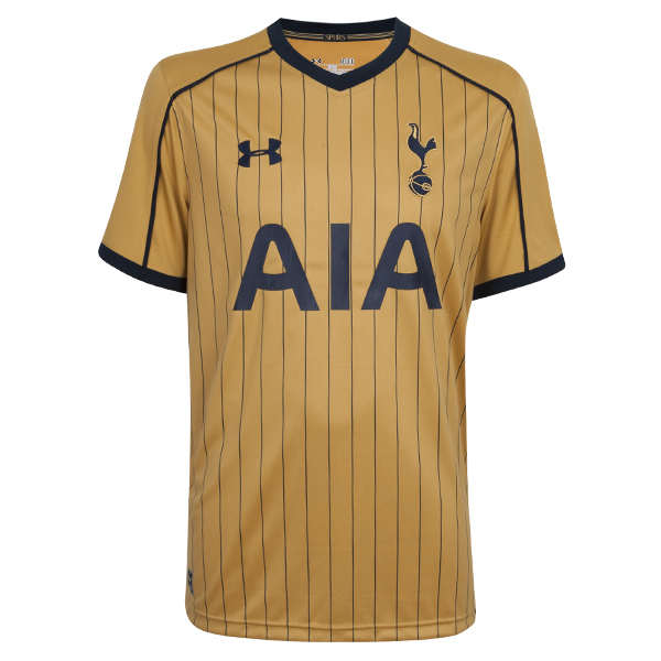
3) Tottenham Hotspur Third
A bit ironic since I literally have the reversed design as the best looking kit, but this goes to show how a change or two can completely make or break a kit. The colors are reversed here, yet the gold base with dark blue lettering just doesn’t work as well as the gold lettering on dark blue.
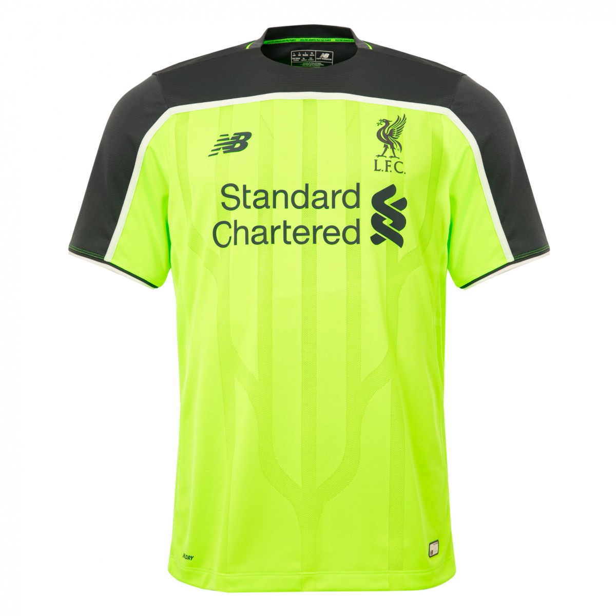
2) Liverpool Third
I guess this year was Liverpool’s turn to have a highlighter green kit. Soccer teams with bright green kits are like kids getting chickenpox. Since a few years ago, most teams are going to have a kit like this at some point and then after that season, they won’t have that color kit again. There’s hardly any way to make a color kit like this look good and Liverpool unsurprisingly couldn’t make it work.
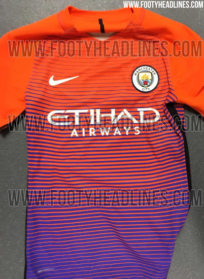
1) Manchester City Third-Leak
This kit isn’t official yet, but there is a 99.9% chance this is going to be the Manchester City third kit. And I hope I’m wrong because this kit looks hideous. Take some advice from me, Nike. You still have time to make sure this shirt doesn’t officially see the light of day. Do us all a favor and make that happen.
