The era of New Era’s “local market” line of Major League Baseball caps was a short-lived one. By the time most people realized that these ugly, cluttered caps were actually real and not a gag, New Era pulled the line from its website.
Will that mean the ill-advised apparel quickly disappears from cultural discourse or lives on to become legendary since so many of the hats were screen-capped and derided on social media? At the very least, the “local market” caps could become a cautionary tale on lame attempts to appeal to regional fanbases and filling up empty space on a cap with embroided clip art icons.
Let’s be grateful for the screen caps because in the years to follow, it could be difficult to describe to future generations — our children and grandchildren — just how terrible these caps were.
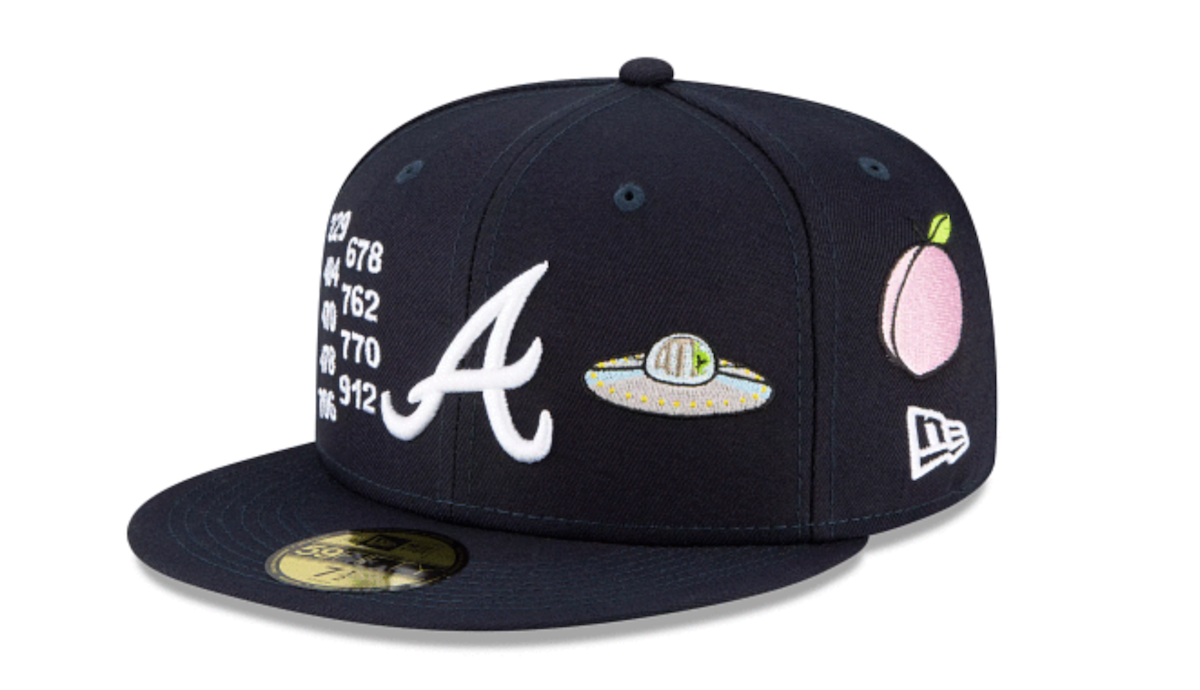
“Well, son — the Atlanta Braves cap had a UFO on it because… of an Outkast song, it’s believed. And the Arizona Diamondbacks lid had a burrito on it because, you know, I guess they ate burritos in Arizona.”
Perhaps we should at least give credit to New Era and MLB for attempting to create something distinct to local markets and fanbases. In addition to the team logo, have the caps bear iconography that represent a region and its people. What typifies a region more than local landmarks and popular food?
Maybe the biggest mistake was choosing a baseball cap as that canvas. There’s only so much room to work with and more than one or two additional symbols would upset the simplicity and symmetry of a team baseball cap. Yet t-shirts wouldn’t be better, right? If you root for a baseball team, you wear its cap.
But did anybody associated with each MLB team, anyone from their respective marketing departments, consult on which icons would go on these caps? Because most of them appeared to be chosen based on vague notions of what might represent a local market. And the Kansas City Royals made it clear that they had nothing to do with what was on their cap by mocking it on Twitter.
New bio, who dis? pic.twitter.com/60jhNHRDnZ
— Kansas City Royals (@Royals) May 25, 2021
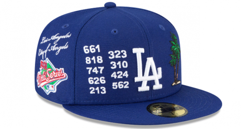
Some items were generically used for every team in a particular state, such as palm trees for California. But is Oakland known for palm trees? And there are some cities that call for very specific landmarks. Like the St. Louis Cardinals cap has the Gateway Arch. The Philadelphia Phillies have the Liberty Bell. So why no Space Needle on the Seattle Mariners cap or the CN Tower for the Toronto Blue Jays?
Putting the area codes for a team’s city on the cap also missed the mark in several examples.
The Tampa Bay Rays cap didn’t have the area code for St. Petersburg, where Tropicana Field is located. Some caps didn’t include the area codes in which most fans reside. Yes, the area code for Detroit is 313. But plenty of fans from the 734, 810 and 586 area codes go to Comerica Park to watch the Tigers. The worst of all, however, had to have been the Royals cap, which sported four area codes that aren’t even in the state of Missouri.

What about a pierogi on the Cleveland cap? Aren’t those more popular in the Pittsburgh area? Cincinnati is known for chili, but serves it over spaghetti rather than in a standard bowl. Michigan, especially northern Michigan, might be known for cherries, but not Detroit. (A coney dog would’ve been a better food item, though people might not associate “chili dog” with Detroit, and think of Brooklyn when they hear “coney.”)
To be fair, copyrighted images probably prevented New Era from putting better icons on these hats. Going back to the Tigers, better symbols could’ve included the Spirit of Detroit statue or the “Hitsville, U.S.A.” logo on the Motown Museum. But maybe those were difficult to acquire. What about a car? But then a choice has to be made between a Ford, General Motors, or Chrysler automobile.
New Era has pulled the whole new Local Market line from their web site.
— Dani Welniak (@DaniWelniak) May 25, 2021
So we get that this may not have been as easy as it might appear. Yet this failed effort, one that didn’t even last a full day, has to be seen as a disaster. Amazingly, the ridicule on social media was apparently too strong this time around. It’s amazing how fast this thing was shuttered. Within four hours? Maybe six?
New Era and MLB are in the business of selling caps, and if you go to MLBShop.com or Fanatics to look for a team cap, you will see some terrible, objectively ugly hats. Logos that are far too large or angled. Pastel colors trying to be fashionable. Some fans bought these caps, however, so they will live on. And maybe they’ll become collectors items or rarities marked up higher than the original $39.99 price on eBay.
That might prevent these caps — which absolutely should be forgotten — from never completely leaving our collective memory.
