The Copa America Centenario starts Friday and some teams have marked the occasion by releasing brand new kits for the year. While some teams kept designs from last year, many other teams launched new designs this year and those various designs can be good and/or bad depending on your view.
The Comeback is looking at the top five best and top five worst kits at the Copa America Centenario but if you want to check out every kit, head over to 32 Flags’ Copa America Centenario kit page and get a look at all the kits for this summer.
Top five best kits
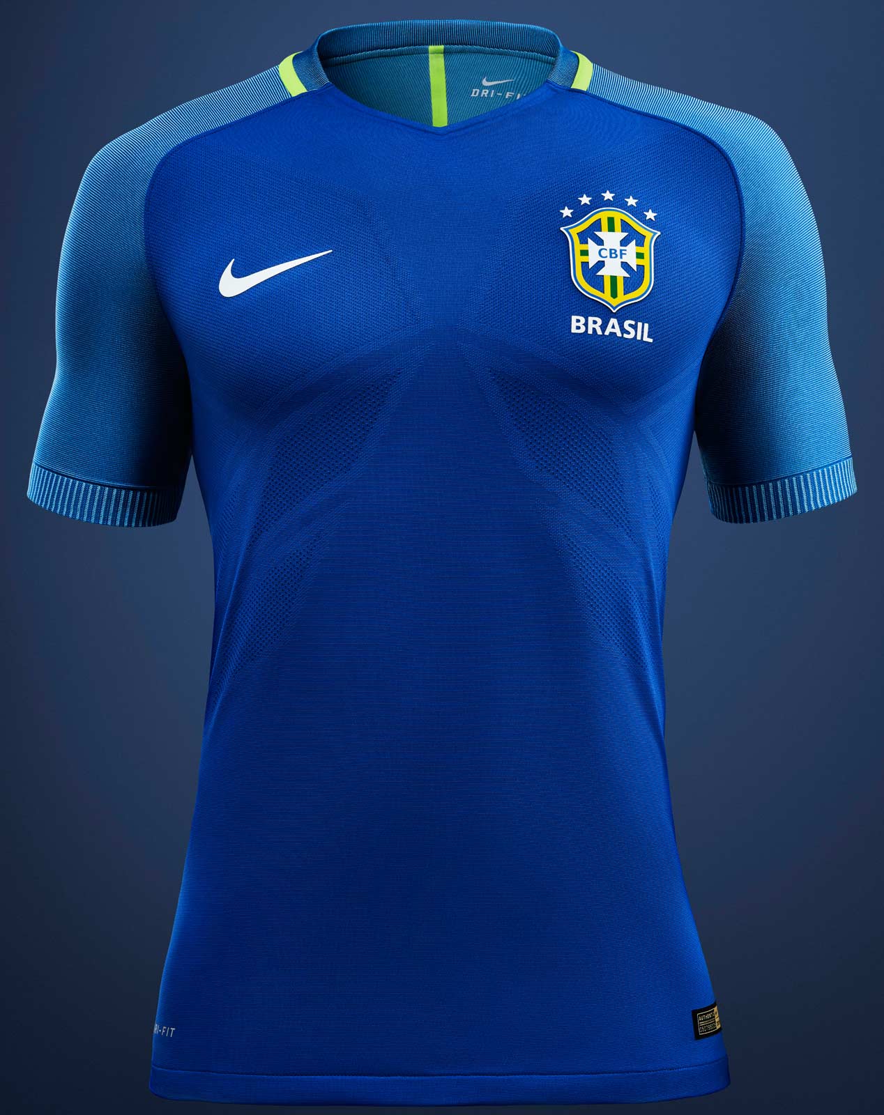
5) Brazil Away
It seems like traditional colors are “in” this year at the Copa America Centenario. Many of the best kits this year are kits that we have seen in similar versions for many years. Celebrating 100 years of CONMEBOL, of course it’s a perfect time to bring out traditional kit designs that have held up over the past century. This kit, while not usually a kit Brazil wears, is still incredibly beautiful and traditional for the Brazilian National Team.
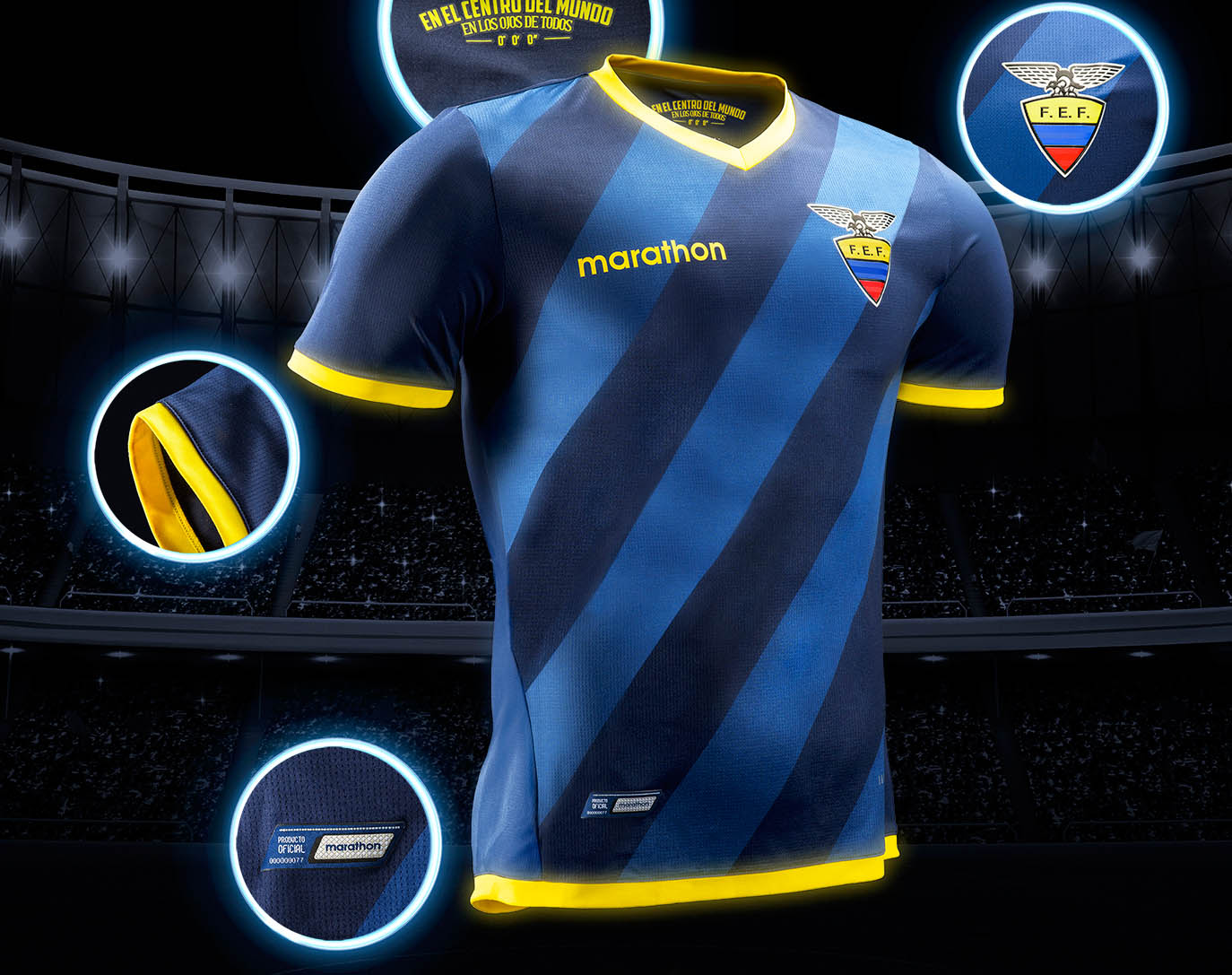
4) Ecuador Away
A rare exception to going traditional and looking good in the Copa America has been Ecuador’s kits. Their away kit is new and looks spectacular. The front of the kit has alternating diagonal blue stripes and has just the right amount of yellow around the ends of the sleeves, neck and bottom of the shirt to really make the kit stand out without being distracting.
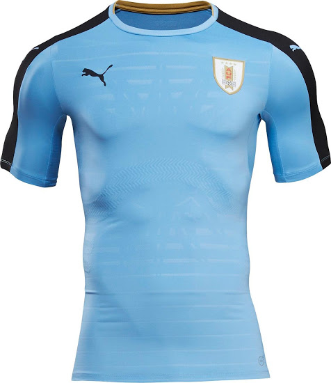
3) Uruguay Home
Uruguay’s home kit isn’t exactly a traditional design but they do use the traditional light blue that is typically on their home kits. The biggest change Puma made was to make the shoulders black. Overall, it’s a great looking kit that doesn’t stray too far from the traditional color scheme. Puma did just enough to make the Uruguay kit different, but not radically different than their traditional kit.

2) Argentina Home
Argentina and their light blue/white stripe home kit is the standard Argentinian kit for many years. Adidas doesn’t stray far from tradition and keep the status quo. With a black stripe around the ends of the sleeves and neck, Argentina’s home kit is the only kit they will wear for the Copa America Centenario. No news has come out to indicate Argentina will be wearing anything other than their home kit and they usually don’t need to. This kit speaks for itself.

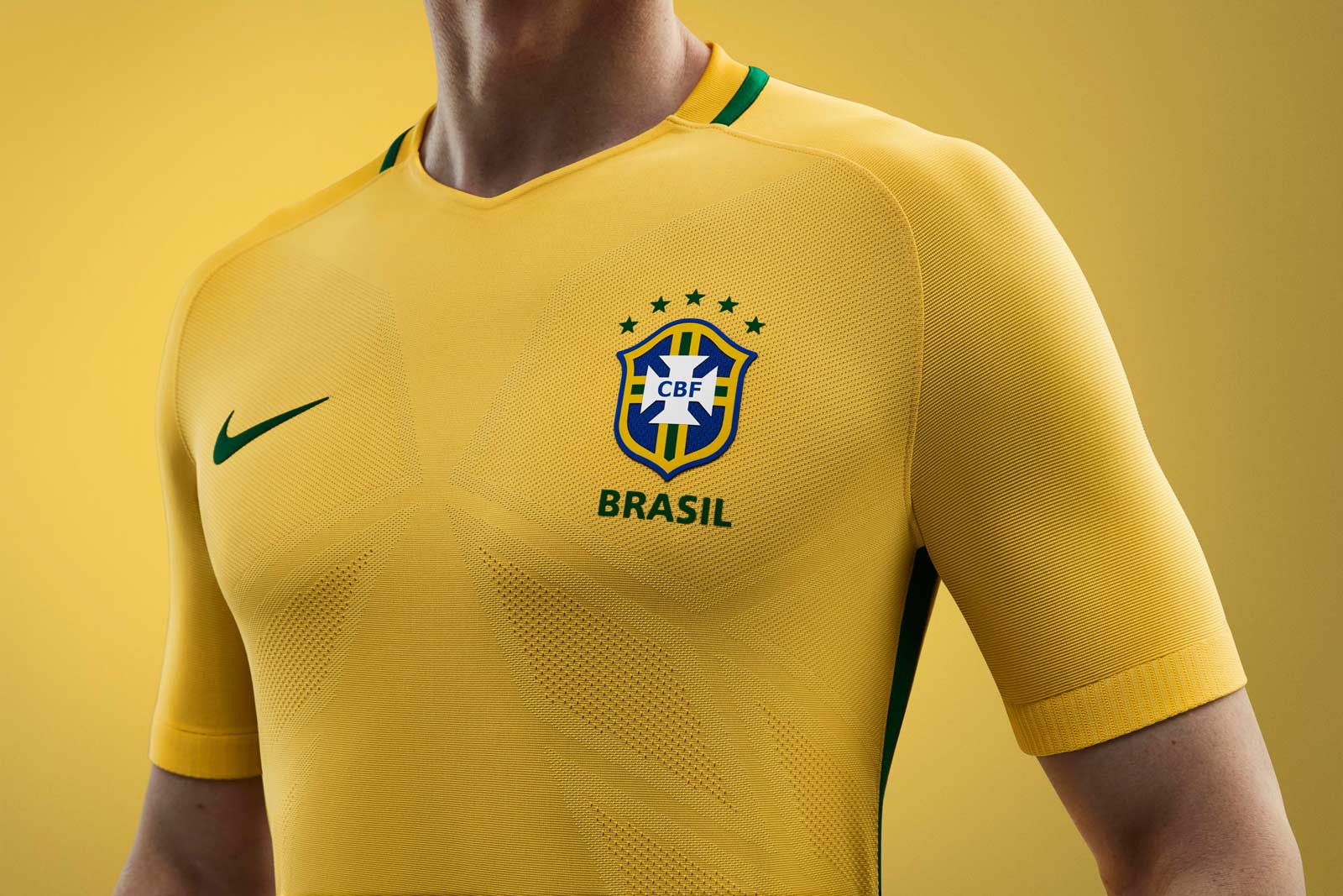
1) Brazil Home
Quite possibly, the most recognizable kit in all of soccer, Brazil’s traditional yellow kit is the ultimate. One literally never has to make any changes with this kit. Solid yellow, Brazil crest and you have yourself a beautiful kit. There’s no doubt this kit is the best in the Copa America Centenario, quite possibly best in soccer.
Top five worst kits
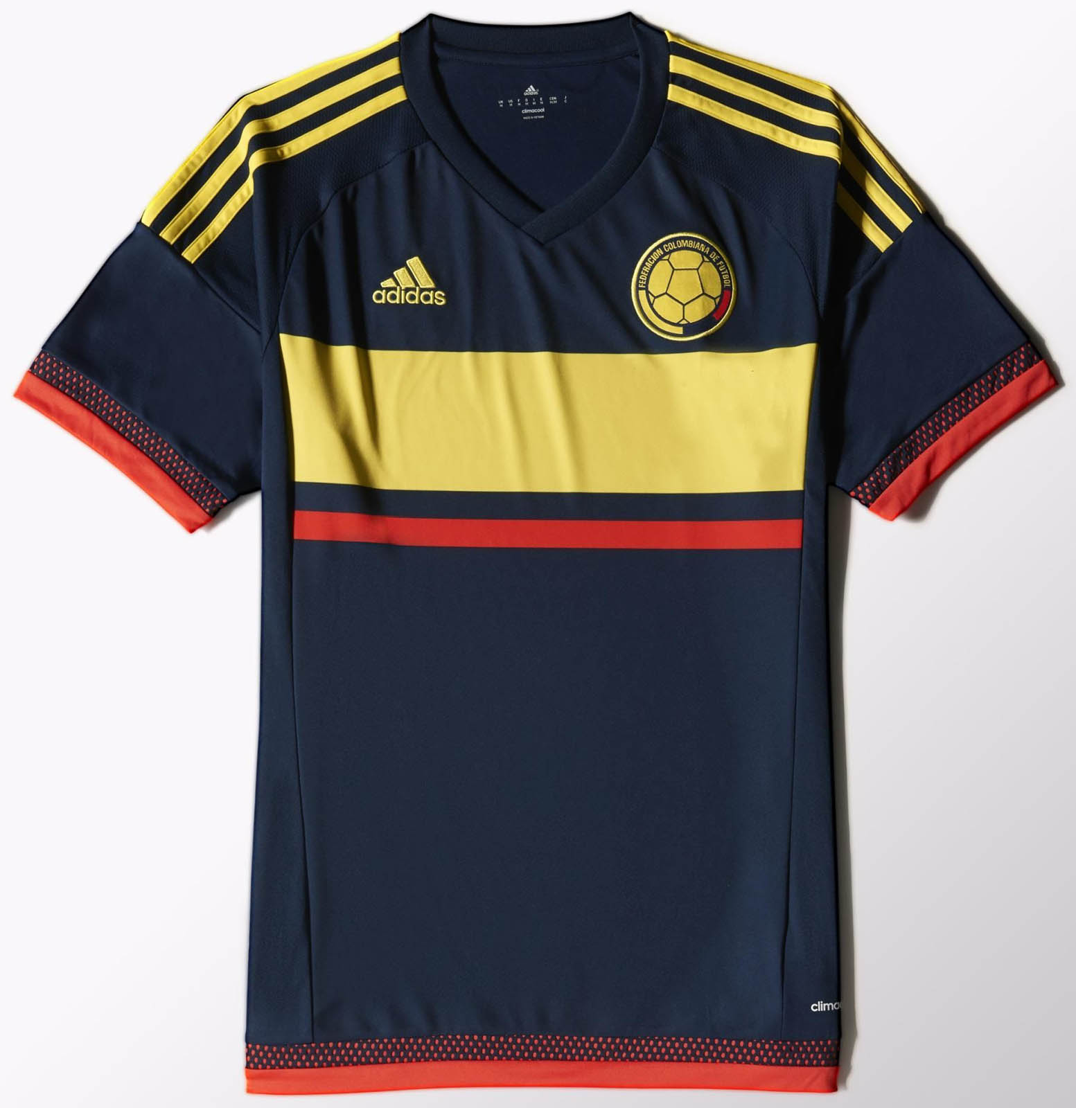
5) Colombia Away (Same as 2015)
Colombia’s away kit is a rather generic looking kit, the kind you would look to buy in bulk for a pickup league team. The kit itself isn’t terrible so that’s why it’s on the edge of the list, but it just seems like something I might wear in a local pickup league.
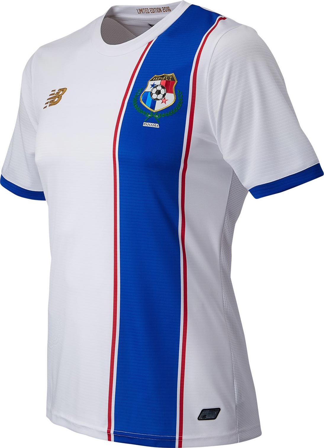
4) Panama Away
Similar to Colombia, Panama’s away kit isn’t terrible, just more generic than anything. The dark blue stripe down the front of the primarily white kit in an off-center fashion is a bit strange. But it seems like something Panama prefers, since they do something similar with their primarily red with white stripe home kit.
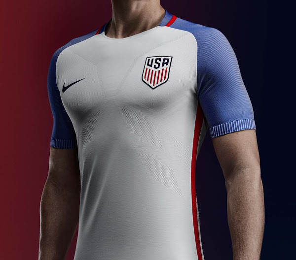
3) USA Home
Where do I begin? Well, considering that Nike is using a similar pattern with other kits such as England and France, there doesn’t seem to be much variety. For goodness sake, the France away kit is the same except the colors of the sleeves are reversed. I can only assume that this took Nike designers about five minutes to design, then figured it was good enough for most of their other kits because they must have had something later that afternoon. At least Nike didn’t completely screw up the home kit and made this kit red, white and blue. Unlike…
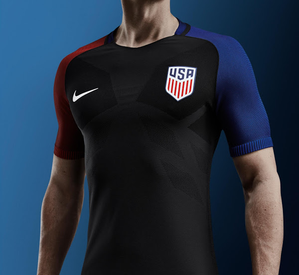
2) USA Away
So let me get this straight. Nike designed a primarily black kit for a country whose colors are red, white and blue and whose citizens are arguably the most patriotic country in the world. Not to mention Nike designed a black kit for a tournament that is going to be played in June. This is a prime example of how a brand can ruin a potentially great thing. I don’t know what was going on at Nike headquarters to believe that this was a good idea, but surely this was incredibly disappointing.
I expressed my feelings about this kit months ago and not much has changed. Sometimes you can warm up to a kit after you get used to it when you see it after a while. Yeah, that hasn’t happened either. It’s sad because Nike is finally selling USWNT kits with three stars in a men’s cut and I would have bought one. But because that started with this years’ kits and both kits look terrible, I guess I’m not buying one this year.
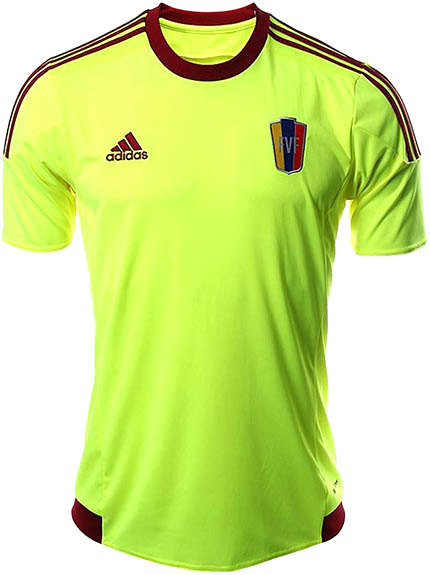
1) Venezuela Away (Same as 2015)
If there’s anything that will make sure you top a worst kit list, it’s making sure you dress as though you are the inside of a nuclear reactor. That is the case for Venezuela’s away kit as they take on the fluorescent green look. Along with a bit of maroon trim on the neck and the three Adidas stripes on the shoulders, Venezuela is making sure their players can be seen from far away.
