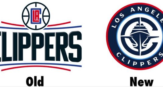
The Los Angeles Clippers unveiled a brand reboot Monday that earned mixed reviews from NBA fans.
The team introduced a new logo, jersey and court design that will be used next season when the Clippers move into their new Intuit Dome arena.
Fans generally applauded the new red jerseys, which feature a stylized cursive “Los Angeles” on the front.
BREAKING: The LA Clippers have revealed a new brand identity, including a new logo, jerseys, and court.
The rebrand will officially debut next season when they open their new $2 billion arena, the Intuit Dome. pic.twitter.com/yRq2PHiOYa
— Joe Pompliano (@JoePompliano) February 26, 2024
The new logo, on the other hand, did not fare well in the court of public opinion. Mike Beauvais won the Internet with his hilarious comment on X/Twitter: “I think the new Los Angeles Clippers logo is cool. You’ve got a basketball indicating the sport they play. You’ve got a ‘C’ that stands for Clippers. And you’ve got a cruise ship that represents all the vacations they go on every May when they exit the playoffs early.”
I think the new Los Angeles Clippers logo is cool.
You’ve got a basketball indicating the sport they play.
You’ve got a “C” that stands for Clippers.
And you’ve got a cruise ship that represents all the vacations they go on every May when they exit the playoffs early. pic.twitter.com/kUknm2UTmP
— Mike Beauvais (@MikeBeauvais) February 26, 2024
Even fans who didn’t hate the new logo pointed out it looks nothing like one of the old clipper ships that inspired the team nickname. Instead, it looks more like a cruise ship, or a warship.
Some fans loved the new logo design. But those fans seemed outnumbered by those who cracked jokes about it.
Rebranding a professional sports team is very hard to do while keeping fans happy, but the Clippers seemed to address the most popular desires of the fanbase:
1. Brought back script lettering
2. Brought back red
3. Completely redid the primary logoWell done, @LAClippers. pic.twitter.com/65YKKQiPDZ
— Joey Linn (@joeylinn_) February 26, 2024
new clippers alternate logo is sick pic.twitter.com/tUIdQYSIAW
— Molly Morrison (@mollyhannahm) February 26, 2024
Good riddance to that horrible nested LAC logo that should have never seen the light of day to begin with.
Love it when a team’s brand actually leans in to its nicknames imagery. https://t.co/GsmMDUwPVZ
— Lemur Femur (@lemurfemur) February 26, 2024
“Let’s be the Wizards but throw a boat on it” https://t.co/QWdUVB7or8
— Tom Haberstroh (@tomhaberstroh) February 26, 2024
Logo isn’t that good, but I’m so relieved that the rebrand didn’t suck that I’m willing to let it slide https://t.co/IeLLImE5nJ
— Μιχαήλ 🇺🇦 (@EchaisInErais) February 26, 2024
This is one of the best rebrands I’ve ever seen. Love the logo and that it actually has something to do with their team name. Going back to the cursive jerseys is also a great move. Whole look feels timeless. A+ https://t.co/S4rFLt0ddF
— Cory Swainston (@coryswainston) February 26, 2024
jerseys are fire but are they running a cruise? https://t.co/o5j5R4oHSq
— jack (@TheCavsJack) February 26, 2024
Jerseys ain’t bad but logo looks like one of a life insurance company tho https://t.co/P9lTdWgDxm
— 🥇 (@DaveClegane) February 26, 2024
the jerseys are clean but the logo looks like a cod clan emblem https://t.co/ze2WkumKoH
— Zain (@zain_gogh) February 26, 2024
[Mike Beauvais; Photo Credit: Los Angeles Clippers]


