
The 22nd MLS season is upon us and that means we are going to see some new kits this season. Unlike the Premier League, which has newly designed kits every season, MLS operates on a two-year cycle for all kits. This is designed so every team gets to release one kit before every season and alternate between a new primary and secondary kit, with expansion teams Minnesota and Atlanta releasing both.
With that, we rank the top five best and five worst new kits of the upcoming 2017 MLS season.
Top five best new MLS kits
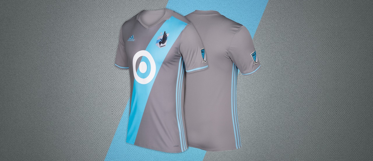
5) Minnesota United Primary
Normally, an primarily gray kit would look horrific but Minnesota has pulled it off. Incorporating a diagonal stripe that’s sky blue, Minnesota United combines a modern color scheme onto a traditional kit design. The Target sponsor logo may cause problems in future designs, but it’s not as much of a distraction here as it could’ve been.
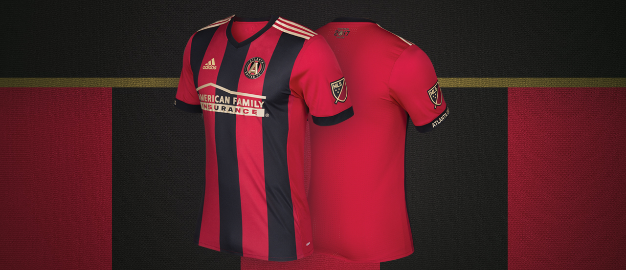
4) Atlanta United Primary
Continuing the trend of expansion teams, Atlanta United does just a bit better than their expansion counterpart with this red and black stripe vertical kit. The red and black color scheme is similar to Arthur Blank’s NFL team, the Atlanta Falcons, but is different enough to give Atlanta United its own identity.

3) Orlando City SC Primary
The only team with purple as its primary color, Orlando City has a distinct advantage of making some of the most unique kits in MLS. They didn’t make too many changes to their original primary kit, but the denim detail in this kit is a nice and subtle touch.
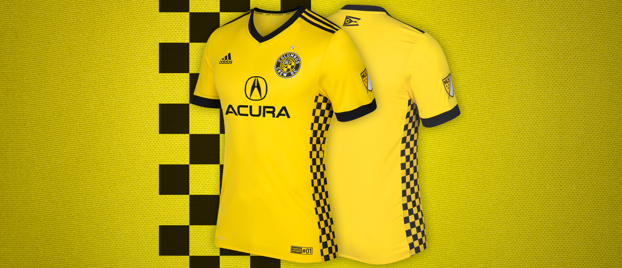
2) Columbus Crew SC Primary
In addition to “most improved,” Columbus Crew SC is back with a vengeance with their new kit. Their all-black secondary kit is one of the best in MLS and they finally got to change their hideous “flag” inspired mess of a kit with something they had for years. In addition to a new kit sponsor in Acura, Columbus is looking more and more like Borussia Dortmund. And when it comes to kit design, that’s not a bad team to aspire to dress as.
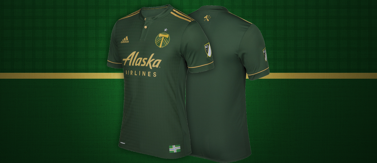
1) Portland Timbers Primary
One of my favorite MLS kits of all time is the Timbers’ third kit which had a retro feel and a modern look. Now that MLS is doing away with third kits, Portland decided to shift this classic look to their primary kit, while making a faint plaid pattern on the front of the kit. This is near perfection and I’m glad we’re going to be seeing this for the next couple seasons.
Top five worst new MLS kits
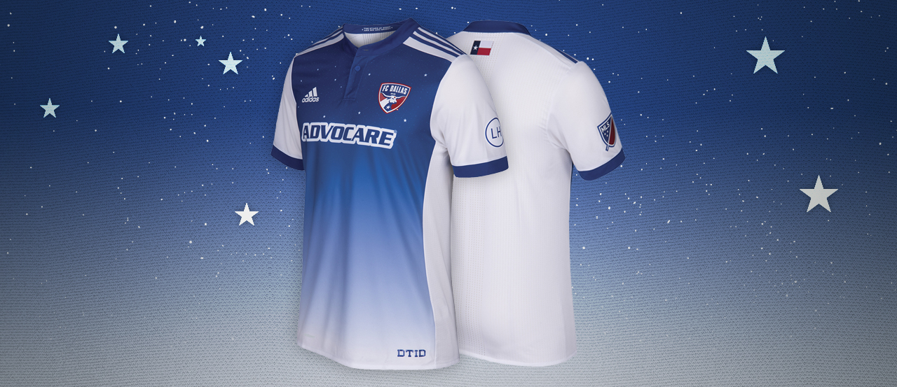
5) FC Dallas Secondary
I really wanted to like this kit, but there was just something missing. Taking an homage from the classic song, “Deep in the Heart of Texas,” FC Dallas actually had a great idea to design a great-looking kit. The issue was that they stopped about halfway through. The front looks great, but I would’ve loved to have seen the entire kit look like this, instead of a white back. Though that could have been impossible for FC Dallas to do because a solid color back is needed to make sure the numbers on the back stand out.
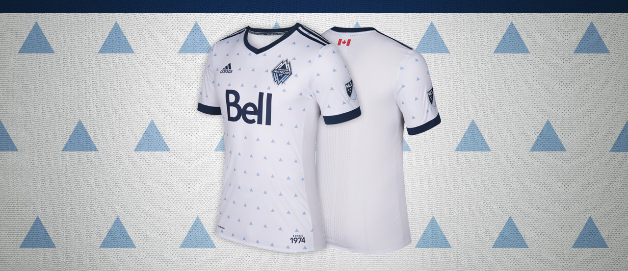
4) Vancouver Whitecaps FC Primary
The small triangles kind of make this look like something you would wear at an ugly sweater party. Yes, it’s to symbolize the nickname of the team but it just seems unnecessary. Also, from about 10 feet away, the triangles look like dots and completely defeat the purpose of the design.
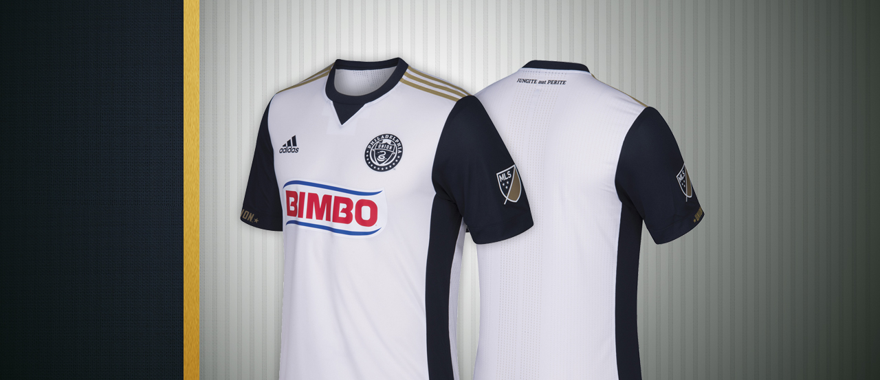
3) Philadelphia Union Secondary
I like the different looking crest to match the sleeves but the Union have a bigger problem. An easy way to design a terrible looking kit is when the kit sponsor doesn’t match with the rest of the kit. While some teams change their logo design for the kit and make it look better, Bimbo doesn’t seem to do that at all and the kit looks worse in comparison. That and I’m pretty sure some people won’t want to wear a kit that has the word “Bimbo” on the front, even if it is a bread company.

2) Real Salt Lake Secondary
BORING! Seriously, exactly how long did it take to design this? There are faint vertical stripes that make it a little bit better, but it really looked like Real Salt Lake just grabbed a bunch of plain white shirts on clearance from Adidas, slapped on a RSL crest and a Life Vantage logo and then charged $119 for an authentic kit. At least the primary kit looks way better.

1) D.C. United Secondary
I would definitely wear this if I got on my bike and went cycling. As a soccer kit, not so much. Whether it looks like tire skid marks or it’s an attempt to give a six-pack on the top half of one’s chest, this just seems like an incomplete idea that would make for an awesome looking kit when completed. Some people may love this, but it’s just not for me. I’ll go for the iconic black primary kit.
