
On the heels of a new Premier League season, the transfer activity has been a bit underwhelming this summer. Nevertheless, one aspect of the summer than can always be up for debate is the kit launch for every team.
Everyone tries to come out with the best looking shirt. Some succeed and some don’t, but there’s no doubt we’ll be seeing these shirts in the 2019-20 Premier League season. We’re counting down the five best and five worst for this season.
THE BEST
5) Everton Away

This kit may divide opinion, but for some reason this salmon/coral color kit grew on me. It’s a color that’s pleasing to the eyes, but not typically one most teams use. And I learned that this was the color Everton wore for their first title in 1890-91. Who knew soccer teams were so fashion conscious back in the 1800s?
4) Brighton and Hove Albion Home

The traditional blue and white with stripes, Brighton’s home kit has a similar feel with the rest of their home kits, but this one has an edge. The blue pops as the colors shift in a “V” pattern down the front with the white stripes. It’s a light detail, but it made all the difference.
3) Burnley Away

Burnley’s away kit employs a modern look to a retro kit. An homage to the home kit from the early 90s, Burnley did a great job incorporating their kit sponsor and crest onto the color scheme of the shirt. Changing the color of the crest may be deemed sacrilege to some, but it matches the shirt and turned it into a great looking kit.
2) Liverpool Home
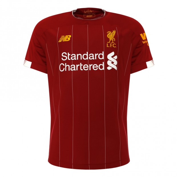
If we counted goalkeeper kits, I would’ve made Liverpool’s black and gold goalkeeper kit first. We’re not, but Liverpool’s home kit is very nice as well. Inspired by their 1982-83 First Division winning kit, Liverpool brought back the pinstripes that they used to have in the early 80s.
1) Arsenal Home

Arsenal’s kit is magnificent. Adidas is back with Arsenal after a 25-year absence and let no detail go overlooked. My favorite detail may be the striping on the ends of the sleeves and the collar, as it incorporates and allows Adidas’ traditional three stripes to blend in seamlessly. There may be questions on whether or not Arsenal makes the top four, but at least they’ll look good.
THE WORST
5) Manchester City Away
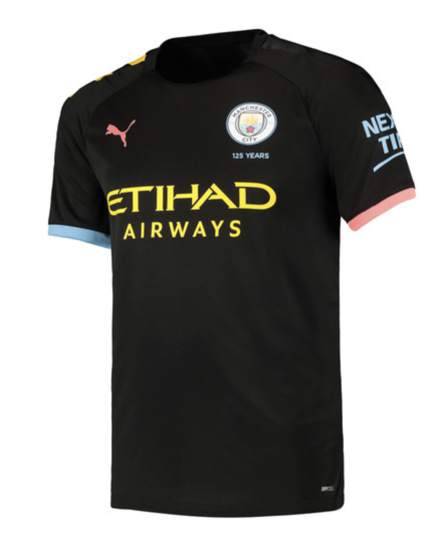
There’s a lot going on this Manchester City kit which is an homage to the legendary Hacienda nightclub. I just feel the colors clash a bit too much which might not be my thing, but could look great for someone else. So I get why Puma went along this route and won’t blame anyone for thinking this kit is one of their favorites, it’s just not for me.
4) Liverpool Away
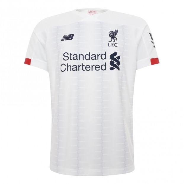
This looks like a Tottenham home kit. It’s obviously not and there’s a faint pattern on the front to prevent the shirt from being completely white, but I could confuse this for a Spurs home kit if I was 10 feet away. It also doesn’t help that there’s a half red stripe on the sleeves and the numbers are red. Makes for a jarring visual that isn’t a hit for New Balance.
3) Watford Home
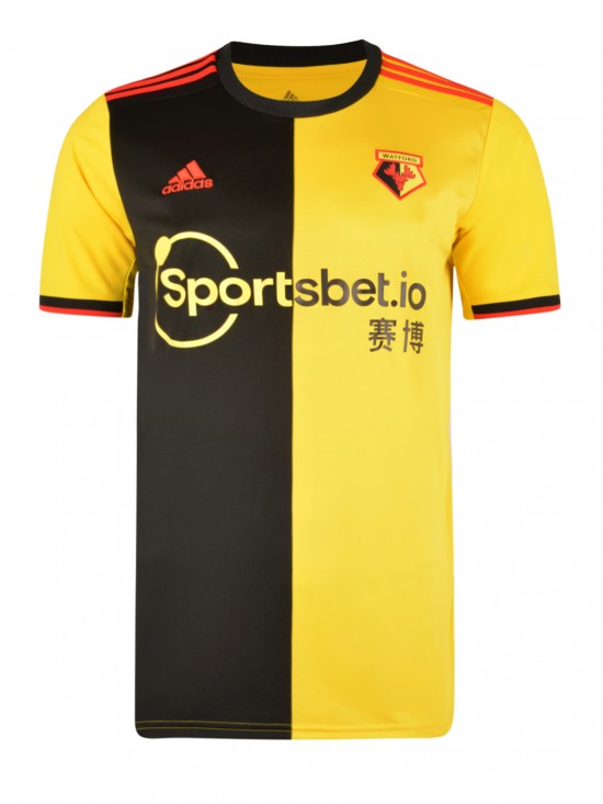
Watford has incorporated yellow and black into their home kit since last season. Last season was a yellow with black stripe setup. This year, Adidas has split the kit in half vertically with one side black and one side yellow. It kind of looks like Watford took a home kit and away kit from a few years ago and sewed it together like fans try to do in order to have a split shirt.
2) AFC Bournemouth Third
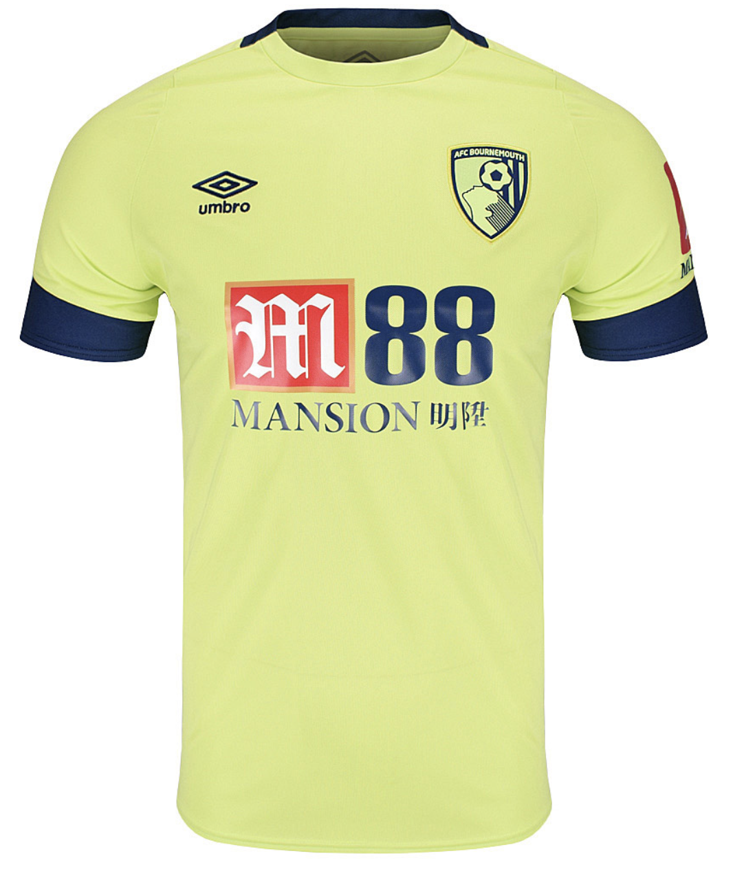
Some may call this color split pea green (officially called Sharp Green). I call it baby puke green and any kit that has this color usually falls under the “worst” category. It’s disappointing because Bournemouth’s away kit looks so good and it’s really just down to a difference in color preference. Let’s hope Bournemouth will wear the away shirt more often.
1) Southampton Home
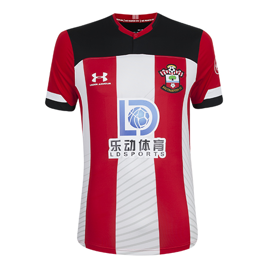
I don’t know whose idea it was to have black shoulders, but it’s a swing and a miss. It just gives an impression that the design is incomplete. Imagine if instead of black, the shoulders were red. It would be a much better looking kit as a result.
