Not long ago, I ranked every NFL alternate uniform set. Now, I’m taking it a step further: a ranking of the best 25 uniform sets in American major professional sports (excluding MLS — they wouldn’t fare well in this ranking anyway).
This was no easy task, and I started with 20 until extending it by five because I didn’t want to leave some teams out. There are still plenty of snubs, and teams that I felt weird about ranking too low. There are lots of good uniforms in sports!
An important note: I’m ranking teams’ entire current sets, not individual uniforms. While I love the Miami Heat’s “Miami Vice” alternate uniforms (and think they should go full to that color scheme), those alone weren’t enough to get the Heat on this list. A bad alternate or combination is enough to get bumped, though.
I leaned toward traditional and classic uniforms, because those tend to be the best. But there’s a smattering of modern sets, as appropriate. You’ll notice that NHL and NFL uniforms are tilted towards the top; that’s because those sports tend to produce the top-tier uniforms. (MLB has better depth of good uniforms.)
I don’t like pinstripes, but that doesn’t mean the Yankees were eliminated. Let’s get to it:
25. New York Rangers
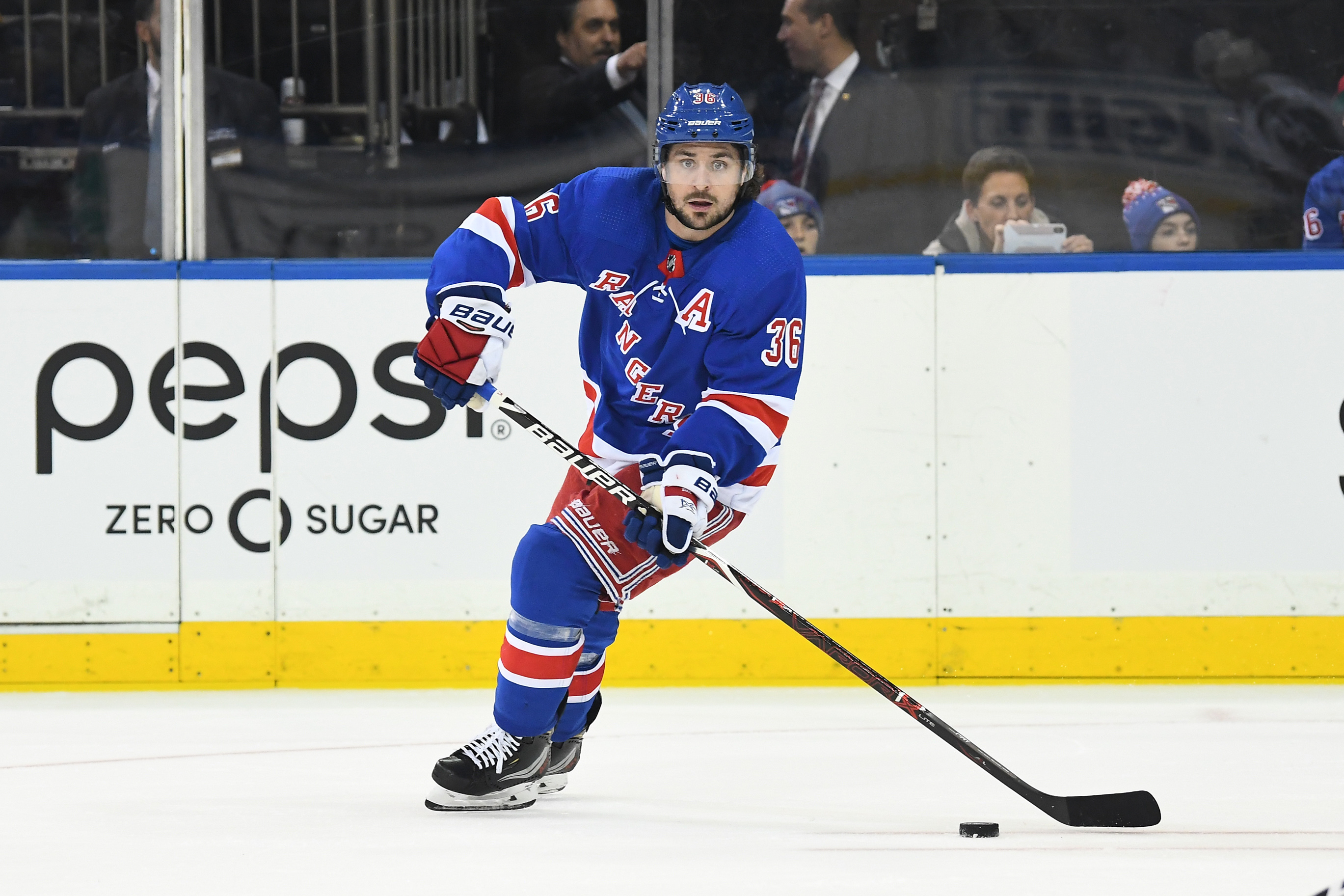
The first of five Original Six teams that made this list, the Rangers’ iconic diagonal lettering and pleasant drop-shadowing sets them apart from the many NHL teams that wear blue and red. I particularly enjoy their white road uniforms, which balance their colors nicely through shoulder coloring and consistent striping.
24. Minnesota Timberwolves
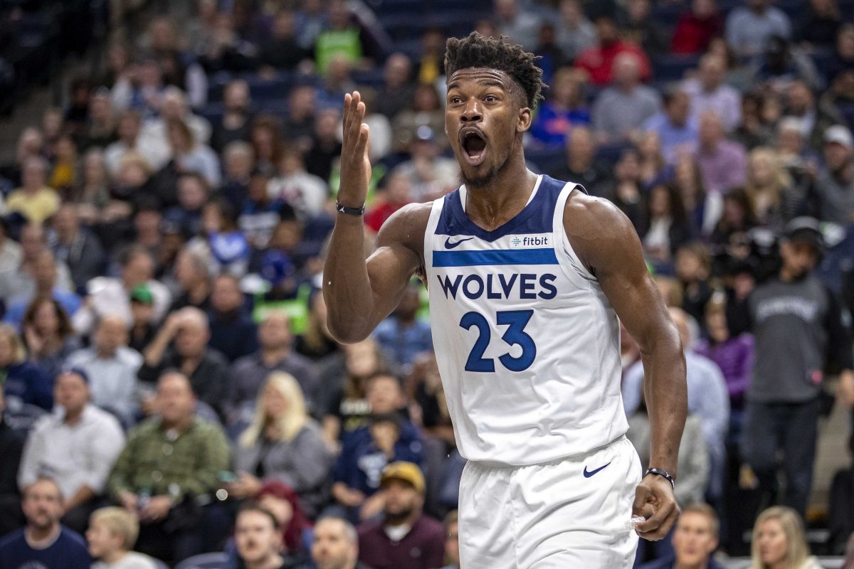
Since the Timberwolves moved on from the Garnett-era wilderness uniforms, they’ve been one of the best-looking teams in the NBA. The double shade of blue is unique and allows for the use of aggressive modern design elements. No other NBA team makes use of the shoulder area like the Wolves, and the pants striping ties the whole thing together.
Even the lime green alternates provide a nice contrast, though they are overly bright.
23. Baltimore Orioles

The Orioles do most everything right: the script across the front of the jerseys looks pleasing, the white-front hats set them apart, and their black-and-orange is the best version of that color scheme in sports. Both the orange and black alternate jerseys fit well. The cartoonish bird logo looks great, as cartoonish animal logos go.
22. New Jersey Devils
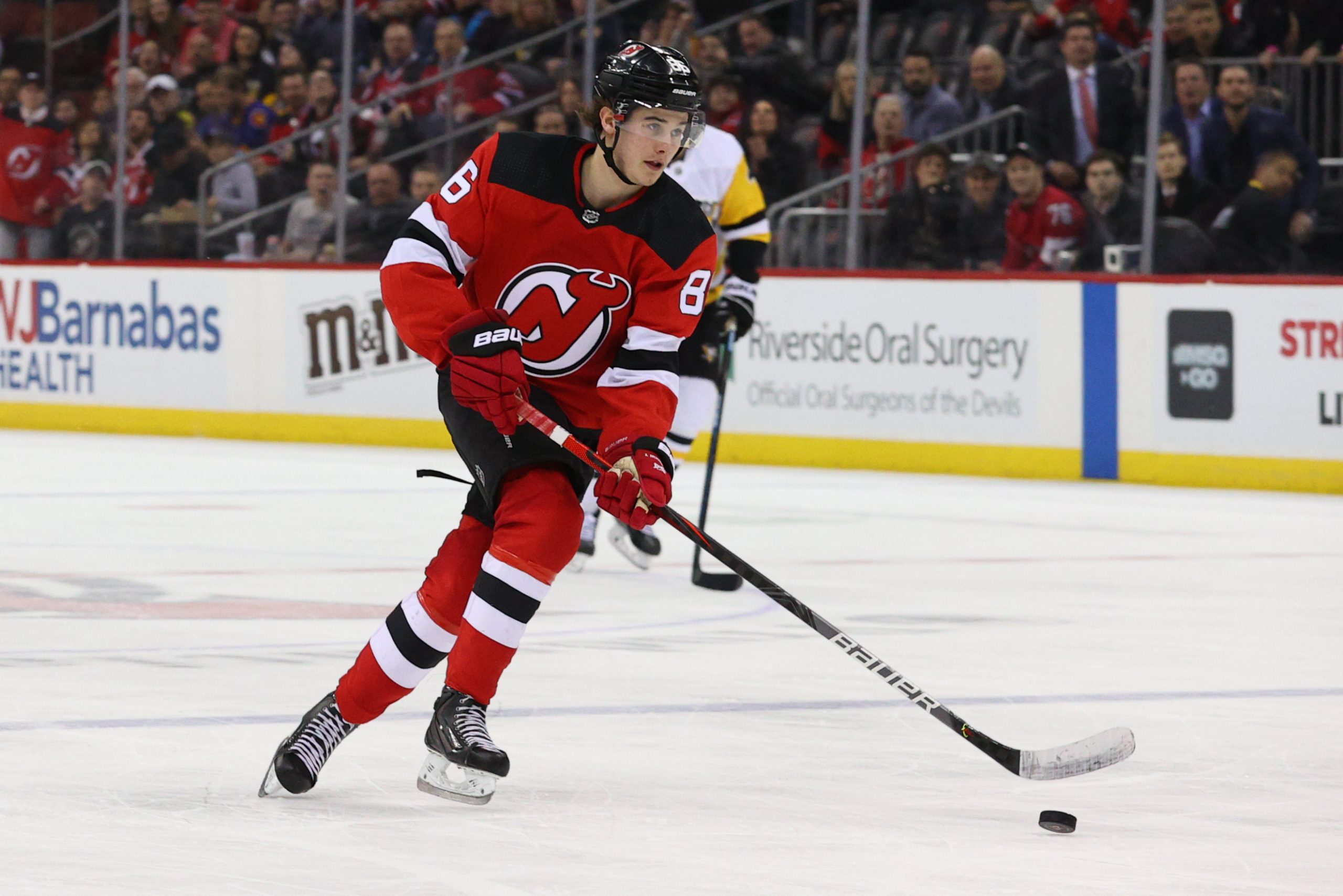
The Devils are a straightforward example of a good and simple hockey uniform. The “NJ” logo is clever and works well at the center of the jersey. The white-black-white striping on the red home is perfect, and the away uniform contrasts well. Very good work from the Devils, who are among a handful of NHL teams that prove you don’t have to be an Original Six team to have a great, classic-style uniform.
21. Kansas City Chiefs
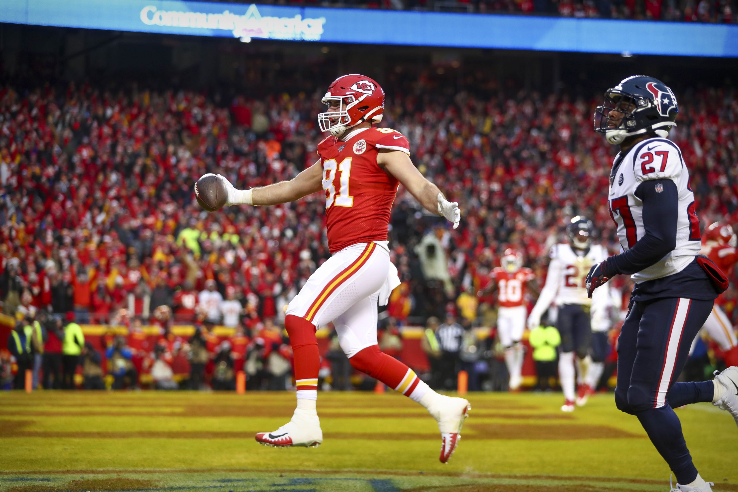
While I’m not enamored with the red and yellow scheme, the Chiefs do about as well with it as you can. Relegating yellow to a fringe secondary color is a good move, accentuating the red and creating simple combos (red-red-white, red-white-red) that work beautifully. The road set, with red pants, is particularly good-looking. Simple, consistent striping makes sure there are no worries of blandness.
I have never enjoyed their logo, and I wish there was some yellow accenting on the helmet, but that quirk has become charming over the years. After years of dealing with the Patriots’ unpleasant uniforms, I’m glad the team we’ll be seeing on the NFL’s big stage has a great set.
20. San Francisco 49ers
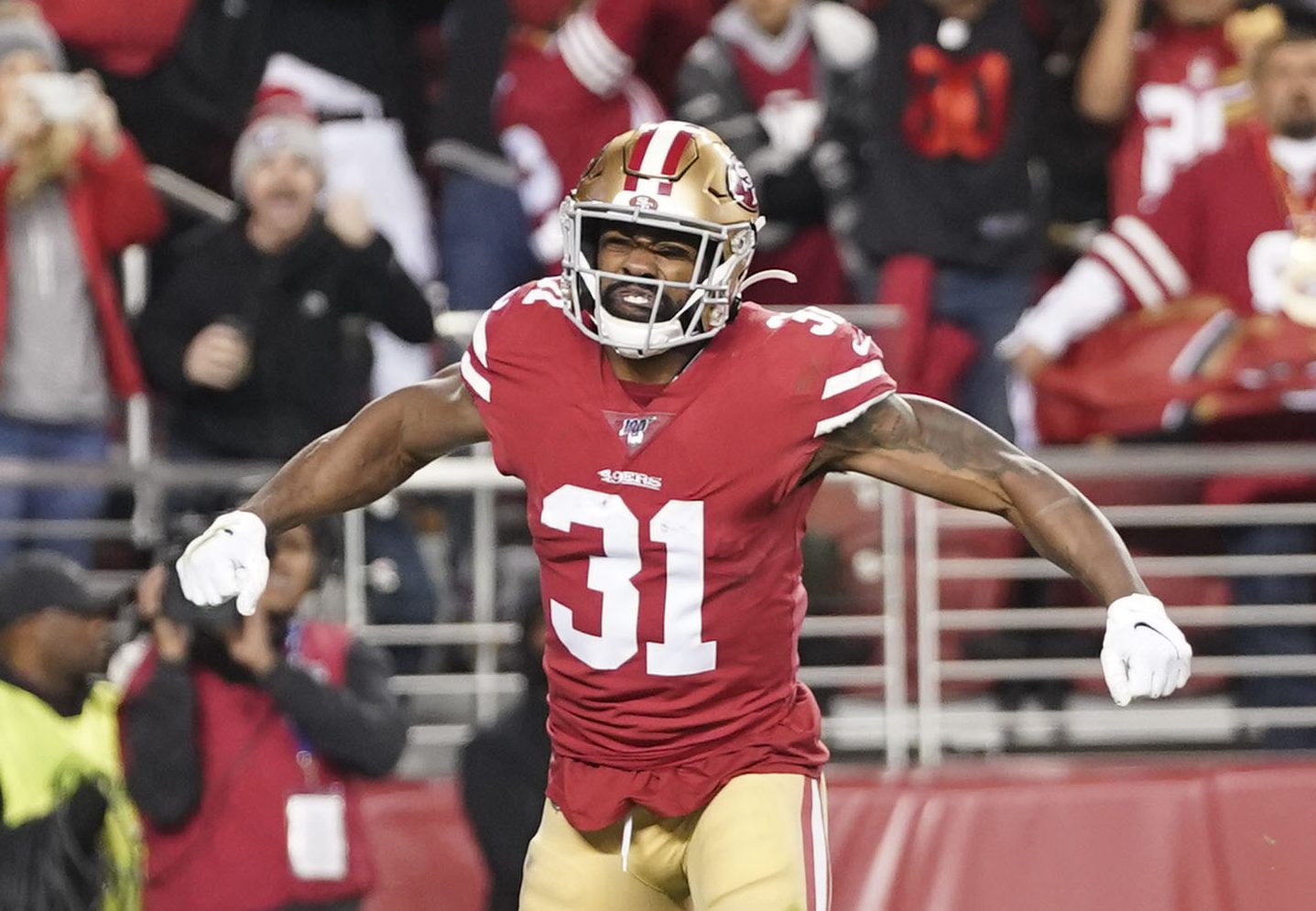
The Super Bowl, as you might be able to tell, was a very nice uniform matchup. (It would’ve been even better if the Niners were the designated home team.) The 49ers are the leading purveyors of not having a hint of their secondary color on the jersey, despite using it prominently elsewhere on the uniform. The lack of gold on the jerseys makes the whole thing look clean and put together. The all-white throwbacks are great as well.
19. Oakland Athletics
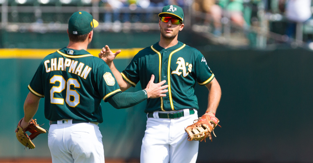
The best part of the A’s uniforms is their kelly green alternate, one of baseball’s best individual uniforms. But Oakland’s entire set isn’t far off. The green and yellow color scheme (underused across sports) is well-executed, with a script on the home and away and piping on the regular green and yellow alternates. Historically a paradigm of baseball uniform success, the A’s continue to be among MLB’s top tier.
18. Detroit Red Wings

Detroit’s red and white color scheme requires no bells and whistles. The precise shade of red they’ve made their own thrives without a non-white secondary color. The road uniform, with red on the arms and a single white stripe appearing a couple of places, is one of the best white unis in hockey. The logo is genius, as well.
17. Golden State Warriors
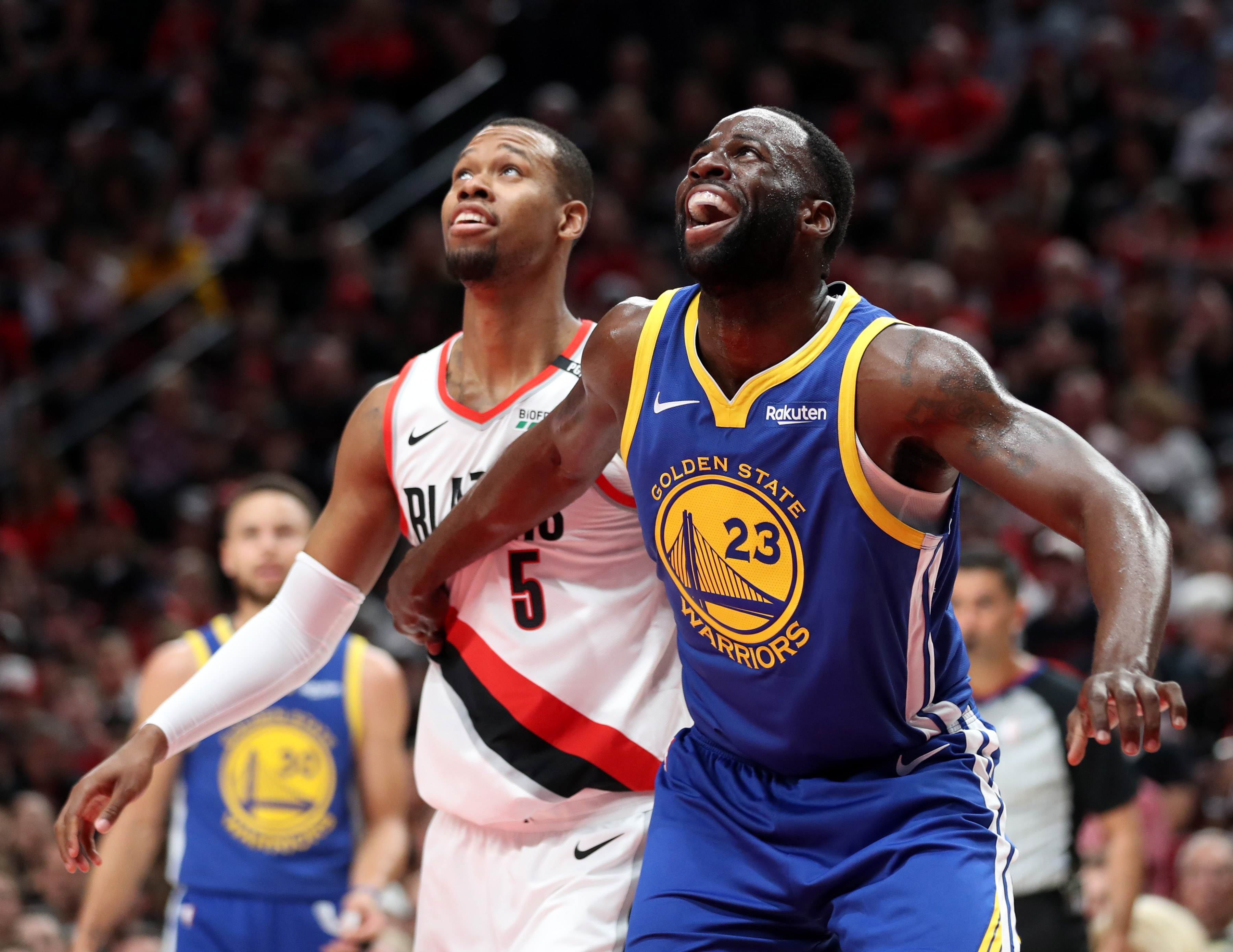
As with all NBA uniforms, the ad hurts. But the San Francisco Bay Bridge design in the center of the jerseys is beautiful, and the various alternates and classic uniforms they’ve produced have elevated the set as a whole. I’ve never been as big a fan of the black City alts that they’ve worn in various NBA Finals, but even that uniform has a nice set of colors and incorporates a similar design in the center of the jersey.
16. Philadelphia 76ers

My favorite part of the Sixers’ set is the white side panels on the blue design. Side panels are a dangerous game — there are many examples across sports in which they don’t work — but the Sixers execute it beautifully. The prominence of the color white, particularly on the blue uniform, lets red flourish as a secondary color. Add the cream City edition and you have one of the NBA’s best uniform sets.
15. Los Angeles Dodgers
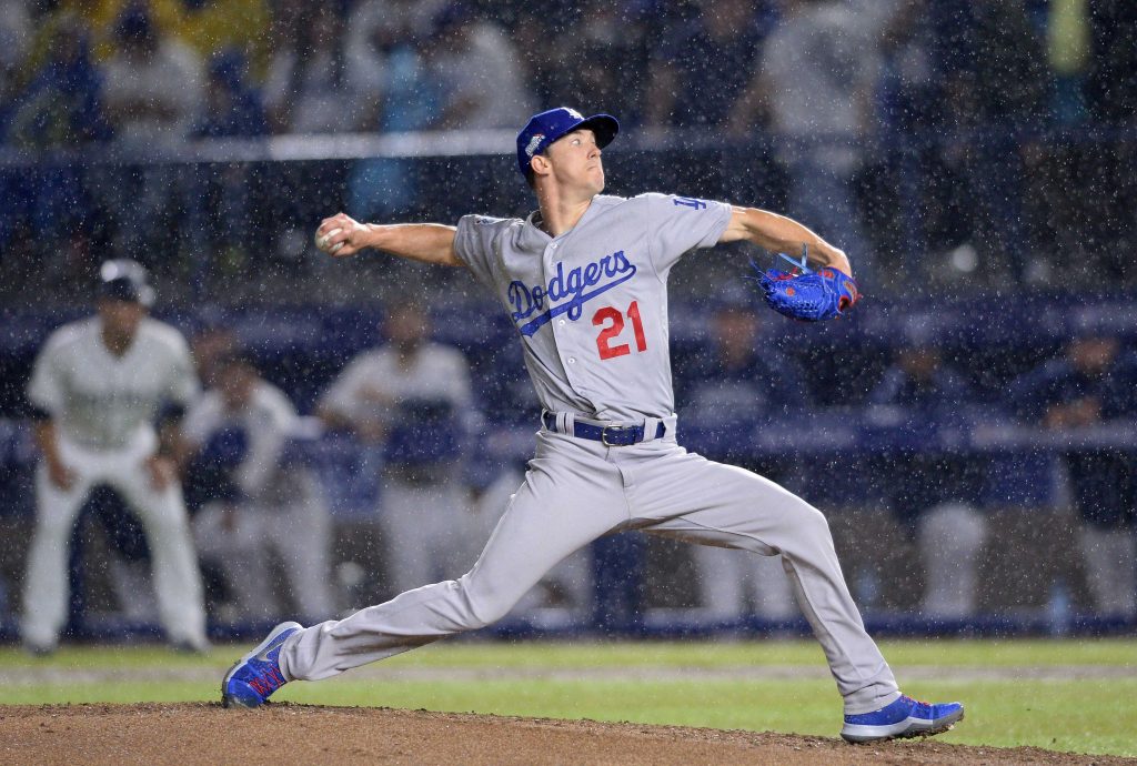
LA’s classic white and gray needs no explanation. The Dodgers’ script is the best cursive wordmark in the majors, and the red numbers are an endearing quirk that makes the uniform feel distinctive. The cap logo is wonderful as well. No reason to complicate: The Dodgers are top tier.
14. Las Vegas Raiders
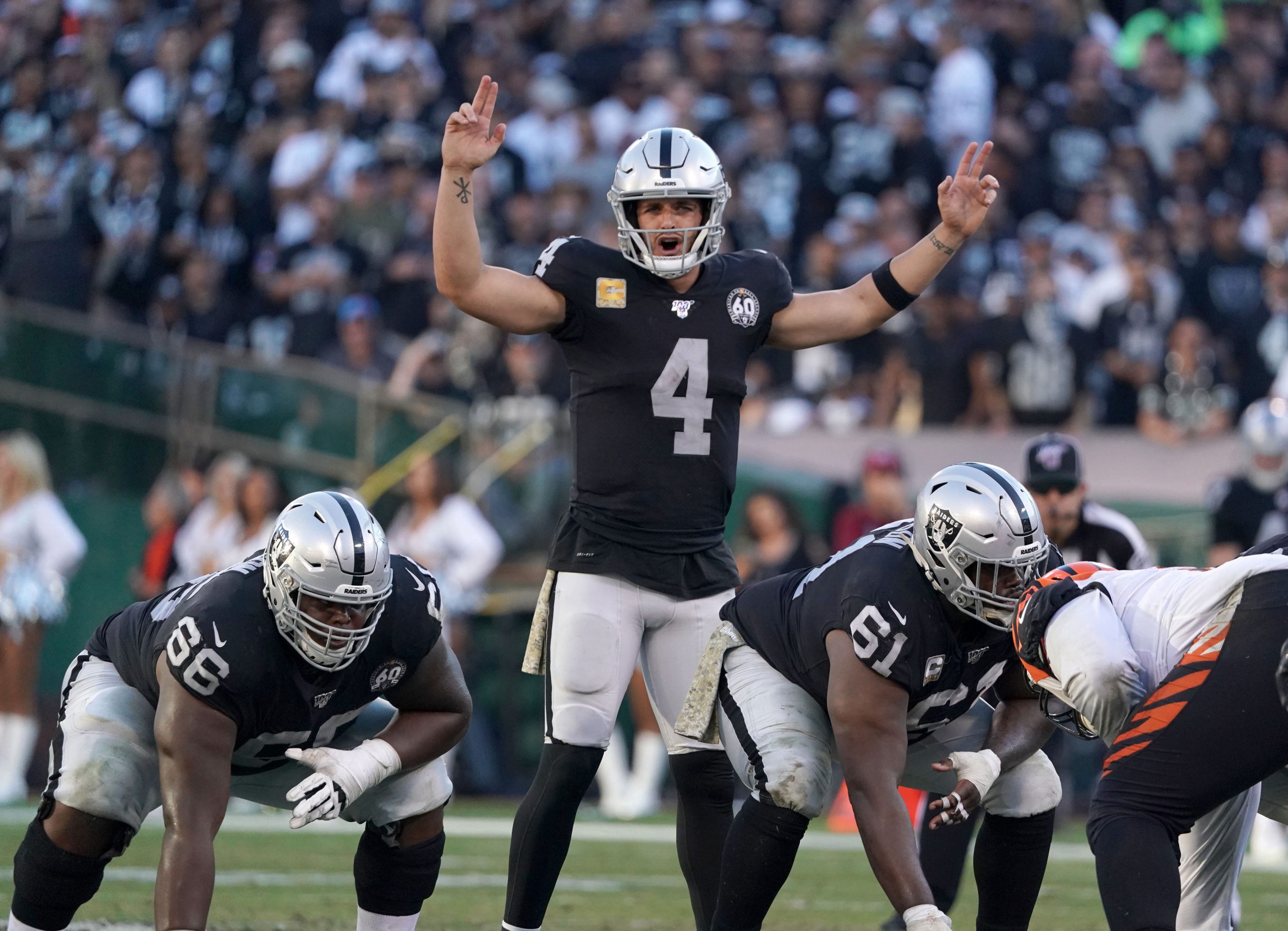
Regardless of where they’re located, the Raiders always have some of the best uniforms in the NFL. The silver-and-black color scheme is classic and fairly unique across sports. The combo of light color-dark color-light color is a great way to ensure a good football uniform.
13. Dallas Stars
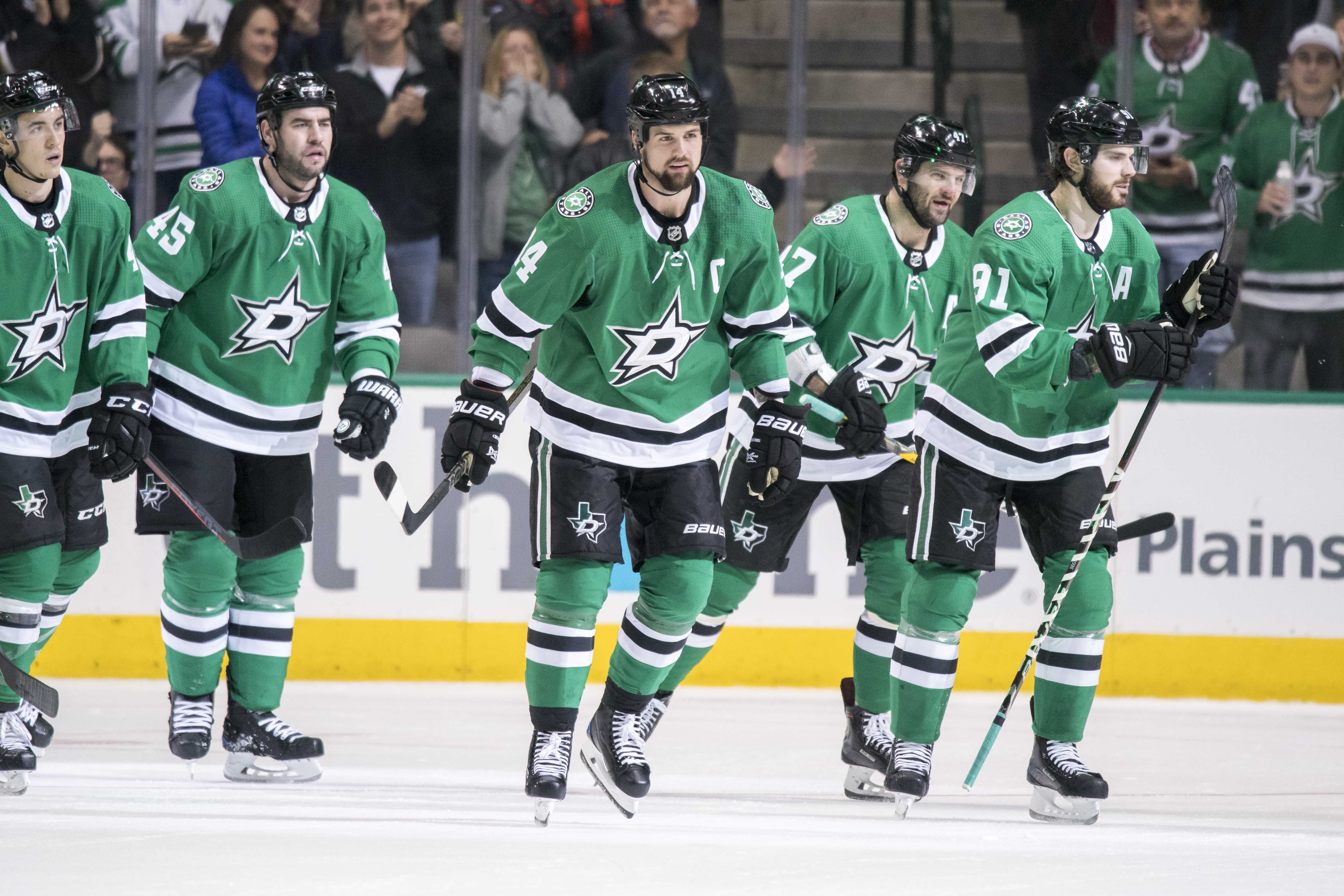
Since the Stars revamped their uniforms before the 2013-14 season, they’ve achieved something greater than aesthetic respectability: they’ve overtaken even some of the NHL’s best and most classic uniforms (some of which are below them on this list). While I’m unusually high on the Stars’ set, I find it hard to temper my praise.
Every element of their uniform is good. They use one of the best shades of green in sports. The white striping in places across the design (particularly on the pants) is a great way to go about accenting the simple black-green-black combo. The logo does everything it needs to, and it fits well on the center of the jersey. I’ll die on the Stars hill!
12. Toronto Blue Jays
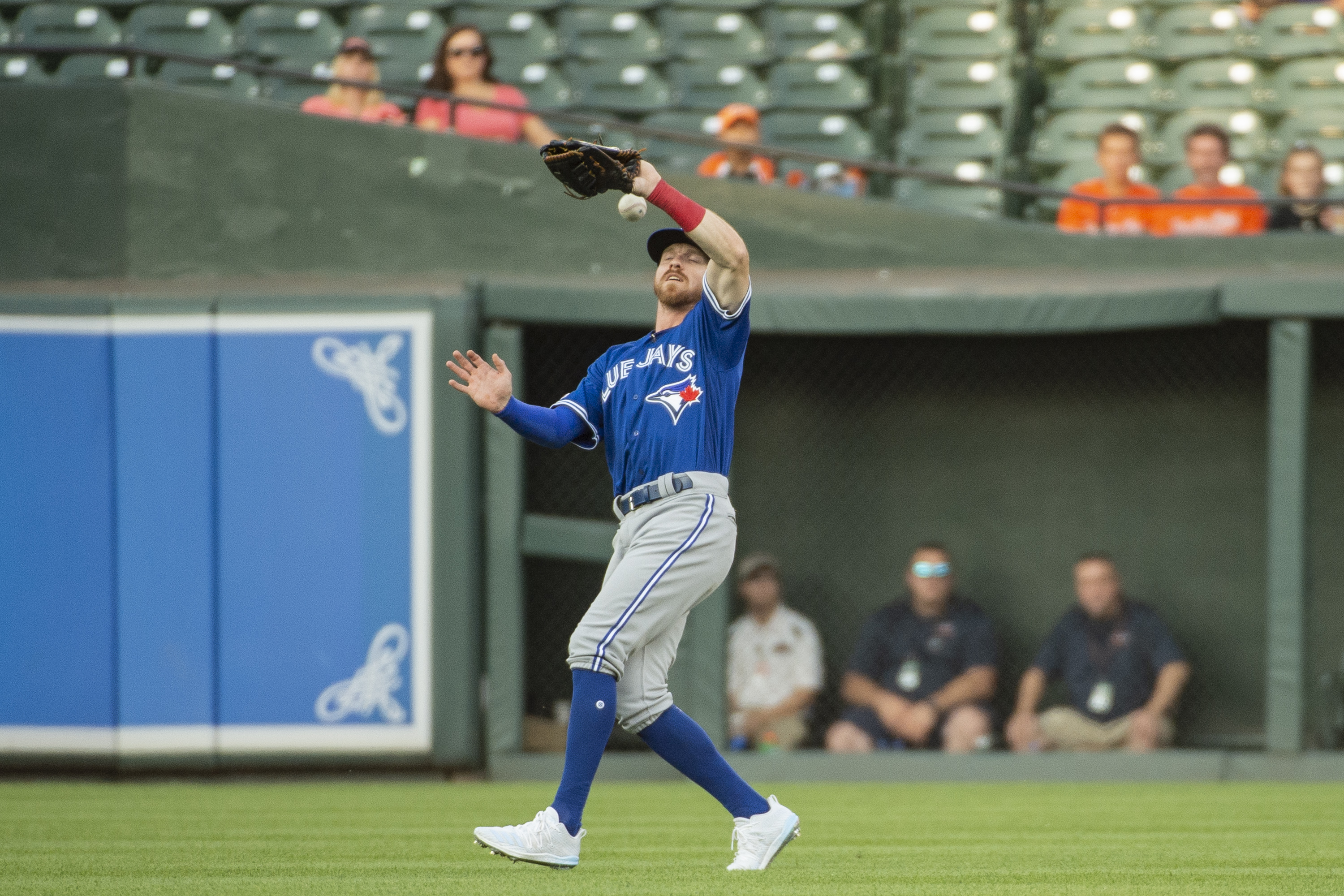
I’m not in love with the Blue Jays’ new light blue alternate (as a proponent of light blue use in sports uniforms, I would prefer teams simply wore light blue jerseys, rather than go all-light-blue), but overall, the Blue Jays are a great example of a modern baseball uniform. Their unique lettering and numbering gives them a special feel, and lets their two-color system work on its own. The logo, with the red maple leaf on the blue jay, is one of the prettiest designs in sports.
11. New York Yankees
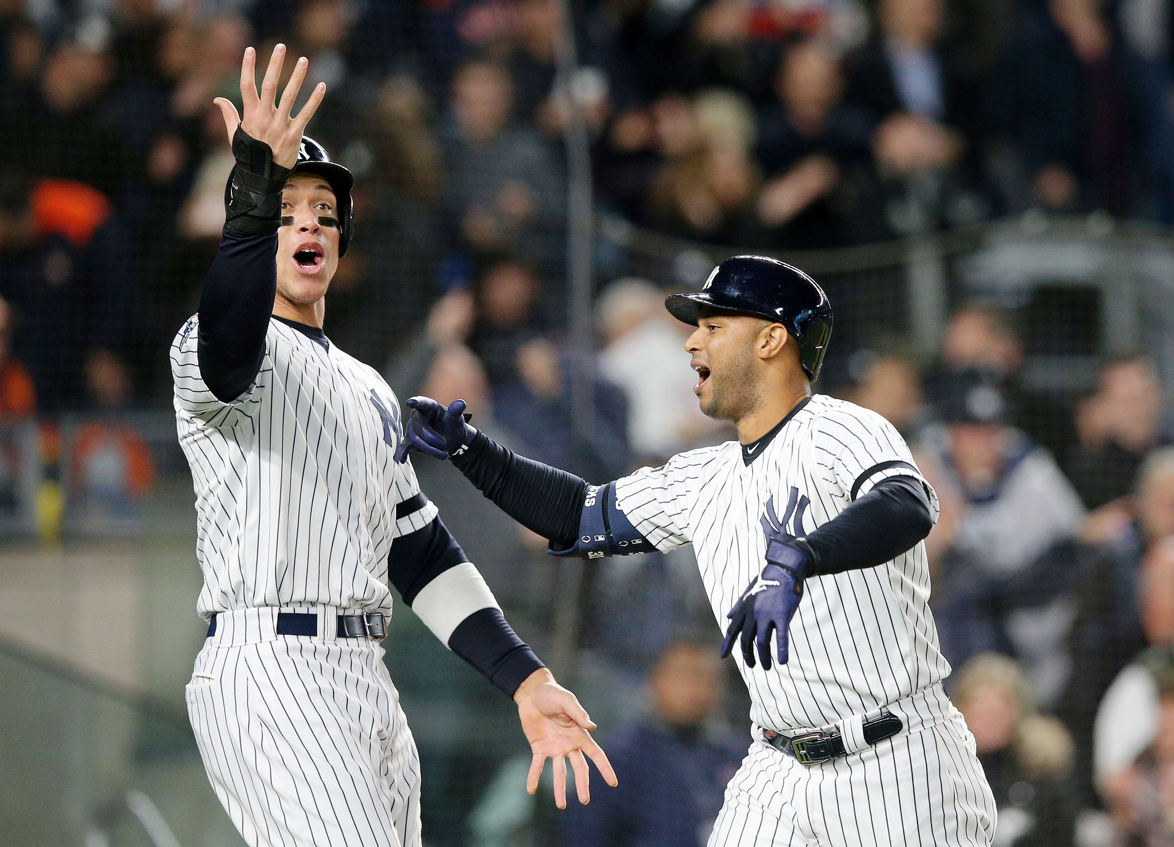
As mentioned in the beginning, I’m no fan of pinstripes. I couldn’t bring myself to exclude the Yankees, however, and had it not been for the Blue Jays’ all-blue alternate, numbers 11 and 12 would have been reversed.
The Yankees’ pinstripes in particular make more sense than any other, because they’re the Yankees and it just looks right. Their gray road uniform is also one of the best in baseball. It looks natural, as though gray is truly a secondary color and not simply the road uniform.
10. Chicago Bears

They’re not the best-looking blue and orange football team in the country (that honor goes to Auburn), but the Bears wear one of the best white uniforms out there. The blue-white-blue look contrasts their home uniform perfectly, and the striping on both the shoulders and the pants helps the colors drive the whole look. I ranked their orange jersey second among NFL alternates recently, and that look certainly helps their ranking here.
9. Florida Panthers
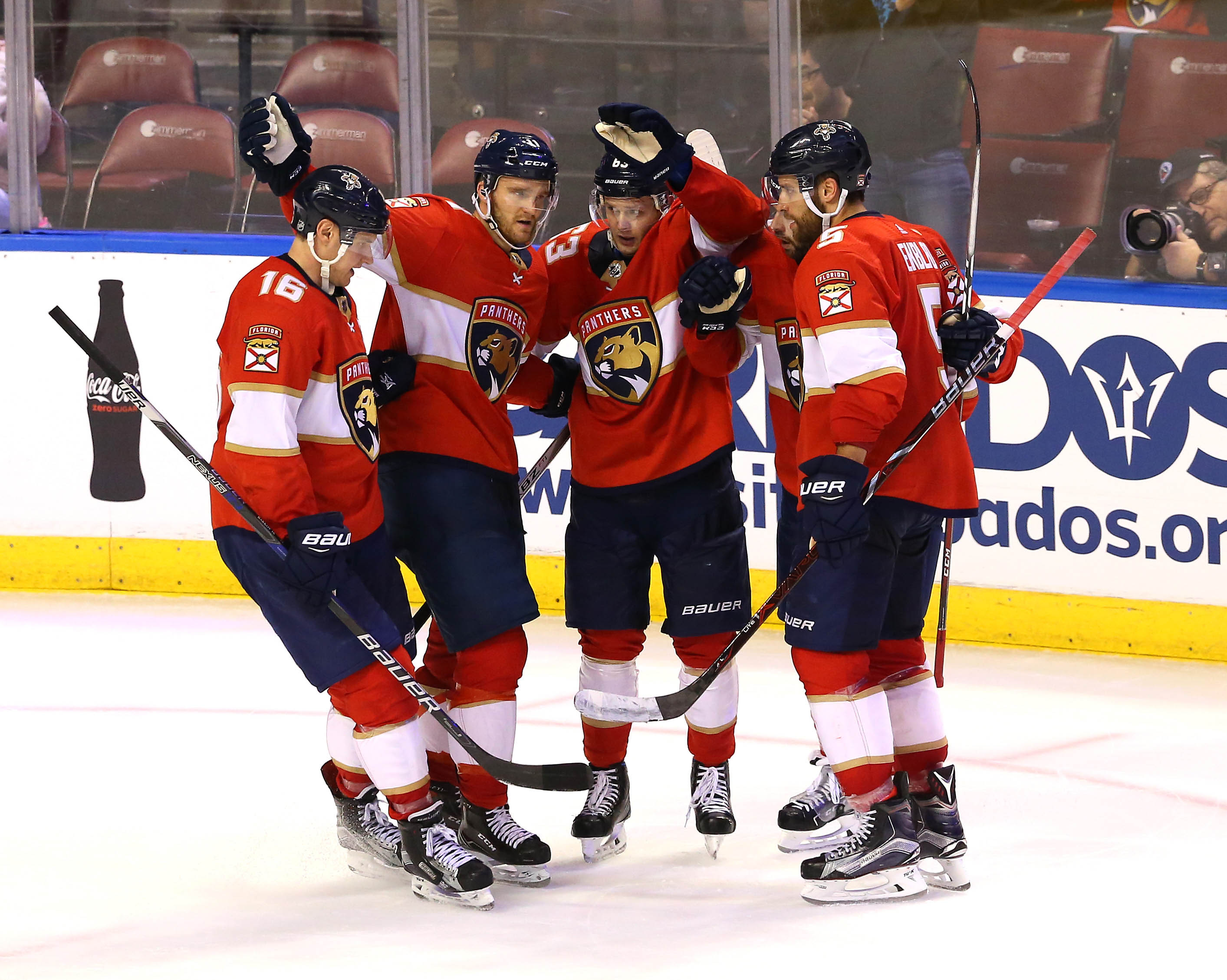
Much of what I said about the Stars applies here. The Panthers revamped their uniforms in the 2010s and came out with a creative, modern design that leans on traditionalist sensibilities. The crest-style logo is elegant and incorporates the third color of Vegas gold, a color that shows up on the uniform as well. Long live the thick chest stripe and Panther crest.
8. Toronto Maple Leafs
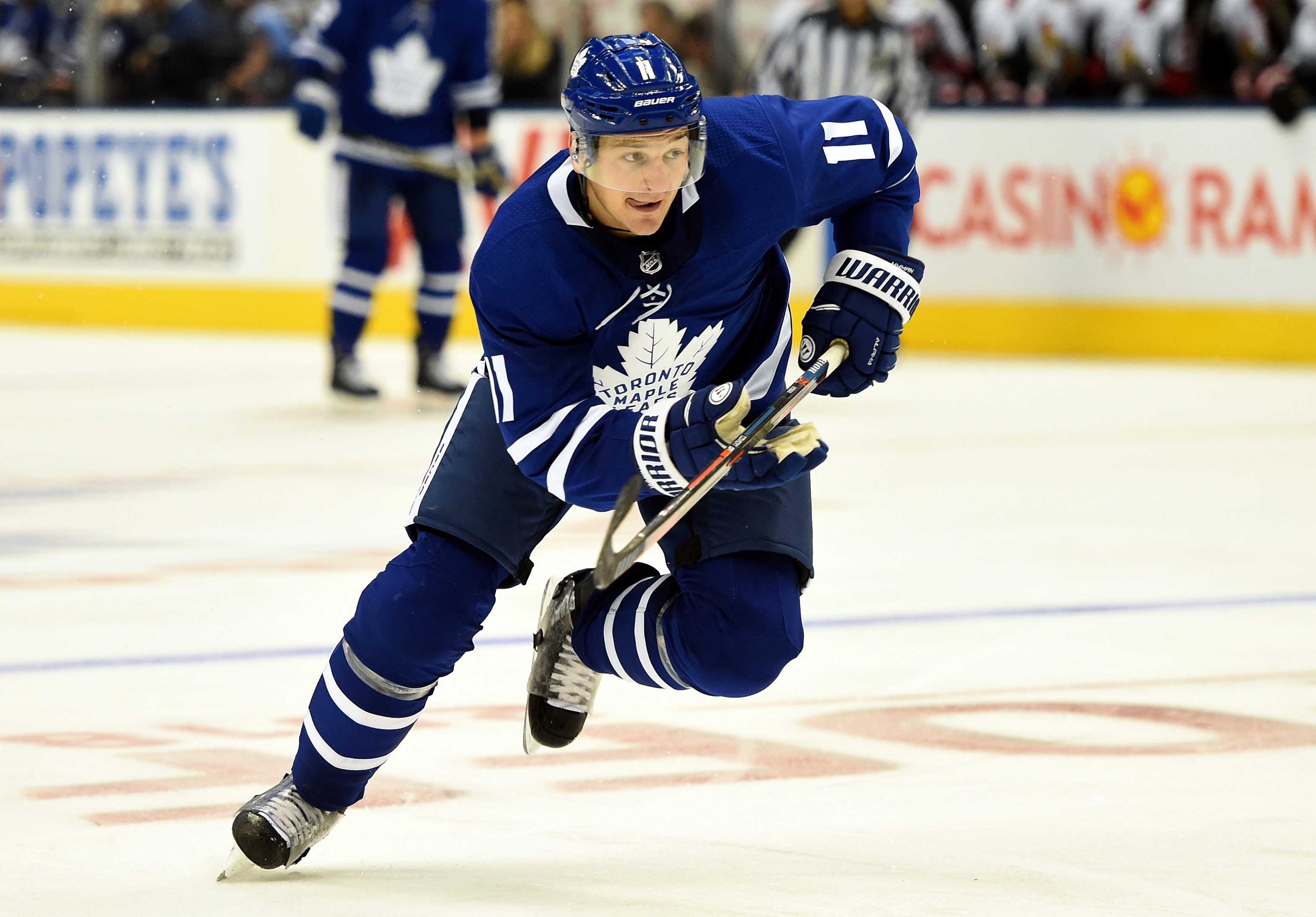
The classic Maple Leaf logo and pristine shade of blue guarantees the Leafs a spot high up this list. One factor, out of the Leafs’ control, hurts their chances of rising up this list: the Tampa Bay Lightning essentially plagiarized the Leaf’s uniforms, to the point where games between the teams look like an intrasquad scrimmage. My opinion of Toronto’s uniforms has been unduly diminished by Tampa’s lack of creativity. The Leafs still deserve their spot in the top 10.
7. Green Bay Packers
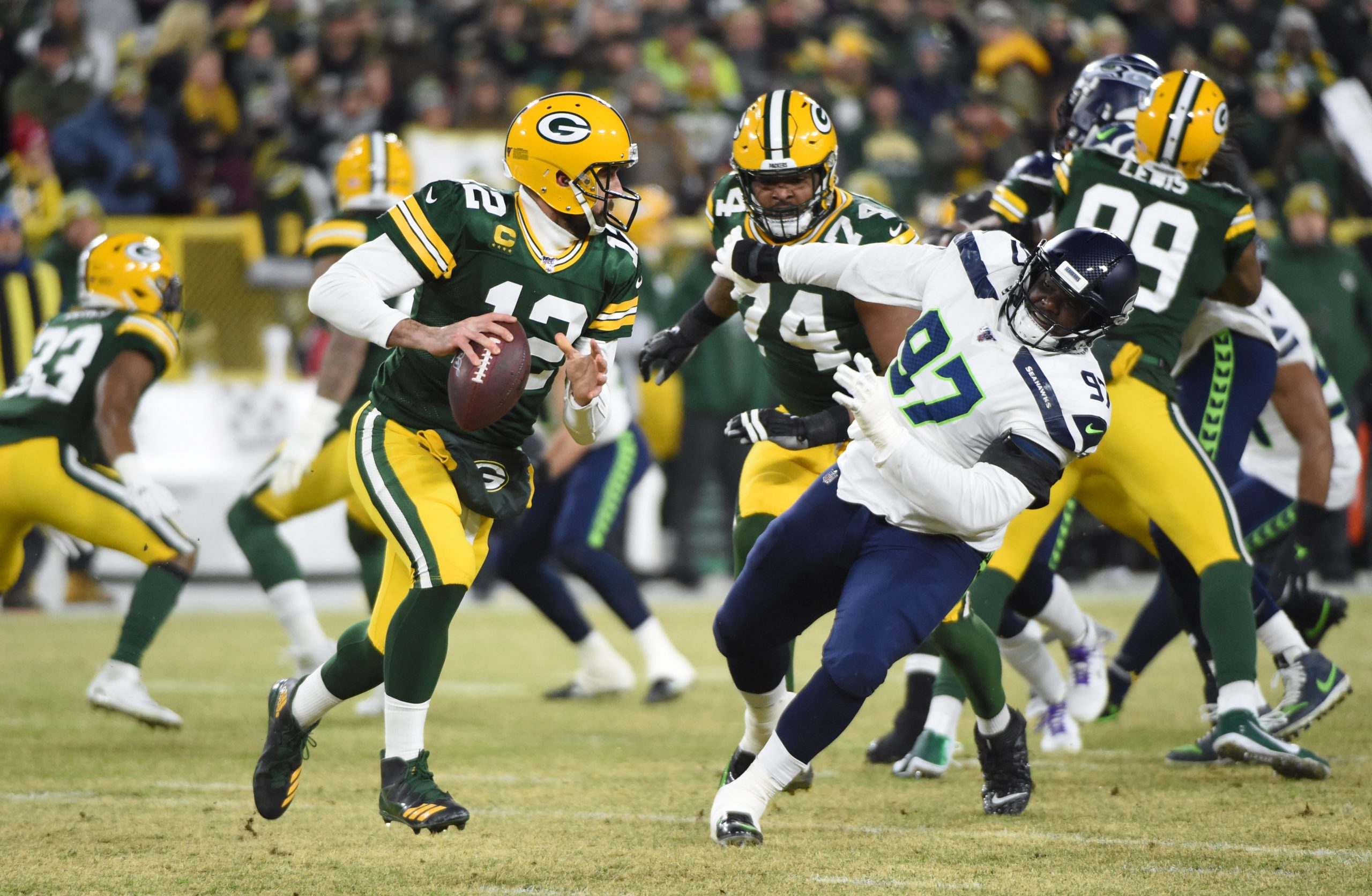
While I have never considered the Packers’ particular shade of green one of the best, every other part of their uniform puts them past most NFL teams. The helmet, with the gloriously simplistic “G” logo and green-white-green striping, is the NFL’s best. The yellow-green-yellow combination is the standard for football uniform design.
6. Pittsburgh Steelers
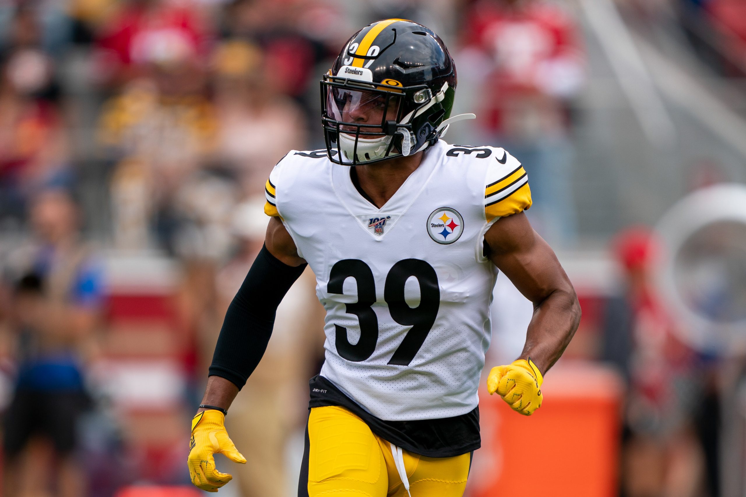
Every design element the Steelers use feels unique to them: the single black stripe on the gold pants, the striping on the shoulders, the gold line down the middle of the helmet, the small numbers on the front of the helmet. The logo on one side of the helmet actually is unique to them. Overall, the whole is greater than the sum of its parts. Black-black-gold is a beautiful combo, and the white version is even better. Great colors and great execution.
5. Chicago Blackhawks
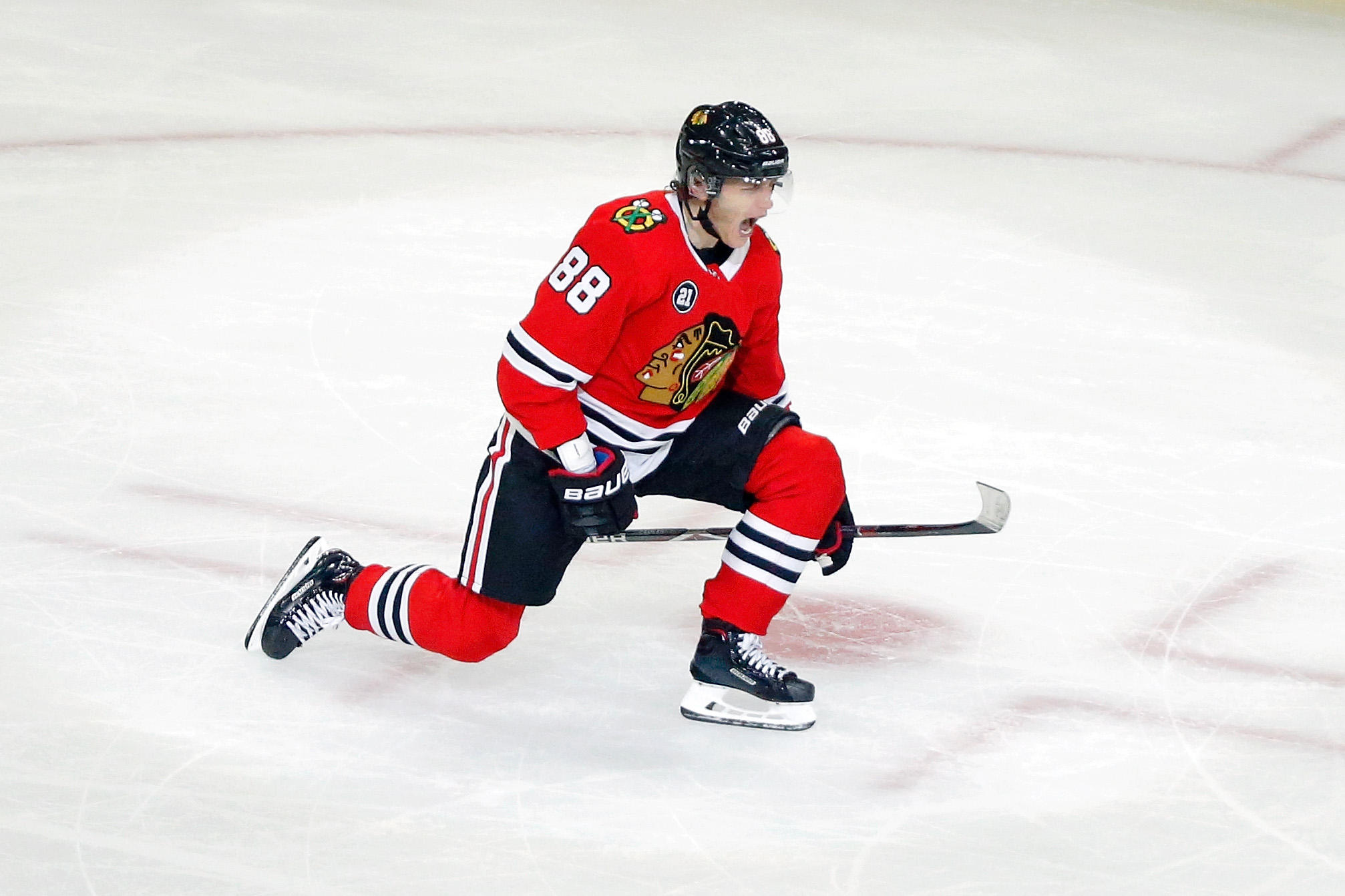
I don’t like the logo, and the use of a colorful secondary mark on the shoulders hurts the uniform, but everything else is flawless. I particularly like how they use white as a prominent striping color, on the bottom and arms of the red jersey, the pants, and the socks. It’s close to a flawless piece of the design. The white uniform is the best road look in the NHL. Something about how the white contrasts to the red home makes it look gorgeous.
4. Boston Celtics
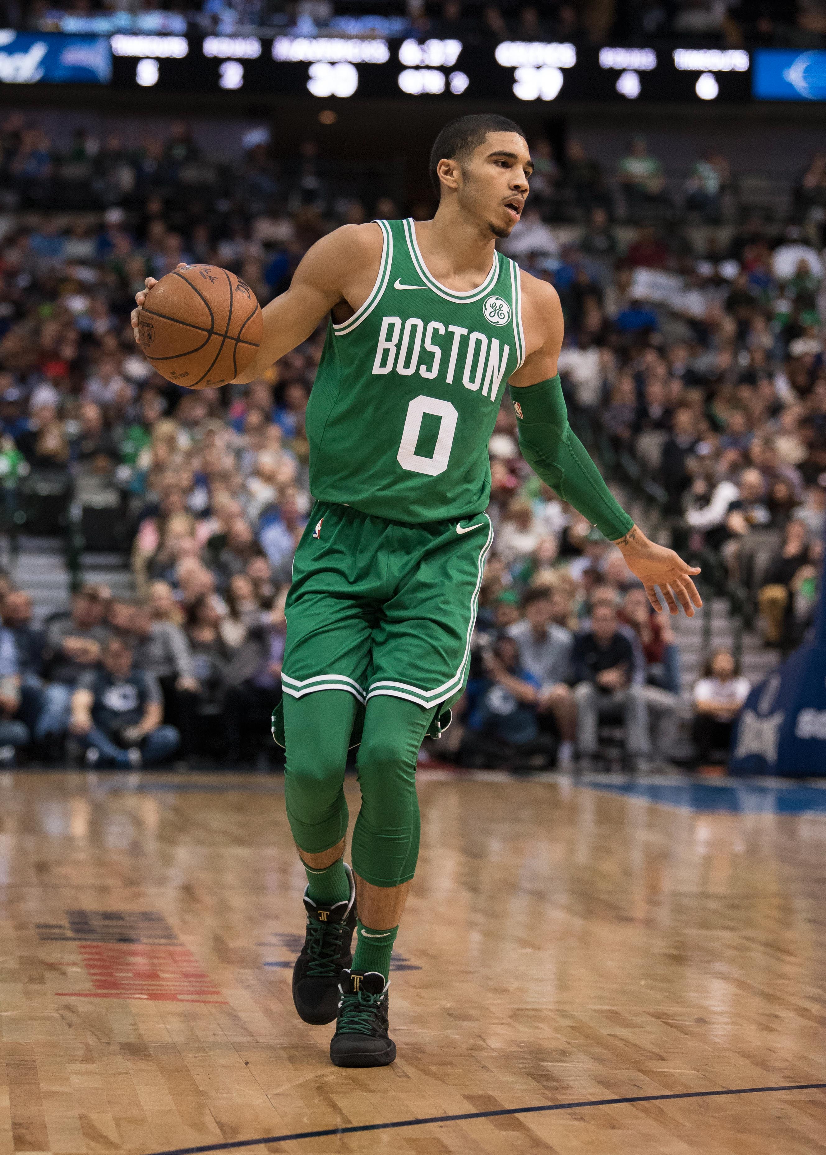
The Celtics love producing various alternates. By and large, those alts tend to be good uniforms. The only issue? They prevent Boston from wearing their beautiful white and green uniforms. The piping on the edges keeps everything simple and lets their particular shade of green soar, helped by the straightforward classic lettering. The Celtics make every game they play look good.
3. St. Louis Cardinals
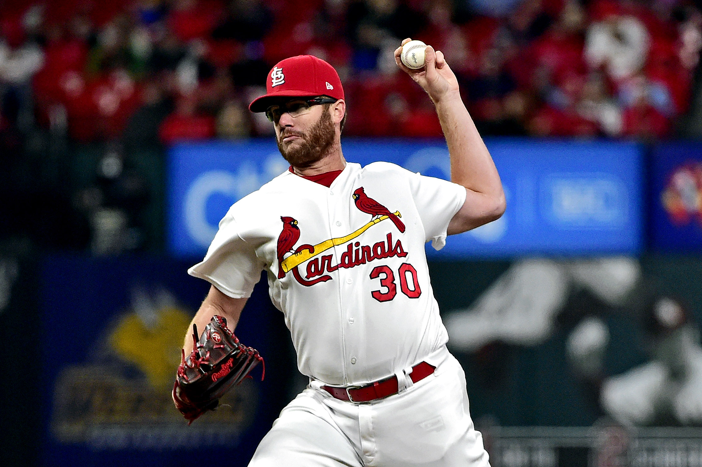
Baseball uniforms have a ceiling. There are limited design elements to work with, and unless you’re the ’70s Pirates, you don’t have the benefit of dealing with colored pants. The Cardinals overcome those inherent issues better than any MLB team. Their “Cardinals” script is perfect. No one uses a better shade of red. Their alternate blue cap is a great way to do a baseball alternate.
The best part, though, is the iconic bird-and-bat icon on the front of the jersey. It’s an incredible way of using the limited space you have on a baseball jersey. The yellow of the bat adds a splice of color. The cardinals perched on the bat are elegant in a way most sports uniforms aren’t. They’re beautiful, peaceful birds, not some fighting cardinal wielding a baseball bat. There is something to be said for that elegance.
2. Buffalo Bills
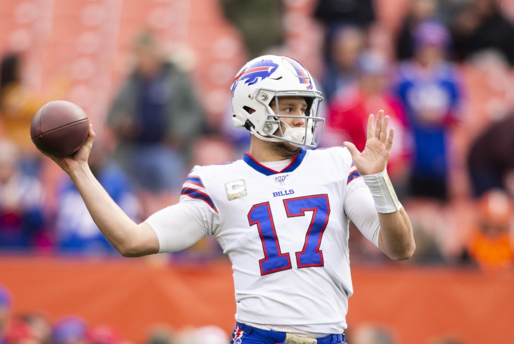
While baseball uniforms tend to be limited in the design elements available, football uniforms are a true canvas. There’s a lot you can do with them. Every part of the Bills’ current set is put together — they are the true paradigm of football uniform success. The charging buffalo is, in my estimation, the best logo in sports. The white helmet is the best way for the logo to thrive.
The red and blue are tinted to feel like the Bills’ own colors, rather than just another red and blue. There’s a different look to this shade of blue. The red is the ideal secondary color, appearing on the fringes of white numbering and lettering and in the middle of the pants striping. No part of the Bills’ design is a mistake, or could be improved.
I’d feel even better about such a high ranking if they’d quit wearing all-red (wear the red jerseys over white pants — please!). Outside of that, the Bills do nothing wrong. If every team coming up with new uniforms approached their designs like the Bills, the NFL would look a lot better.
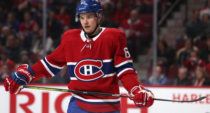
1. Montreal Canadiens
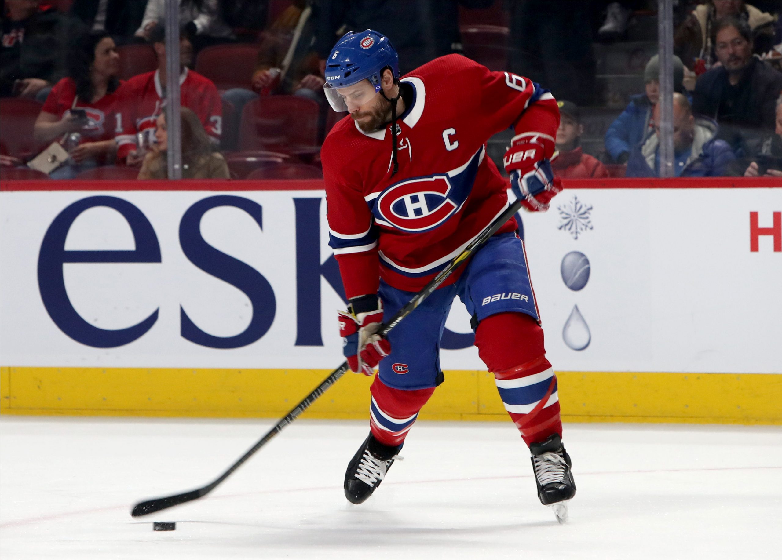
The Canadiens do things better than everyone else. Their red home uniform is incredible, and no uniform in sports can match it. The blue stripe across the front of the jersey, with white outlining, allows both the red and the blue to shine. Like the Bills, the Canadiens use their own beautiful shades of red and blue. Their slightly lighter blue is particularly gorgeous.
The balance of colors on the home uniform makes the whole thing thrive. The red jersey doesn’t need accents on the shoulders or arms because the chest stripe does the job. The blue helmet and pants thus feel perfectly in place. Ultimately, the red and blue, coupled with exquisite design, make their home uniform the best individual uni in sports.
Montreal’s road uniform is not quite as good. But their clever logo (arguably the second-best in sports) is still there, and the blue pants assure that the road uni still thrives. The Canadiens have a strong hold on the top spot.
