17-13: Nothing Fancy, Form Over Function
(These are perfectly adequate jerseys. Like an outfit from The Gap, you’re not bragging about it but you’re not ashamed, either)
17. Washington
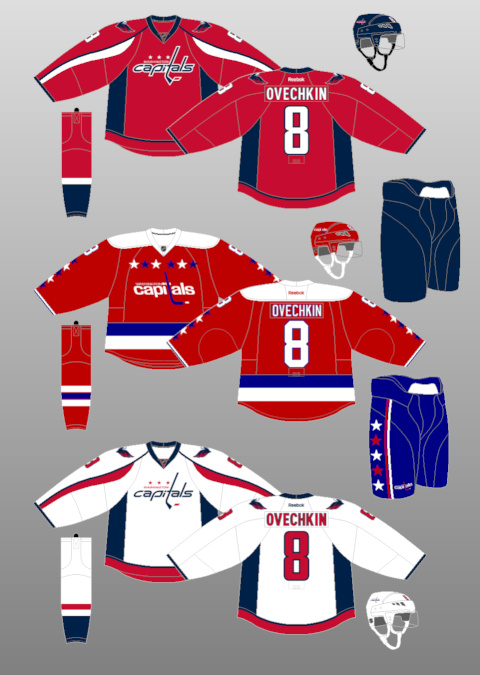
What works: The thing about these white jerseys are they are so close to being the best white jerseys in the league because they look like the retro jerseys they wear sometimes. Those are glorious. These still look fine, although they are what you’d design if you wanted to make a Capitals jersey but needed to work around copyright law.
What doesn’t work: The blue vertical stuff on the sides. The red vertical things on the arms. Just switch to the retros, Washington, and wear them at home.
Rating: 5.2
16. Florida

What works: While the Predators logo isn’t scary because the cat wouldn’t be able to chase you with its giant tooth scraping the ground, this cat is ready to kill. For a 1990s expansion team, the Panthers have done OK for themselves.
What doesn’t work: The palm tree/hockey stick shoulder patch is corny. We get it. You play near Miami. There are palm trees. If all teams had to do this, the New York Rangers would have a shoulder patch with a hockey stick over a pile of garbage underneath scaffolding.
Rating: 5.7
15. Minnesota
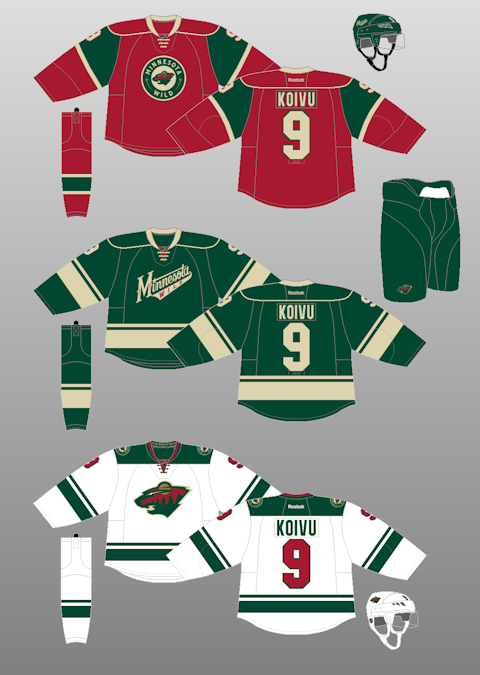
What works: Jerseys with simple piping can never be considered ugly. It’s this unwritten rule.
What doesn’t work: Should the number be green instead of red? Isn’t the logo weird? Maybe it’s the yellow moon that throws it out of whack. It’s like a Bob Ross painting from when he was just figuring things out.
Rating: 5.9
14. Chicago
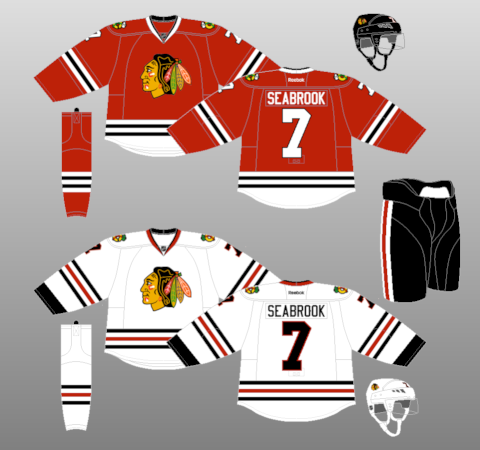
What works: For an Original Six jersey, it’s sort of boring, isn’t it? It’s just sort of OK. If it’s good enough for Clark Griswold, it’s good enough for you.
What doesn’t work: The story behind the Native American head logo seems to have left everyone thinking it’s not offensive, so that debate won’t be re-opened here. But this is the rare Original Six team that has a better dark jersey than white jersey.
Rating: 6.0
13. Tampa Bay
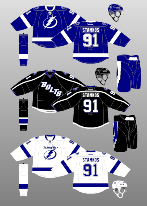
What works: It’s simple and very clean, like a studio apartment inhabited by Monica Geller. No need for a third color when you have blue and white.
What doesn’t work: Congress should hold hearings on the white/dark jersey battle and call to testify the person who created the black monstrosities they wear at home with BOLTS written diagonally on them. The fact fans could get these white ones 41 times a year and get the black thirds occasionally should be a crime.
Rating: 6.2
Continue on the next page…

The Bruins’ B is spoked because Boston is known as “The Hub”.