Major League Baseball took to Twitter to show off a whole ton of uniforms your favorite baseball team will be wearing this season, and it may have been a little too much all in one lump sum.
The uniforms for the All-Star game in San Diego were unveiled, but Major League Baseball had plenty more to show off today. Uniforms to be worn on Mother’s Day, Father’s Day, Memorial Day and July 4 were all shown, leaving some to wonder where the uniform for Earth Day or Flag Day were. Why not show us a uniform made 100 percent out of recyclable material, MLB? What better way to recognize Earth Day? Let’s move on…
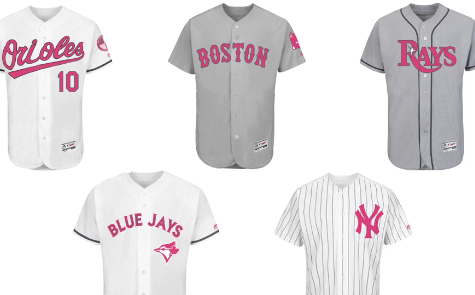
Baseball has previously given games on Mother’s Day and Father’s Day a special look with pink or blue gloves, wristbands or bats and cleats, but this year each baseball team will be wearing a specially designed look for Mother’s Day…
For the first time, @MLB clubs will don specially designed caps for Mother’s Day … pic.twitter.com/j7v1qmwzW8
— MLB (@MLB) April 13, 2016
The @MLB team jerseys for Mother’s Day? Also a first! https://t.co/8pTFJr4pzE pic.twitter.com/bqrTCOxPCJ
— MLB (@MLB) April 13, 2016
… and Father’s Day…
… and Father’s Day. pic.twitter.com/Y7yyoMdDEJ
— MLB (@MLB) April 13, 2016
Same goes for the Father’s Day unis. pic.twitter.com/Pq0MhyNann
— MLB (@MLB) April 13, 2016
You know, it’s not a bad touch. Some of these actually look really good. The Phillies’ Father’s Day uniform actually looks like a throwback to a very brief era where the team went by the name of Blue Jays. Toronto looks solid in their Father’s Day look too. Kansas City looks… the same. Also notice the San Francisco Giants refused to replace the orange in their name across the jersey with blue. And the Angels? No way they were going to wear a blue uniform. They stand out in their red jersey.
And the Mother’s Day uniforms? Not terrible, but some obviously look better than others. The Angels and Indians look pretty solid. Same with Boston. Arizona though? Well, maybe it’s just their ridiculous road gray look in general.
Of course, MLB cannot help itself but go with a military look for a Memorial Day cap and uniform, which is… ummm…
And of course, summer holidays – and your head – are covered with caps for Memorial Day …https://t.co/Tr0PQllhrK pic.twitter.com/tSCzqNjmj5
— MLB (@MLB) April 13, 2016
Can’t forget the jerseys for Memorial Day … pic.twitter.com/siMP0I8hAQ
— MLB (@MLB) April 13, 2016
Maybe this is just me, but I have always felt wearing a military fatigue pattern for a baseball or football uniform was a little disrespectful despite the attempt to be just the opposite. I feel like the more it is done, the more and more it loses its impact. People wear these looks for a reason, and it’s not to play a nine-inning game of baseball while being paid handsomely to do so. But wait, check out the special Fourth of July hats and uniforms this year, which look like they were bought right off the boardwalk at the shore…
… and Fourth of July. pic.twitter.com/R5hW1ZReIt
— MLB (@MLB) April 13, 2016
… and July 4th, so you can look hot when the weather is. pic.twitter.com/hJKdf0tQZR
— MLB (@MLB) April 13, 2016
I tend to be OK with this approach when it comes to July 4th. Others may disagree, and the traditionalist inside me cringes when I say this, but I think MLB did a decent job with the July 4th jerseys. Not so much with the hats. I would have preferred a simple style cap with the team’s regular look, but switch up the color scheme for red, white and blue caps with the regular or patriotic-style team logo and a flag on the back or side of the cap. Instead, baseball teams will be looking like they are on spring break with these caps. Do they come with a snapback too?
That’s what I think. What do you think about these uniforms? What other holiday should MLB adopt a special look for, and how would you design it? Leave your comments below.
